Member-only story
10 Insights from Apple’s Human Interface Design Guidelines
Noteworthy takeaways from the IOS design guidelines.

I’ve been developing an IOS app for the past few months and have been constantly referring to Apple’s Human Interface Design Guidelines. I would consider it a must-read for any aspiring or current UI/UX designer.
It’s surprisingly approachable and easy to understand. It isn’t written with overly technical jargon and gets straight to the meat and potatoes of designing an interface for IOS.
This is a list of the most noteworthy takeaways from the design standards laid out in the guide.
I know most people just scroll through these articles and don’t actually read them so the images are purely here for comic relief — enjoy.
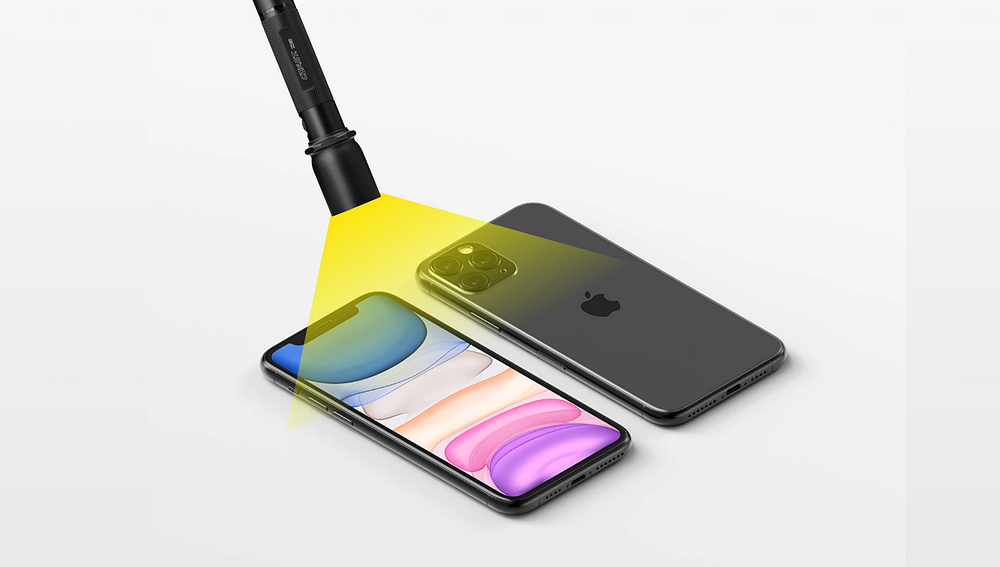
1. Test your app’s color scheme under a variety of lighting conditions

“Lighting varies significantly both indoors and outdoors, based on room ambiance, time of day, the weather, and more. Colors you see on your computer won’t always look the same when your app is used in the real world. Always preview your app under multiple lighting conditions, including outdoors on a sunny day, to see how colors appear. If necessary, adjust colors to provide the best possible viewing experience in the majority of use cases.” — Apple Color Guidelines
A perfect example of this is the sleep cycle app. The app has a calming dark display making it easy on the eyes and perfect for someone setting the alarm before going to bed.
In addition to color, I’d like to add that there are various contextual factors that influence a user’s behavior when interacting with an interface. Consider where the user is when using our app, how much time they have, and what their emotional state is.
You can see good and bad examples of this everywhere. Navigation apps have minimal reading or touching required, Kindle’s have no glare when reading outside, note-taking apps are available offline, and so on.


