
10 key UX & UI Design elements that will provide the best positive user experience
UX designers are constantly thinking about the experience of a concept or product. As we work through the UX process it allows us to discover growth opportunities for existing products or explore improvements to develop an entirely new design concept. It is extremely important that during this process we include the appropriate design principles to deliver the best positive user experience and encourage returned users.
As designers, we often ask ourselves, “Are we using the best UX/UI elements to achieve our product’s purpose?” Check out my selection of 10 key UX and UI elements that will help achieve the best positive user experience and save you time on deciding what design components to incorporate.
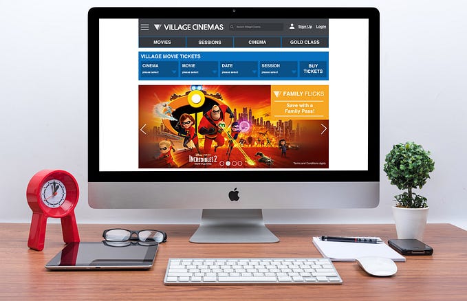
1. Best Performing CTA buttons

Your call-to-action buttons are a highly important feature within your product. It’s crucial that the correct context is added to its action so it can perform effectively to its dedicated purpose. For example, instead of “Buy” use “Buy Now”. Keep it to a maximum of three words.
2. CTA on Mobile

Designers use various sizes for CTA buttons. The article by MIT Touch Lab study of Human Fingertips, indicates the average width of the index finger is 16–20 mm for most adults, which makes the ideal button size 40–50px wide.
Depending what platform in which the application is created for will use different design specs.
For example:
iOS — Button Height 44px
iOS — Clickable area for icons 44x44px
Android — Button Height 48px
Android — Clickable area for icons 48x48px
3. Primary Action Button

The primary action button should be prominent, larger in size and easily accessible. The button should also be wider and tappable on mobile as this will always perform better for the users as it is easier for them to confirm an action.
As stated earlier and as per the MIT Touch Lab study of Human Fingertips publication, the ideal button size 40–50px wide. Therefore, a larger primary action button allows users to hit their target accurately even when their finger is slightly off target.
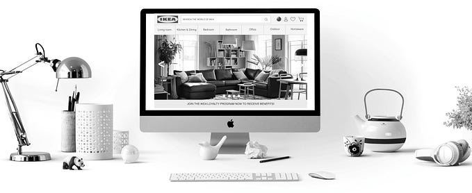
4. Image Overlaying
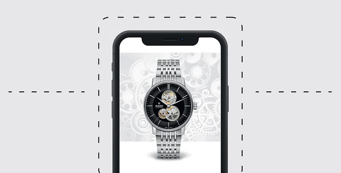
If you need to bring that WOW factor to emphasise a certain element in your design, consider image overlaying. Visually it becomes more interesting and appealing to the user, drawing their eye to be persuaded in buying the product or signing up for the service.
5. When to use Radio Buttons and Dropdown Menus
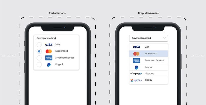
Not sure when to use radio buttons or a dropdown menu? If you want the user to scan the options easily and quickly and have less than 5 options, radio buttons are the perfect feature.
When there are more than 5 options or they can be categorised, the drop-down menu is essential as it becomes less cluttered on the UI. Either feature will avoid long scrolling making the users selection quicker and easier.
6. Placeholder — Context of Field Requirement

Using a placeholder with a sample copy example sets a clear direction of what is required and increases form conversion. For example, insert a sample phone number in the field text instead of putting the text “phone number”. Same goes for email, insert a sample email like “alex@gmail.com” instead of the text “email”. It’s a proven UX principle.
7. Error Message
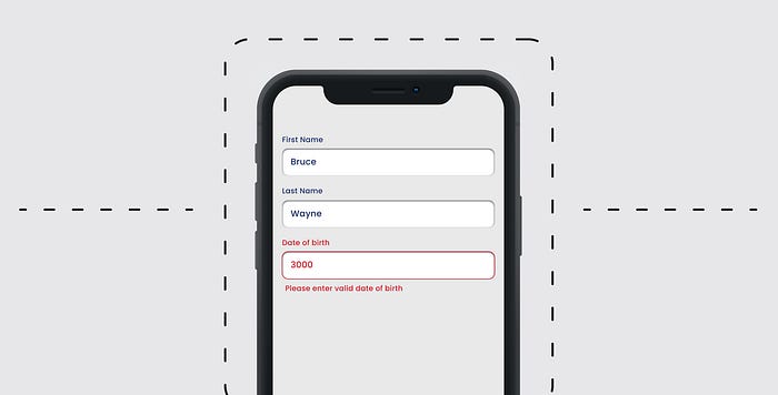
We often make mistakes and when we do it’s important to offer suggestions to correct our errors. To boost conversion rates the ‘instructional’ error message needs to be short and concise.
The style of the error fields needs to be distinguishable from the normal input field as well as careful placement of the error message. We need users to read the error instruction and follow to correctly fill in the field.
The style and location of the error will help users easily spot where they have made mistakes and rectify them promptly.
8. Icons

The use of icons should always have a primary goal to communicate a concept quickly. The design should have an understandable symbol that is readable, represents a strong meaning and reinforces the functionality that can’t best be described with words. Overusing icons is a big UI mistake, often compromising the UX so make sure you use them purposefully.
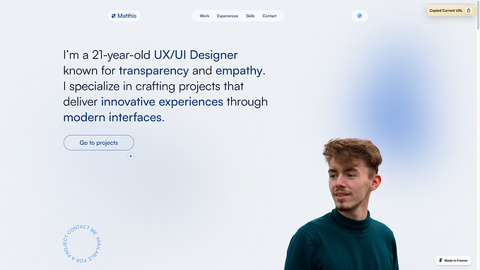
9. Create a Hierarchy of Text Styles and Fonts
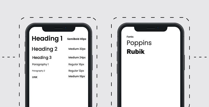
Developing a hierarchy of text styles and choosing fonts before a products UI development is started is extremely important for consistent UI design within the entire project. To do this, you need to create a design system for your product displaying hierarchy of styles with text styles starting from the largest to the smallest and keeping it to a minimum of 2 typefaces. That does not mean you can’t use more, but it’s better not to.
Use a font that has a font family with various weights like light, regular, medium, bold and extra bold, as well as styles like condensed, expanded, and italic. This will add some more dynamics to your design without adding an additional typeface.
10. Colours & Gradients

Colours are an essential part of visual design language you use to communicate with your users. 5 colours are a good maximum when designing your design system. If you do decide to use more colours, you will notice it’s harder to use them effectively.
If you are working on a brand colour scheme, ideally you will have between 1–4 colours depending on the vision of your brands product or service.
Gradients make objects stand out by adding a new dimension to the design and add realism to the object. Whether your gradients are used in backgrounds, image overlays, illustrations, or logos, it adds more depth to your design. However, make sure you don’t overload with too many colours within the gradient, use two or three.
Not only do gradients add depth to your visual elements but they can also be used to control the user flow in applications or websites. A well-designed gradient subconsciously leads the user’s eye towards the focal point and creates a seamless flow.
Closing Note
The UX and UI elements mentioned above are designed to sustain users and deliver growth because they create a seamless and positive experience for the user. I have selected these 10 based on my own work experience, takeaways from research and design articles and discussing with other UX/UI Designers.
Robert Golotta, a UX/UI/Digital/Graphic Designer has years of experience in solving business problems for clients and brands. Robert creates beautiful visuals and engaging digital products that provide positive experiences for users and increased brand awareness and company growth.


