10 things I wish I knew before I started designing bots
I want to be technically correct and admit that my work and these 10 “things” relate to bots and not chatbots. As long as there is a fixed decision tree, a predefined user flow, the chatbot turns into a bot. Taking that into account, the turned based interaction still feels like a conversation, supported by images, buttons and static text. I learned the following 10 things from tracking our users' interactions, qualitative interviews, testing a few things and checking different bots all the time.
Do Not Disclose Everything from the Start
Companies , including the one I work with, have the tendency to show users absolutely all their features the second they land in the bot. People will suddenly be greeted with three or four messages, an image and a few buttons, all at once, sometimes with a mix of UPPER and lower case text as well.

You are not designing a static website anymore and on-boarding is not just a topic designers use on Dribbble to show off. Messenger (Viber as well) has the ability to track the type of ads your users were interested in or their entry point, to then tailor a specific welcome message. Use the entire power of these platforms to get the best first impression possible. Some people might have a goal in their minds, others might be there to just explore this new product, hearing about it from their friends. As always, one design cannot fit them all.
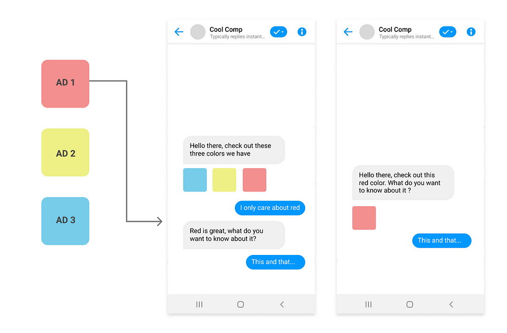
Make the greeting "lighter", take newcomers easily, don't throw them into the lion's den immediately. Try a few images, maybe a video, or a very short text with step by step introductions. See what works best, otherwise you may come out as desperate.
Avoid Using Multiple Messages at Once
I mentioned this in my previous article as well. There is a misconception among designers and creators of bots in general that sending multiple messages is better than sending one. Breaking down one message into smaller bits will make it more digestible, in theory. However, in real life things are a quite different.

Technically, our eyes don't read a single line of text at a time, we read in saccades making quick jumps across multiple lines, stopping shortly for some words. This happens due to our limited visual acuity, relying on the fovea, occupying only 1% of the eye, to create a sharp image. The peripheral vision then guides the fovea to jump around in our environment until we construct a complete image in our brains. So, while you focus on scanning and understanding the first message, your peripheral vision gets instantly distracted by another motion-the second message popping up. You shift your focus long enough to force you to start the first message again. This happens twice in the case above.
Most of the time you can say the same thing in fewer words. If that's not possible, than maybe you are trying to say too many things at once.
Stop Over-explaining the Basics
The main reason most message are too long and bots too verbose is because their tendency to repeat obvious information. First of all, do not repeat the name of your business throughout the bot: “Sign in to get better [name] services”, “Get [name]’s best offer”. You are supposed to provide an experience, not a marketing brochure. Once in the welcome message should be enough. The thing all our interview participants were running away from were messages having a sales like approach. They were getting enough of those in ads, apps and shops.

Then stop using phrases as : “Click below”, “See above”, “Swipe or scroll to see more”, etc. Bots do come with a different way of interacting with a service, but the building blocks are the same. Basic buttons, swiping and scrolling have all been invented before Messenger and its chatbots. Better start with the bare minimum, test it and see if people understand it. You’ll be surprised how easily people just try different things with or without your texts. Respect people’s intelligence and do not assume they cannot comprehend basic visual systems right from the start. Instead of stating the obvious make sure that you create proper connections between each interaction.

Checkout Might Not Work
There are a few brave companies that are trying to keep the checkout as "native" as possible, without sending people to a webpage. As much as I admire their idea, I must say that buying regular products that require a full address, phone numbers, names and payment methods poses a challenge in current bots.

All the required steps must be presented upfront, since there is no progress indicator and you don't want to be perceived as something that keeps coming up with needs. Tell people that you will need five things from them, each one at a time. Then, make sure that each necessary input is explained correctly, people only have one text field, without any labels and placeholders as you have in your app, or website.

I admit I've only seen this in a few bots, most of them redirect people to their websites, finishing the checkout in the browser. Keeping it native does work when buying simpler products, as a data pack that connects to your telco operator's account. In that case, you only need to confirm the purchase and you're done.
Be Short and Precise
Even though there is no actual chat, the interaction still takes the form of a conversation, which could quickly turn into an overwhelming monologue. The bot will obviously “talk” more than the user, since it will present its services, while trying to be polite and possibly a little informal. However, make sure you are mixing long and short messages as much as possible.

If you don't repeat yourself unnecessarily and you don't explain the basics, your messages should be straight to the point. This becomes especially important for errors. What I witnessed during tests, was that people simply stopped when seeing an error, without any clear advice for proceeding. By stopped I mean, just froze. They had an immediate desire to stop using the bot, as it felt like that've hit a dead end. In the end, a conversation that makes no sense becomes a waste of time.
Keep Quick-replies as Answers / Choices only
During a few user interviews in which I asked participants to use a feature similar to one they used before, they all scrolled up and looked for the button that triggered the first one. Even though the button was right under their noses, in the bot menu, they all, almost instantly preferred to use their past experience as a starting point to finish the next task. That’s how we identified the issue.

Messenger enables the use “quick replies”, which are small buttons that can be added under a message. However, once another message is sent by the user or the bot, the quick replies disappear. One of our feature was only present as a quick reply. It was only when after tested and saw that some people would rather scroll up, that we moved the feature to a static button in a card.
When you think about it, we do scroll up in message history from time to time to find different pieces of information, which makes this behaviour relevant in the context of a conversation-like interaction. Make sure that your quick-replies do only make sense in the context of the message they are attached to and are not stand-alone features.
Support the Chat, Don’t Replace It
People can open webviews(web browsers) inside a bot, just by pressing a button. These webviews can be as specific as a specially designed page, based on the button pressed in the bot, or as generic as opening the same home page from any button. Even though this is mentioned in the Facebook guidelines as well, many bots seem to prefer sending people into a web page, keeping the bot as an entry point to their website only.

Webviews should be used to support the native experience, as: accessing more information about a product, for authentication leading to a personalised native experience, possibly finishing a checkout process, or even to get richer content. People are not naive; the moment they will have to navigate through multiple web pages, inside Messenger, they might question the point of using the bot in the first place. If the bot is used just to create another presence in social media, redirecting people to your other products, maybe it shouldn’t exist in the first place.
Old Habits Die Hard
How do people do to decide which product they should go with, from a list of product ? They compare different attributes of the product, including their price. We initially used a carousel to display multiple related products. The carousel has a simple ascending logic for the price, but then each card has its attributes listed in their description. If people wish to compare card 1 to card 5, they need to constantly swipe 4 times back and forth between those two. That’s how a user told us that swiping caused her “a little bit of an inconvenience” when choosing a product, compared to a simple list she shared from an app. The carousel can work for browsing through different categories, sizes or colours. It could also work when there is only one thing to compare, presented by the order of cards, as ascending or descending price for example. If there are more variables, a list could be a better choice. However, at the moment, Messenger allows only four items in a list, which either complicates the issue some more, or forces you to restructure and focus.

If your argument is that you wish to have more than 4 items displayed for sell at once, there is a very simple counter argument. When we checked the data, the most bought and accessed products are always the first two or three in all carousels, there is almost no point in adding more than five products in a carousel.
Do Not Push Your Luck
“ I just delete them all…I’m not on everything they offer” — this is what all our participants said, in different ways. People are sick and tired of promotional messages. Moreover, they do not expect to get these in Messenger and the moment they receive one, the bot gets muted and most likely never used again. Multiple people had their chat history filled with out push notifications without ever pressing one. Make sure the messages you send are relevant to the receivers, don’t just engage with the entire base, hoping to get a higher click through rate. You will get a higher percent, but you will annoy a lot of people at the same time.
If your bot’s main purpose is to sell products through push messages, you’re in for a bumpy ride. Your product has to either provide an amazing price for its value, or your audience needs to be engaged and expecting this behavior.
Fun, New and Memorable
Above all, aim to create a memorable experience for your users and don’t be afraid to try new things. If you have exactly the same approach as in apps and websites, what’s the point of all this ? Even if you don't create a chatbot, the interaction can still be smart and memorable.

I'll leave you my personal take. Facebook Messenger, Twitter and Viber gave birth to a new type of hybrid app-bot and I’m not sure it’s a good thing. The smart thing about chatbots is that people can type a command in different ways and get the result without having to navigate through multi-layered menus. Take that away and you’re left with possibly complex navigation through a text-based interface…kind of beats the purpose? Even the ones that allow text input are extremely limited in understanding nuances, spelling mistakes or phrases. I wonder if these bots are actually throwing us in the wrong direction and are just used as another tool for luring people into services…


