10 Tricks & Techniques to Make The Most Out of Sketch
A quick illustrated guide to help you become a real Sketch professional

Learning Sketch is a lot like learning how to drive. It’s relatively easy to take the first steps, but mastering the skill is a completely different animal.
As always in design, devil’s in the details. Becoming a Sketch pro is pretty much about clever workarounds and nasty little tricks. Today I’d like to share a few of them — ones that I personally like most. Some of them are pretty basic, some are not. Some have already gained popularity, some are rather unknown. But no matter what’s your level of experience in Sketch, I do hope you’ll find something useful for you in the article!
Most of the examples below come from the recent freebie of mine, Sketch UX Kit. Feel free to download it and have a play with the described techniques yourself.
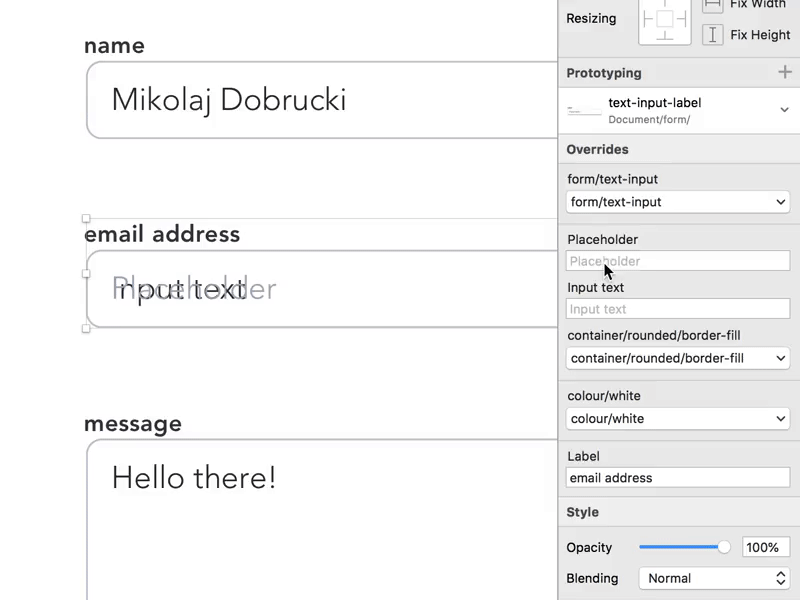
1. Use prototyping to organise your Sketch files.
In the version 49, Sketch finally introduced native prototyping. Is it great or at least as good as the 3rd-party alternatives? Uhh… not really, to be honest. But there’s at least one purpose it serves very well: instead of using it to create clickable prototypes of your website or app, it can be extremely helpful with organising and documenting your project. Could be worth a try if you have a large file with lots of artboards, components… and collaborators.

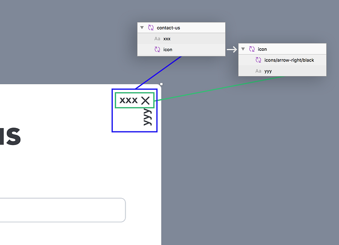
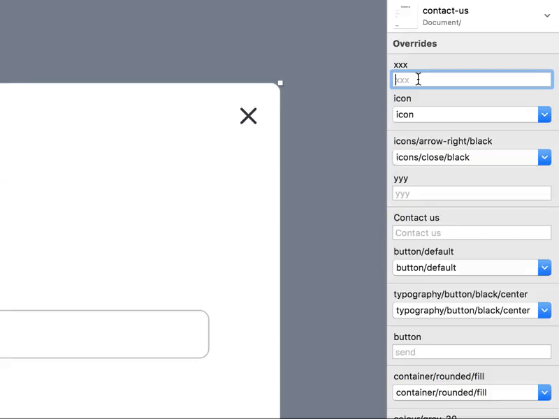
2. Use nested overrides to customise almost everything.
Symbols are probably one of the most valued and powerful features of Sketch. They let you reuse elements — like buttons, icons, or even much larger components — easily across your document. However, the real power of symbols lays in nesting them which allows you to alter each instance of a symbol separately and customise almost everything in them, like colours, shapes, effects, or even text styles.
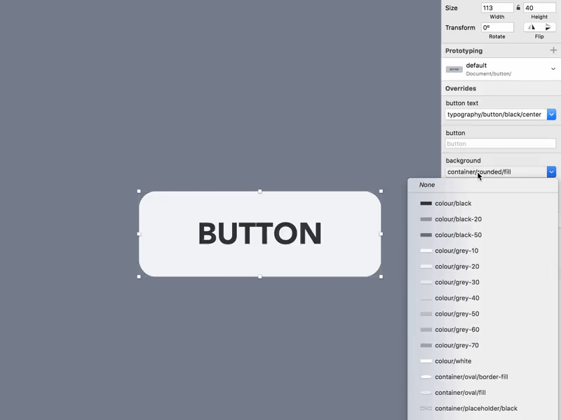
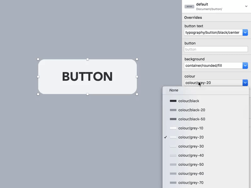
Colours
Let’s say that a project requires 3 buttons in 3 different colours. To use only one symbol for all of them at once, we need to be able to change the colour of the button without detaching it from a symbol. Doable? Of course, it is.
When you put a symbol inside another, you can swap the one inside with any other available symbol of the same size. In Sketch, this function is named nested overrides. This way, if you have multiple colour swatches saved as symbols, you can easily replace one swatch with another.
Sketch docs reference: https://www.sketchapp.com/docs/symbols/nested-symbols/

Shape
There are plenty of use cases for nested overrides. In the Sketch UX Kit, I use them to change the buttons’ colour, effects or even shape. Yes — you can use exactly the same symbol for a big rectangular button and a Material Design’s Floating Action Button. Isn’t it cool?
Text styles
Nested overrides let you manipulate symbols inside another symbol but they don’t allow you to control text styles used inside of a symbol. This is one of the things that annoyed me in Sketch for a very long time. Eventually, the best workaround I found is to put each of your text styles… in a symbol and use it as nested override as well.
Transparency
Unfortunately, in Sketch, you can’t use symbols as masks. That would solve lots of problems but probably will never happen. One of those problems is controlling the opacity of nested symbols. The best workaround I found so far looks basically like that:
- Place the nested symbol which opacity you’d like to control in a group.
- Turn this group into a symbol.
- Duplicate a symbol you just created and change the opacity of the group inside.
- Create as many symbols with different opacity levels as you need.
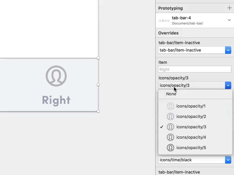
As you can see it works… kind of. There are two crucial limitations to this method. First, you’re limited to the opacity levels you created. Each new opacity level needs a new symbol. Second, when changing opacity, you reset all the nested overrides. If it’s one icon that you change the opacity of, probably it’s not such a biggie. But if you’d like to use it for a more complicated symbol with lots of overrides… good luck.
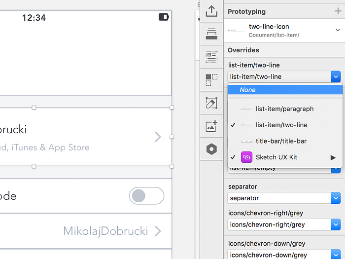
Bonus Tip: Nested overrides are cool not only because you can swap the nested symbols but also because you can remove them. On top of the list of available overrides, you have an option None. Choose it to simply remove the nested symbol from its parent instance.
3. Hide text within symbols with whitespace.
Talking about hiding stuff. Having a text layer inside of a symbol, you can turn it into a nested symbol (which means that you can hide it later as any other override). But there’s a much easier way of doing that. Instead, override layer’s contents with whitespace (that is a space, or whatever). Simple as that.
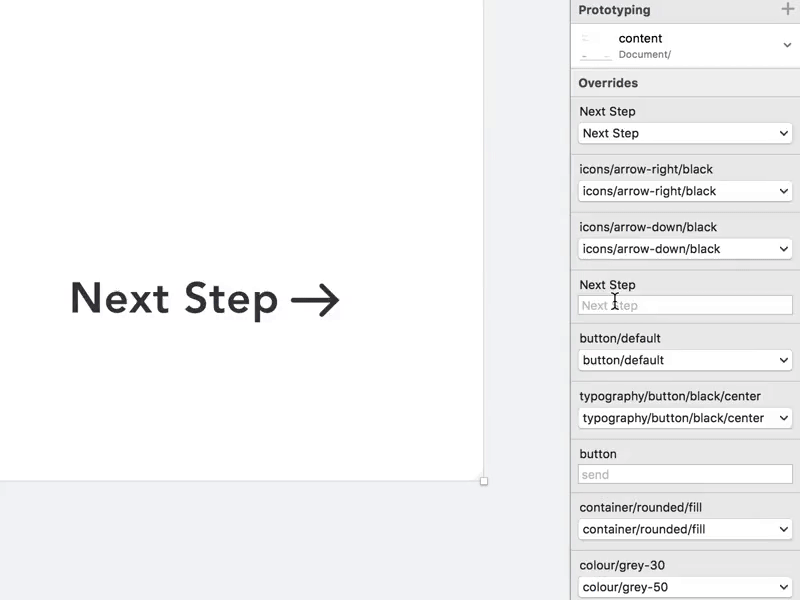
4. Be smart with your symbol instances.
Symbol overrides are cool as long as there’s not too many of them. Once your Inspector gets full of all the available overrides of all kinds and types, it’s not that easy to use anymore. There are 4 practices that might help with this kind of a nightmare:
- keep the right layers’ order — the order of the overrides in the Inspector reflects the order of the layers inside the symbol. So if you make the layer’s order logical and follow the actual visual order of the elements it will be much easier to figure out what is what
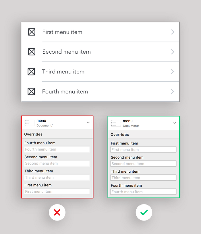
- name your layers — if you have the same symbol nested in another one multiple times, rename its instances in a explanatory way (e.g. left, right, middle…)
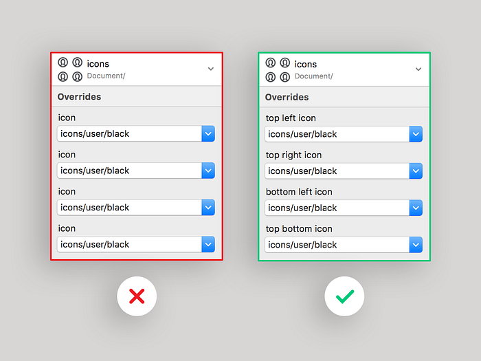
- override text in multiple nested symbols — let’s consider a symbol with a grid of 4 identical components inside, each of them containing some text. If you override this text inside the symbol, it will show up on the parent symbol’s list of overrides.
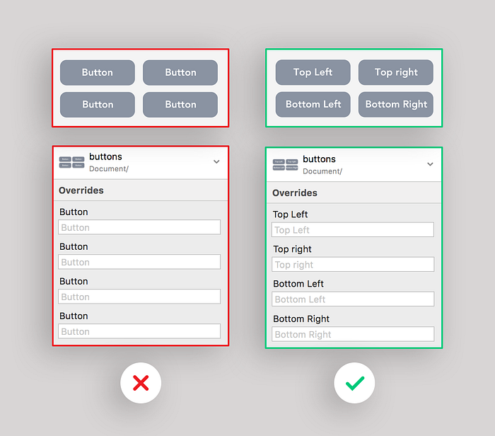
- block unwanted overrides — if you don’t need some nested symbols to be overridden just block them in the layers list. It will help you a lot with keeping your overrides list clean.
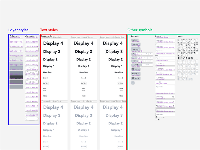
5. Keep masters of your layer styles and text styles together.
Layer styles and text styles are extremely useful as long as you use them in a right way. Two golden rules regarding styles to which I’m trying to stick in all my current projects are:
- Every single text layer should have a text style and every single rectangle should have a layer style.
- All the text styles and layer styles should be synced across the document and should not have any local amendments.
Sometimes, it’s very tempting to apply a text style to a newly created layer and just change its text alignment or colour. But if you do that, you can no longer update your style as your change would affect all the other layers with this style. So if your file is full layers with amended styles (marked with an asterisk after the style’s name and a refresh icon to the right), you’re doing something wrong. In a few words: use styles consequently or don’t use them at all.
One issue that is a consequence of this approach is, of course, many text styles and layer styles. E.g. in the Sketch UX Kit, there are 11 text styles, each of them available in 2 colours (black and grey) and 3 alignments (left, central and right). This makes a total of 66 text styles and it’s just a simple wireframing kit! Potentially, it could be a reason to some big headaches, once you’d like to update a lot of those styles at the same time.
A good practice that will help you avoid (or at least minimise) most of those pitfalls is keeping all the styles presets in one place. I do it for both layer styles and text styles. I usually put them on the Symbols page (but this could be any other page as well). This gives me a great overview of all my available styles and lets me select and update them easily.
6. Build a hierarchy of your symbols and styles wisely.
Once you have a lot of symbols, layer styles and text styles, you’ll definitely want to group and categorise them somehow. In Sketch, you can easily do that using slashes (/) in the symbols’ and styles’ names. There’s one tiny detail that many overlook though.
Switching between symbols and styles (not to be confused with swapping nested overrides), the siblings of the active symbol/style are always listed on top of the list. Why is it that important?
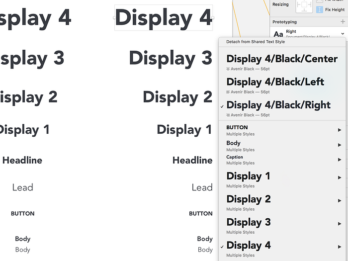
Let’s consider 4 text styles: a large black heading, a small black heading, a large grey heading, and a small grey heading. If you think about putting the categories in the right order, there’s quite a lot of the difference between this structure:
Heading/Large/Black
Heading/Large/Grey
Heading/Small/Black
Heading/Small/Grey
and this structure:
Heading/Black/Large
Heading/Grey/Large
Heading/Black/Small
Heading/Grey/Small
In the first case, you can easily change text colour without diving into the whole menu but you cannot change the size that easily. In the latter one, you can change the size but not the colour. Which one is better? There’s no simple answer, but it’s very useful to keep this rule in mind while structuring your symbols and styles.
7. Keep your grid and layout aligned.
Layout Settings and Grid Settings in Sketch let you easily create custom grids and keep all your UI elements properly aligned. However, there’s no such a thing as a great grid as long as it’s not regular and precise. You can make a 1120px grid with 12 columns and 30px gutters, but do you know what do you get then? 8 gutters of 30px and and 3 gutters of 31px. Not nice at all!
One of the layouts I commonly use is a 1152px layout with 32px gutters and 64px columns. It’s not only regular but also aligns perfectly with the 8px grid as all its values are divisible by 8. Combine it with a plugin that lets you change your nudge distances (e.g. Nudged, Automate Sketch) and you’re in the layout-grid heaven.
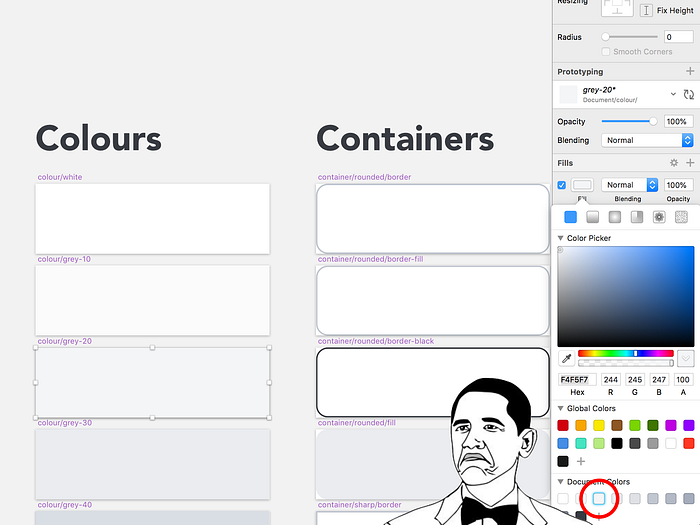
8. Fully control your colour palette.
As your project grows, it’s often really hard to keep track of all the colours it uses. To be consequent with using colour palettes we usually use layer styles, text styles, symbols and Document Colors within the Color Picker. But how can we ensure that there’s no layer that gets unnoticed with a wrong background colour?
Find and replace colour
Sketch 49 introduces one more useful feature apart from prototyping: Find and Replace Color. Even though the main purpose of it is to, well, find and replace colours, it’s also an awesome tool to check what colours are used in your document. Just open it and you’ll see a complete list of all the colours you used in the file. Seeing anything unwanted? Replace this colour with the right colour from the palette!
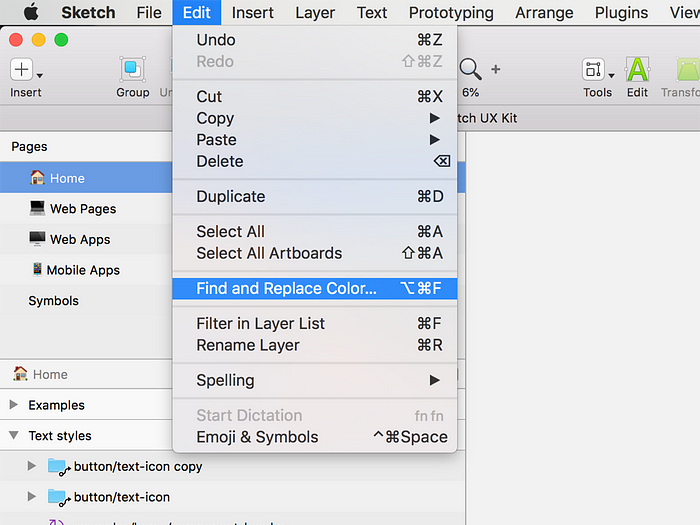
Here you might say: But in my project, I use lots of external assets and illustrations that don’t match the brand colour palette and are messing this list up! What should I do now? Fortunately, there’s a solution to that too! Just move those assets to the external Library! You cannot use Find and Replace Color to target colours in the linked libraries so they won’t appear on the list. And by the way — keeping that stuff in a separate file might not be a bad idea anyway.
Colour Picker
There’s one more simple way of checking if the colour you used on a layer is right. First, you need to add all the colours from your colour palette to the Color Picker. Then, find a colour you’d like to check against your palette and open in in the Colour Picker. If the colour matches any of the colours from the palette you will see a blue glow around it on the colours list.
9. Control position of the nested elements in symbols with text overrides.
Brace yourself, if you haven’t heard about this trick before — it’s a weird one. But very useful sometimes.
You might have noticed that if you put a text layer and an icon within a symbol one by another (but not overlapping!), if the text layer’s Alignment is set to Auto, the icon will remain in the correct spot even if you change the text layer’s contents.
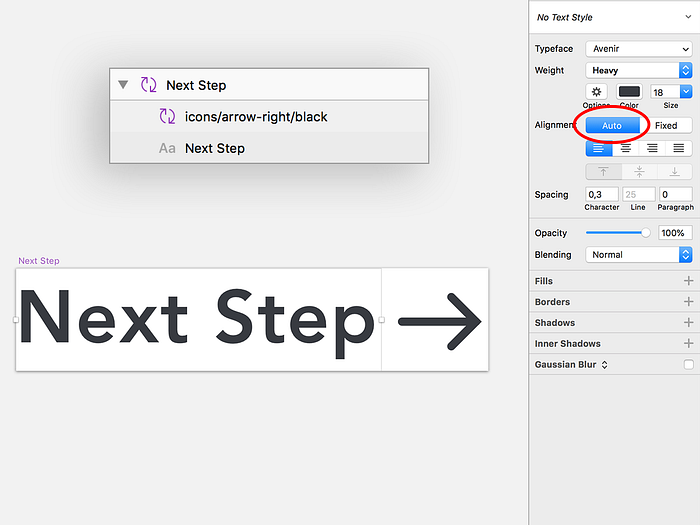
It’s a cool feature, no doubt. But it’s also much more powerful than you might initially think. When using this technique, you can almost limitlessly control the position of the elements inside the symbols. Just set the text layer’s opacity to zero and you have a great tool to move things inside the symbols left, right, or even up and down!
Is it a perfect method? Of course not. But if you play a bit with Font Size and Letter Spacing you can easily get a pretty fair pixel by pixel accuracy.
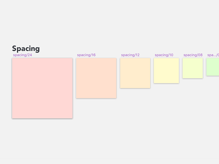
10. Create your own spacing symbols set.
Being consequent with spacing is probably one of the most tedious, problematic challenges of many UI projects. With time, similarly to some other teams and designers, I’ve developed a habit of keeping a special set of symbols for spacing within a Sketch file. You place them between other layers to simply check how much space lays between them.
If you ever decide to create your own, here are a few tips to make your spacing layers as useful as possible:
- group the symbols together in your Symbols tree to swap them easily
- name the symbols alphabetically so they’re logically sorted
- use colours to differentiate the symbols
- use Spacer plugin for auto size when switching symbols
That’s it for today! Hope you learnt something new! If you have any other favourite Sketch tips and tricks don’t forget to share them in the comments!
If you have a question or need some more explanation on any of the listed tips, don’t hesitate to contact me here or on Twitter:

