Member-only story
10 Ways to Design More Inclusive Products
Ways to make digital products more accessible, usable, and user friendly for everyone.

I wrote this article to help designers, product owners, product managers, UXers, developers, and anyone else to craft more inclusive product experiences.
It’s normal to approach design through the lens of our own perspective, believing our experiences reflect those of everyone else. This natural bias in our human nature can work against us when solving design problems since we’re only solving for people who are like us.
The challenge in design is to create experiences that are adaptable, flexible, scalable, and most importantly, usable by as many people as possible. Our goal as designers is to be advocates for improving the human experiences of everyone, not a measly few.
In this piece, I’ll share a few ways we can move in the direction of building more inclusive, accessible, and accepting digital products.
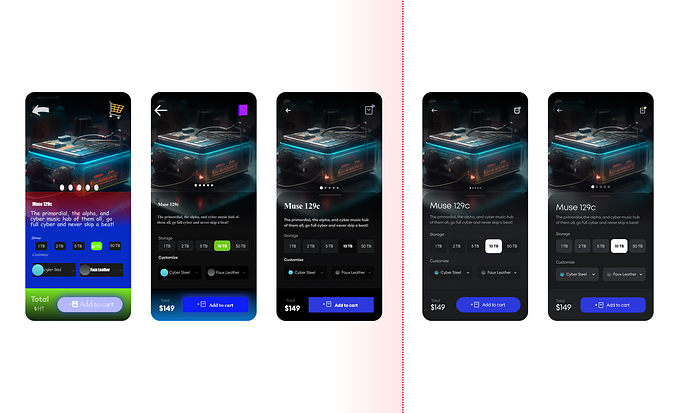
1. Designing with color

As designers, color is our world. Designing an inclusive product doesn’t mean avoiding the use of color or resorting to lackluster palettes. It does, however, have guidelines that enable people with visual impairments or color deficiencies to use our products the same as a non-visually-impaired person can.
Here are a few rules of thumb to follow:
- There must be a color contrast ratio of at least 4.5:1 between all text and background.
- Do not rely on color alone to convey information. For example, an error state shouldn’t only be displayed with a red outline, use a warning icon and descriptive text as well to alert that as issue has occurred.
To ensure we’re meeting color standards, download the Stark plugin for Figma, XD, or Sketch (If you’re not using these, use Colorable to check contrast ratios). Stark makes it easy to ensure designs are accessible by simulating color blindness, checking contrast, and providing smart color suggestions.


