Member-only story
10 Ways to Improve Dropdowns in UI & UX Design
If appropriately used, dropdowns don’t have to be awful.

Dropdowns are one of the most widely used and versatile tools in the UI & UX designer’s toolbox.
They provide a simple way for designers to group many options into one handy component.
There are though some fundamental ways in which dropdowns should be improved.
If you follow these tips, you’ll be sure to improve your user’s experience while leveraging the flexibility and simplicity of dropdowns.
This list was adapted from a 2016 Keynote at SXSW by Golden Krishna of Google, the author of “The Best Interface is No Interface,” and Eric Campbell of Rdio — You Know What? Fuck Dropdowns.
1. Smart Default

By utilizing analytics and overall usage patterns, we can determine which option is selected most frequently from our dropdown.
If 80% of the users are selecting a specific option, then we can allow 80% of users to skip this step entirely by making that option the smart default.
If you’re paying a speeding ticket on a Colorado website, for example, it would make sense for the smart default to pre-select Colorado as the state.
2. Simplify

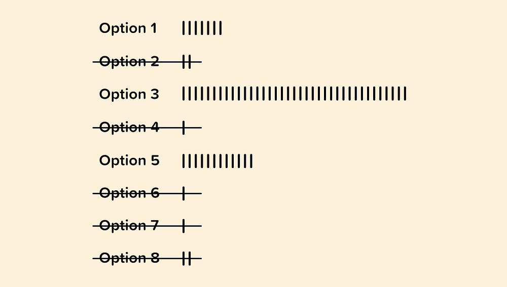
When possible, we can use analytics to inform on which options from our dropdown may be unnecessary.
If users are only selecting a handful of options and rarely selecting or never selecting others, then we can consider removing them.
Having a concise dropdown will make it easier for our visitors to quickly choose the option that is most relevant to them.

