You're reading for free via Lucas Didier's Friend Link. Become a member to access the best of Medium.
Member-only story
20 psychological principles applied to product design
Using cognitive biases and persuasive patterns to build better products.

A few years ago, a colleague of mine introduced the Mental Notes game in my former company (BlaBlaCar). For each feature we were designing, we were gathering with a few product managers, designers and developers in a “behavioral review”, to see how we could apply a few behavioral psychology principles to our project.
Even a few years later, I still regularly use those principles on the projects I’m working on as a freelance product guy. In this post, I’ll share some of them with you, with some concrete examples of how they’re applied in real products. I hope this can help you in your own projects as well!
Disclaimer: All the topics and their descriptions below are coming from the Mental Notes card deck.
Social proof
“We tend to follow the patterns of similar others in new or unfamiliar situations.”
Apps that try to push users to complete an unusual action or start a new uncomfortable habit often use social proofs, like comments, ratings, testimonials, etc.
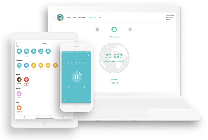
One example is the meditation app Petit BamBou that shows in real-time how many people are meditating, or how many have been meditating over the past week, month, year, etc. That way, they’re intending to show that meditation is something accessible to everyone, and that there shouldn’t be any barrier to practicing it.
Countless examples of social proof can be found as you get closer to the bottom of a purchase funnel. For instance, when you land on a pricing page, it’s quite common to find a few social proof elements:
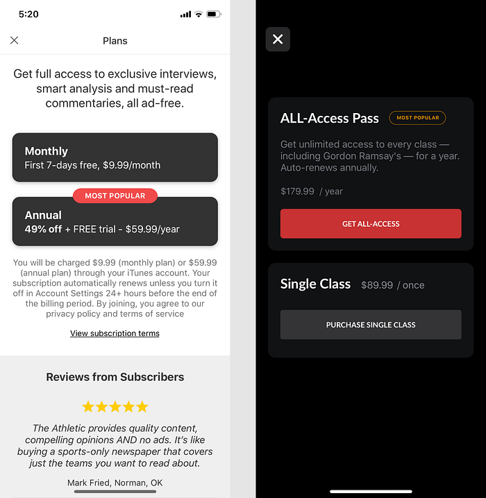
You’ll often see a “Most popular” label associated with the more expensive option, and sometimes a few customers testimonials in order to convince you to finally buy the product or service.
Curiosity
“When teased with a small bit of interesting information, people will want to know more!”
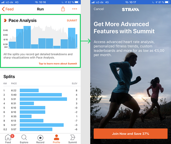
That’s for example what the fitness app Strava does with its “Pace Analysis” feature. They give you a preview of how the graph looks like, but not much more information. If you want to see more, you have to subscribe to their paid subscription “Summit”.
Another industry heavily relies on curiosity to generate subscribers and thus revenue: news. We’re all used to articles ending unexpectedly with this annoying fade inviting you to subscribe to read the full story.
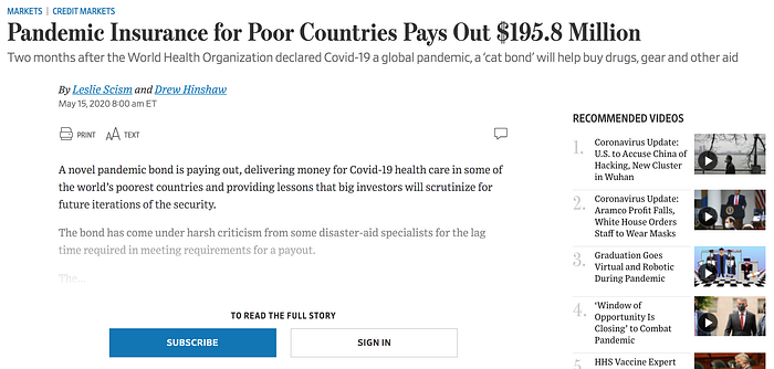
The small excerpt they’re showing is supposed to be sufficiently enticing to turn visitors into subscribers.
Recognition over Recall
“It’s easier to recognize things we have previously experienced than it is to recall them from memory.”
That’s why so many products suggest choices to their users instead of asking them to remember everything themselves.
For instance, Airbnb’s rating flow gives you 8 different criteria to rate after a stay. It enables to have enough insight from the guest in case they don’t provide any qualitative feedback on their stay. It also enable guests to remember specific parts of their stay. If Airbnb didn’t provide all of these categories, ratings would probably sloppier because guests would only rate the highs and lows of their stays, not what’s in-between.
That’s also why the insurance startup Lemonade suggests several pre-defined categories of high value items.
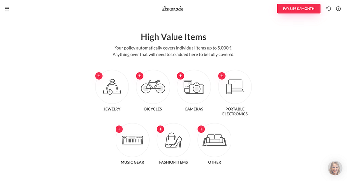
This makes it much easier for users to remember which items they own might potentially be worth a lot of money. Without those visual clues, the recollection process might be tricky, causing some users to drop out of the flow and thus decreasing conversion.
Delighters
“We remember and respond favourably to small, unexpected and playful pleasures.”
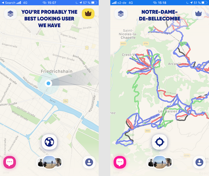
As an example, the location sharing app Zenly sends lots of compliments (“You’re probably the best looking user we have”) and easter eggs (showing ski slopes on its map) to its users, which makes it one of the most loved apps on social media.
A long list of delighters can be found on Little Big Details, a repository of UX micro interactions and easter eggs. For instance, one of my favorites:
Anchoring & Adjustment
“When making decisions, we rely too heavily — or anchor — on one trait or piece of information.”
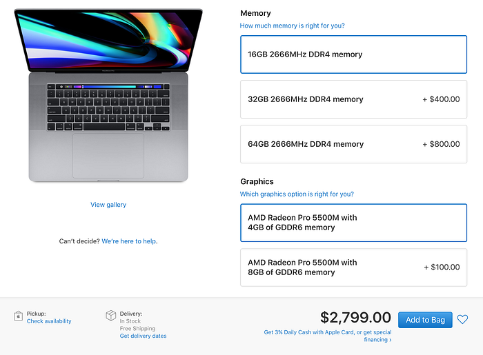
For instance, when you buy a new laptop on Apple.com, they’re proposing you tons of options ($200 for a more powerful processor, $100 for better graphics, $400 for more storage, $299.99 for pre-installed Final Cut Pro X and $199.99 for pre-installed Logic Pro X). Taken separately, that’s a lot of money for all these options. But when you’ve already taken the mental leap of paying for a $2,799 laptop, is it that big of a deal?
The same approach goes for donations to charities when you’re paying your $150 groceries at the cashier. Will it really change anything if you’re adding $0.50 to that amount?
Appropriate challenges
“We delight in challenges, especially ones that strike a balance between overwhelming and boring.”
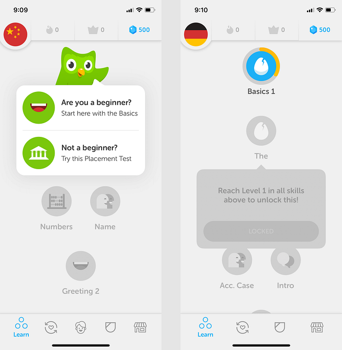
That’s why the language learning app Duolingo starts with a placement test, in order to make sure you start lessons that are appropriate to your level and you don’t drop from the first lesson because you’re bored.
Aesthetic-Usability Effect
“Aesthetically pleasing designs are often perceived as being easier to use.”
We perceive attractive things as being easier to use. The calendar app Sunrise, acquired in 2015 by Microsoft for more than $100 million, was the best rated calendar app on iOS and Android at the time. It had thousands of ambassadors, praising the user-friendliness and usability of the app.
But was Sunrise really pushing the boundaries of what a calendar could do? It had a few convenient features, like the integrations with Facebook events. But it didn’t do anything rocket science. Nor did it do anything that Apple Calendar or Google Calendar couldn’t copy in a few weeks.
Pierre Valade, the founder of Sunrise, is a product design fanatic. He wanted to build the most beautiful calendar app in the world. And that’s what made Sunrise such a great product.
Value Attribution
“We value things when they cost more.”
Cost can be monetary or just an investment of time.
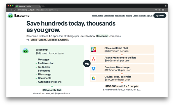
Regarding money, there are countless examples of unintuitive pricing experiments, where companies have benefited of increased conversion and/or revenue as a result of increasing prices. In their book “It Doesn’t Have To Be Crazy At Work”, Jason Fried and DHH talk about how increasing the entry price of Basecamp from $29 to $99 a month enabled them to attract new customers. Sometimes, people see more value in your product if you increase its price.
Regarding time, it’s mostly relevant for mobile games or gamification-based apps. In freemium games with in-app purchases, if obtaining a certain feature or privilege takes a lot of time, users will perceive it to be more valuable, and will be ready to pay more to obtain it.
Loss aversion
“We hate losing or letting go of what we have (even if more could be had).”
A good example of how this psychological insight is applied can be seen on the cancellation flows of many subscription-based services. For instance, when you try to cancel your Adobe Creative Cloud plan, here’s what they tell you:
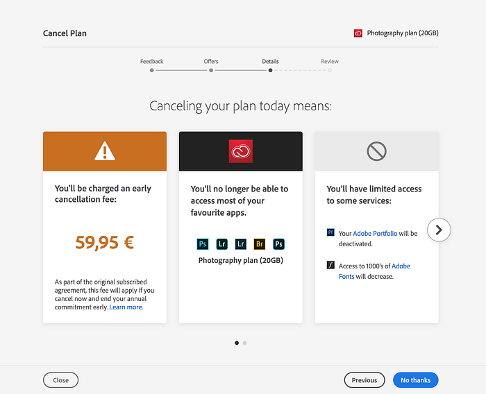
It emphasizes everything you’re going to lose, both financially (because of early cancellation fees) and functionally (in terms of features you’re not going able to use anymore).
Loss aversion is widely leveraged on products that you can try without signing up. This is very frequently the case on mobile apps: if you don’t sign up on Angry Birds, you’ll lose all your progress.

Similarly, if you don’t sign up on Duolingo, you’ll lose all the initial info you’ll filled in as well as the first “introduction” test you’ve made.
Loss aversion is also heavily used in freemium subscription apps. For instance, let’s say that you’ve started an introduction to meditation on Headspace. After 10 sessions, you’ve already well committed in your path to learning meditation. But if you don’t subscribe to the premium plan, you won’t be able to continue your progression and you’ll lose this momentum you’ve initiated.
Contrast
“When scanning new visual information, we are unconsciously drawn to things that stand out against their surroundings.”
To illustrate this idea, let’s compare the “Passenger Details” step of two flight booking services. On one side, “Opodo”, an online travel agency created by several European airlines; on the other side “Ulysse”, a French startup that wants to disrupt the flight booking experience.
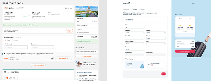
At this step, what do passengers want to do? Well, fill in their information as easily as possible, optionally add some services but mostly move on to the payment page.
On Ulysse, it’s pretty straightforward what the next step is : continue to payment. The blue side panel remains sticky as you scroll down the page. The color contrast of the page also reflects this prioritization of users’ intention.
On the contrary, on Opodo the hierarchy of actions isn’t very well contrasted. Selecting your seat, sending via email, adding luggage and logging in have the same weight as continuing to the next steps. Even if this hierarchy probably aims at generating more upsells, this is strongly likely to result in a poor user satisfaction while booking on Opodo.
Periodic Events
“Recurring events create sustained interest, anticipation and a sense of belonging.”
That’s why Headspace implemented a “group meditation”: everyday, at a fixed time, all Headspace premium users get to connect and meditate together. They say that this group meditation is known to be “encouraging in building, and sticking to a meditation routine”. That’s also a good way to build long-term user retention, and a sense of community in the app.

Sequencing
“We are more likely to take action when complex activities are broken down into smaller tasks.”
There are countless of good sequencing examples out there. Several products have managed to break down complex flows into seamless and quick experiences. For instance, Airbnb’s publication flow or TransferWise’s money transfer flow.
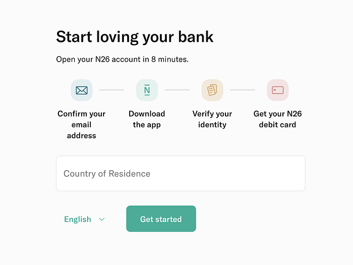
In this post, I’ll focus on the online bank N26’s signup flow. By splitting each step of the signup into one dedicated screen, they make opening a bank account seem like a piece of cake!
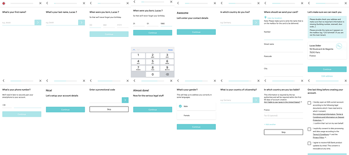
It’s even advertised as “Open your N26 account in 8 minutes” on their website.
Of course, making a complex flow user-friendly isn’t just about cutting it into a “one screen, one action” experience. There are other principles that need to be taken into consideration — that will be for another post!
Limited Choice
“We’re more likely to make a choice when there are fewer options.”
Some recent businesses have built their entire value proposition around simplifying the number of available options in their offerings.
For instance, the car rental service Virtuo built itself around offering only a handful of premium cars at each location.
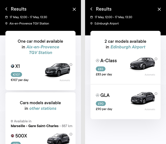
When you only have limited choices, you’re more likely to make a decision.
The same goes for the French health insurance Alan, who took a complete opposite approach vs. traditional health insurances, where the pricing model is usually very obscure and complex. With Alan, there’s only one offer, and it’s only calculated based on your age. This philosophy — simplicity— is one of the things than Alan’s customers love about their product.
Reputation
“We care more deeply about personal behaviors when they may affect how peers or the public perceive us.”
Reddit and StackOverflow are two examples of products heavily relying on reputation. Through what they post and comment, users will either earn reputation (through upvotes and badges/trophies/medals) or lose reputation (through downvotes).
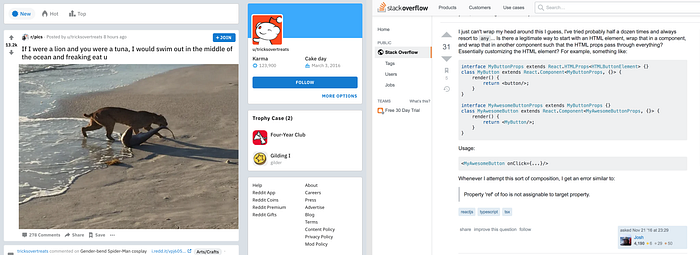
As a result, each and every user is pushed to not only post relevant content, but also be helpful to other users as well as to stay polite and constructive.
Authority
“We want to follow the lead and advice of a legitimate authority.”
Some products make money out of providing expertise to users in fields they aren’t very savvy.
For instance, AirHelp helps its customers claim compensations for their flight delays or cancellations. They know all the flight-related legislations around the world and will request as much money as they can for you with their lawyers. But how on earth would a you’ve never met in person be able to get money back for you?
AirHelp knows this concern; that’s why they add some elements justifying its authority on their request flow:
- The mention of the “EU regulation EC261”
- A human presence, “Jane — Your AirHelp Assistant”
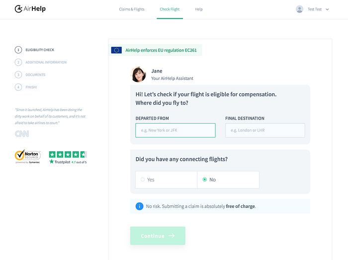
This human presence is something we can find in lots of products where users need guidance, especially banking, real estate and legal tech.
Limited Access
“We naturally desire things that are perceived as exclusive or belonging to a select few.”
I don’t need to remind you about all the hype that emerged around Inbox, the alternative e-mail app from Google, when it launched with limited access a few years ago. Everyone was fighting to get an invite.
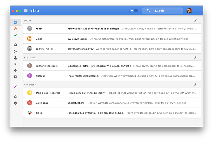
In the end, Inbox was a fail. It was shut down in 2019 by Google. Beyond bringing a few additional features to Gmail, it didn’t revolutionize email as it was initially intending to do. However, its product marketing was a success. Similar hypes can be currently observed around Superhuman and Clubhouse.
Another example of a product with limited access is Dribbble, the community for designers.
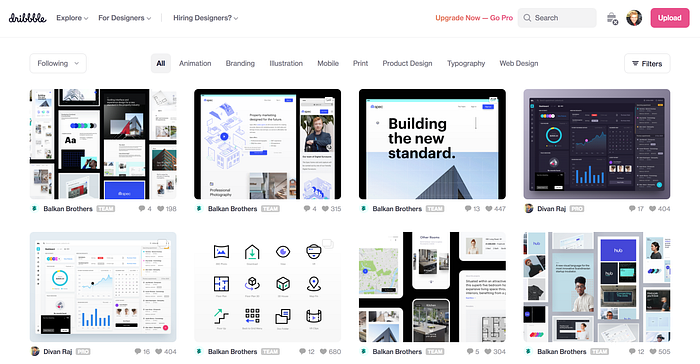
Anyone can browse content on Dribbble, but if you want to post your work publicly, you need to get an invitation from an existing member. This is not only a way to keep a certain level of quality on the platform, it’s also a way to make Dribbble desirable vs. other communities.
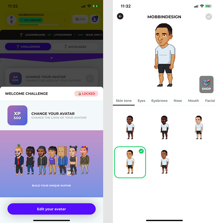
Self-Expression
People seek opportunities to express their personality, feelings or ideas.
This is a very powerful principle that works for all age groups.
A lot of apps that target teenagers almost always offer their users to customize their profile with a color, an avatar, cool accessories, etc. I’m thinking of Pokémon Go, Snap (with the Bitmoji) and more recently of Stadium Live.
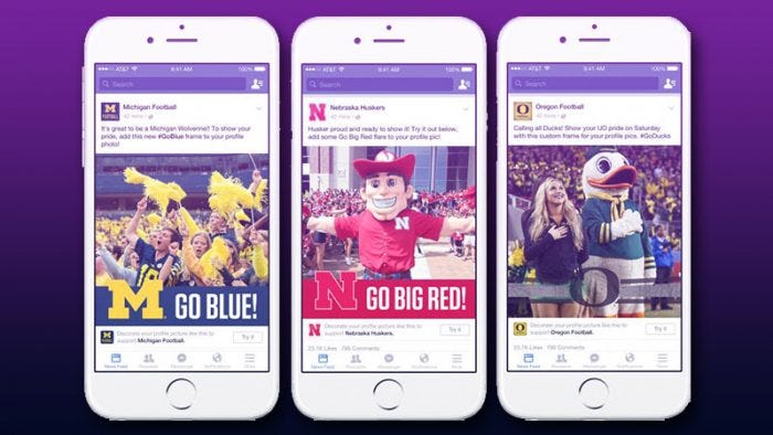
It’s also why Facebook created Frames, to enable its users to express themselves by adding profile frames to show that they’re supporting a sports team, a charity, or any other cause.
Other example in SaaS tools can also be found: Trello enables its users to change the background color/image, Slack provides lots of themes to customize its interface.
This self-expression principle builds a stronger connection between a product and its users.
Scarcity
“We infer value in something that has limited availability or is promoted as being scarce.”
The absolute specialist of this principle is Booking.com. When you browse hotels on their search results page, it’s not uncommon to find several visual clues indicating scarcity.
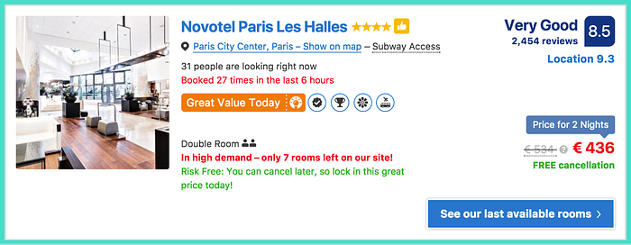
On this listing, the following information indicates that this hotel is about to be fully booked:
- “Booked 27 times in the last 6 hours” (but this is also following the Social proof principle)
- “In high demand — only 7 rooms left on our site!”
More generally, e-commerce websites use this technique a lot to drive impulse purchase and boost conversions.
Humor Effect
“Humorous items are more easily remembered — and enjoyed!.”
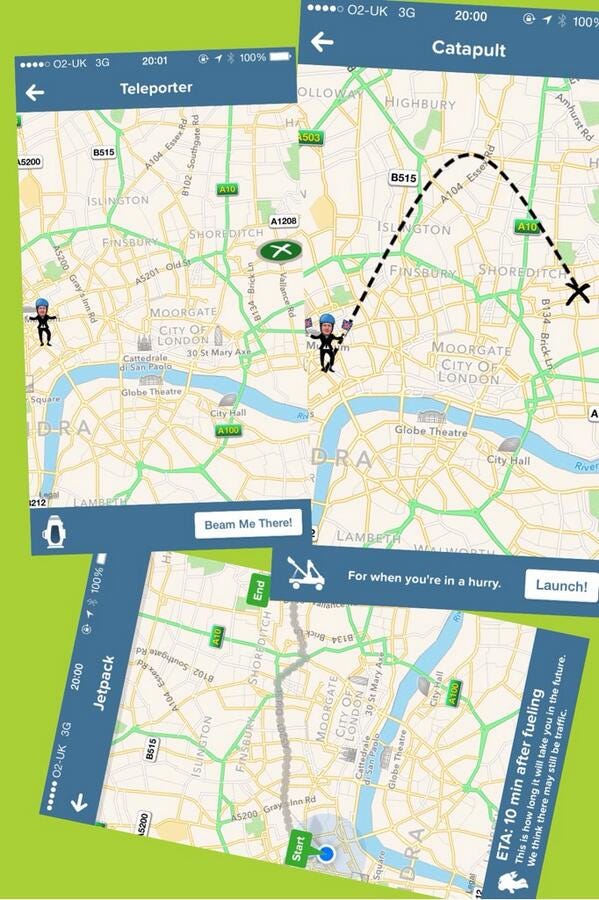
Citymapper is a city-based itinerary app, an alternative to Google Maps. It has gathered a big community of fans partly thanks to its humorous features and quirky wording.
For instance, when looking for an itinerary to go from A to B, you can sometimes use their “Teleporter”, “Catapult” or “Jetpack” features, where you see Boris Johnson travel from A to B in less than 5 seconds.
Citymapper is building its paid subscription partly upon this humorous approach.

One of the arguments they put forward for subscribing to their premium offer, the “Citymapper CLUB”, is that it’s supporting what they do — among others: “Staying weird, cause that’s important too”.
Variable Rewards
“Random rewards make powerful motivators; they seem scarce and unpredictable (and they’re less likely to conflict with intrinsic motivation).”
One of the things that has made Snapchat so exciting to its users is its “trophy case”.
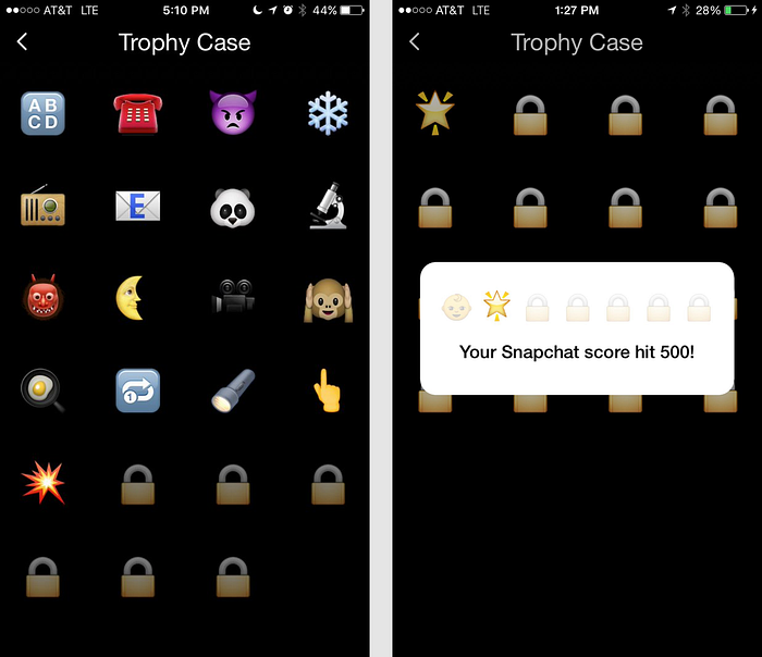
The trophy case gathers the rewards you’ve collected depending on your behavior. But it doesn’t tell you how to get a bigger trophy for a certain action. Nor, what are the other trophies to win. This is what makes them “variable rewards”. Snapchat uses these trophies to rewards unusual uses of their app, like “Sending a snap between 4 and 5 in the morning” or “Sending a snap with the temperature filter below freezing”.
Other apps, like Tinder, have placed variable rewards at the center of their differentiation strategy. On Tinder, you never know what you’re going to see next. It became an addictive app by implementing unpredictability at the core of its product.
More on variable rewards and gamification in general in this deck by Mozza: Mobile Gamification — How The Best Apps Nailed It (Waze, Duolingo, Tinder, Snapchat, LinkedIn, Zenly…)
I hope you enjoyed those examples! Feel free to share some of your own examples of psychological principles applied to product design.
If you want to learn more about Mental Notes, their card decks are unfortunately not available to order anymore, but I came across the Persuasive Patterns Poster by UI Patterns that should be similarly insightful.
If you liked this post and want to read more about the topic of psychology applied to product design, I would recommend you to check out Growth.design’s excellent page “The Psychology of Design”, where they have gathered an even longer list (101!) of cognitive biases and principles that affect UX.
Want to get more product tips? Sign up for my monthly newsletter to stay in touch! 👉 http://eepurl.com/gYTX2b
Need product/UX consulting on your own product? Check out my services! 👉 http://www.lucasdidier.com

