20 ideas for better data visualization
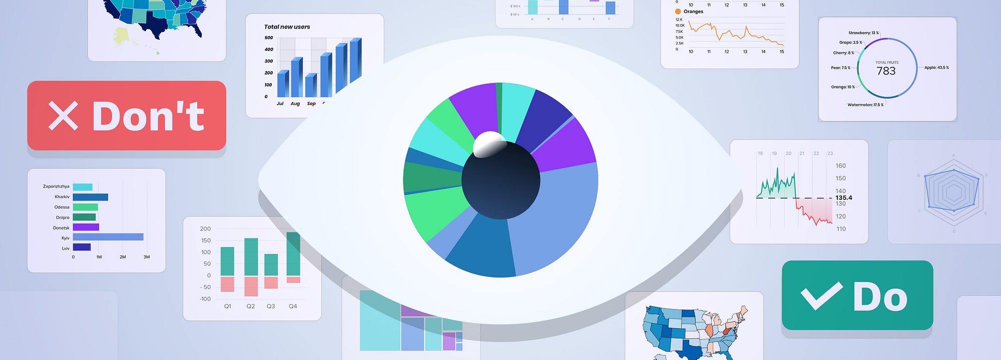
Applications we design are becoming increasingly data-driven. The need for quality data visualization is high as ever. Confusing and misleading graphics are all around us, but we can change this by following these simple rules.
1. Choose the right chart type
Choosing the wrong chart type, or defaulting to the most common type of data visualization could confuse users or lead to data misinterpretation. The same data set can be represented in many ways, depending on what users would like to see. Always start with a review of your data set and user interview.
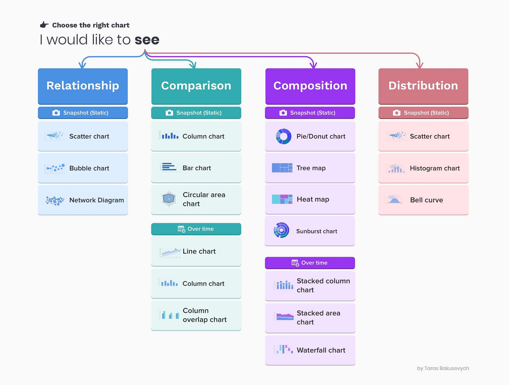
You can learn more on how to pick the right representation for your data, and how to design effective dashboards in my article about Dashboard design.
2. Use correct plotting directions based on the positive and negative values
When using horizontal bars, plot negatives values on the left side and positive on the right side of a baseline.
Do not plot negative and positive values on the same side of the baseline.
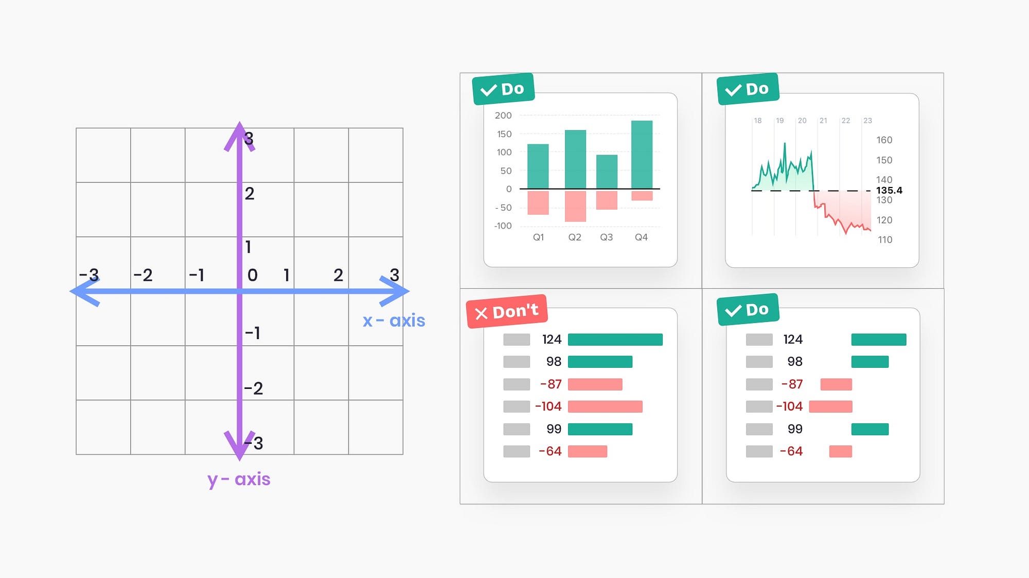
3. Always start a bar chart at 0 baseline
Truncation leads to misrepresentation. On the example below, looking at the chart on the left, you can quickly conclude that value B is more than 3 times greater than D when in reality the difference is far more marginal. Starting at zero baseline ensures that users get a much more accurate representation of data.

4. Use adaptive y-axis scale for line charts
For line charts always limiting the y-axis scale to start at zero may render the chart almost flat. As the main goal for a line chart is to represent the trend, it's important to adapt the scale based on the data set for a given period and keep the line occupying two-thirds of the y-axis range.

5. Consider your time series when using a line chart
The line chart is composed of “markers” that are connected by lines, often used to visualize a trend in data over intervals of time — a time series. This helps to illustrate how values change over time and works really well with short time intervals, but when data updates infrequently this may cause confusion.

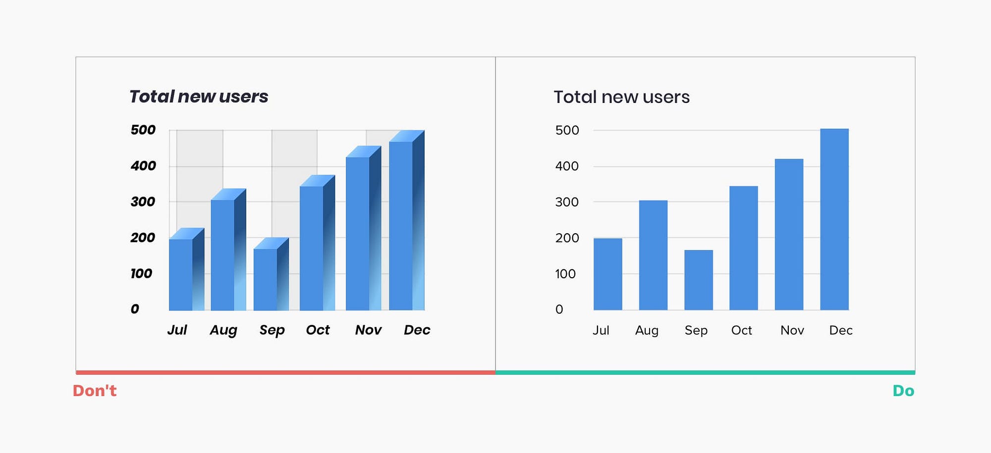
Ex. Using a line chart to represent yearly revenue, if values are updated monthly will open the chart to interpretation. Users may assume the lines connecting the “markers” are representing actual values when in reality true revenue numbers at that specific time are unknown.
In such scenarios using a vertical bar chart can be a better option.
6. Do not use “smoothed” line charts
Smoothed line charts may be visually pleasing but they misrepresent the actual data behind them, also excessively thick lines obscure the real “markers” positions.

7. Avoid confusing dual-axis
Often, to save space for your visualization, you may be inclined to use dual-axis charts when there are two data series with the same measure, but different magnitudes. Not only are those charts hard to read, but they also represent a comparison between 2 data series in completely misleading way. Most users will not pay close attention to the scales and just scan the chart, drawing wrong conclusions.

8. Limit the number of slices displayed in a pie chart
A pie chart is one of the most popular and often misused charts. In most cases, a bar chart is a much better option. But if you decided on a pie chart here are a few recommendations on how to make it work:
- Don’t include more than 5–7 slices, keep it simple
- You can group the extra smallest segments into the “Other” slice

9. Label directly on the chart
Without proper labeling, no matter how nice is your graph — it won’t make sense. Labeling directly on the chart is super helpful for all viewers. Consulting the legend requires time and mental energy to link the values and corresponding segments.

10. Don’t label on top of slices
Putting the values on top of slices may cause multiple problems, from readability issues to challenges with thin slices. Instead, add black labels with clear links to each segment.

11. Order pie slices for faster scanning
There are several ways commonly accepted in ordering pie slices:
- Put the largest slice at 12 o'clock position and put next slices in descending order clockwise
- Put the largest slice at 12 o’clock, second largest after it clockwise, third at 11 o'clock, and all remaining slices in descending order clockwise
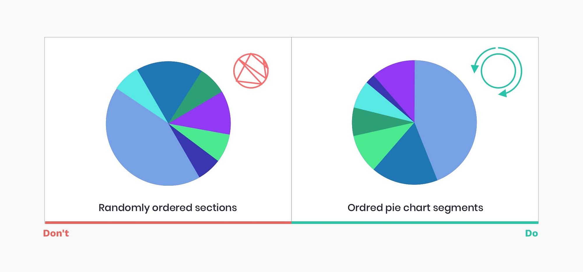
12. Avoid randomness
The same recommendation holds true for many other charts. Do not default to alphabetical sorting. Place the largest values on top (for horizontal bar charts) or left (for vertical bar charts) to ensure the most important values take the most prominent space, reducing the eye movements, and time required to read a chart.

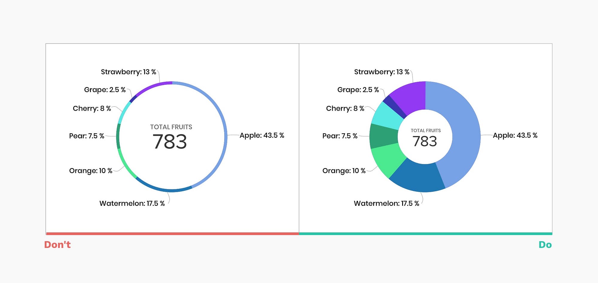
13. Thin donut charts are impossible to read
A pie chart in general is not the easiest chart to read, as it's very hard to compare similar values. When we take the middle out and create a donut chart, we free as space to display additional information but sacrifice clarity, taken to extremes it renders the chart useless.
14. Let data speak for itself
Unnecessary styling is not only distracting, it may cause misinterpretation of the data and users making false impressions. You should avoid:
- 3D elements, shading
- Shadows, gradients, and other color distortion
- Zebra patterns, excessive gridlines
- Highly decorative, italic, bold, or serif fonts
15. Pick a color palette that matches the nature of your data
Color is an integral part of effective data visualization, consider those 3 color palette types when designing:
A Qualitative color palette works best for the display of categorical variables. Colors assigned should be distinct to ensure accessibility.
A Sequential color palette works best for numeric variables that need to be placed in a specific order. Using hue or lightness or a combination of both, you create a continuous color set.
A Divergent color palette is a combination of two sequential palettes with a central value in the middle(usually zero). Often divergent color palettes will communicate positive and negative values. Make sure color also matches the notion of “negative” and “positive” performance.

Check out a handy tool — ColorBrewer that can help you generate various color palettes.
16. Design for accessibility
According to the National Eye Institute, about 1 in 12 humans are color blind. Your charts are only successful if they are accessible to a broad audience.
- Use different saturation and luminance in your color palette
- Print your data visualization in black and white to check the contrast and readability.

17. Focus on legibility
Make sure typography is communicating information and helping users focus on data, rather than distracting from it.
- Chose legible typefaces, avoid serif and highly decorative fonts
- Avoid italic, bold, and ALL CAPS
- Ensure high contrast with the background
- Do not rotate your text

18. Use a horizontal bar chart instead of rotating labels
This simple trick will ensure users will be able to scan the chart much more effectively, without straining their neck)

19. Choose your charting library
If your task is to add interactive charts to web and mobile projects, one of the first questions you should ask is what charting library will we use? Modern charting libraries have many of the previously mentioned interactions and rules baked in. Designing based on a defined library will ensure ease of implementation and will give you a ton of interaction ideas.

20. Go beyond static reports
Help users explore by changing parameters, visualization type, timeline. Draw conclusions to maximize value and insight. In the example below, you can see the IOS Health app using a combination of various kinds of data presentation to its benefit.

Reading suggestions
For all who would like to learn more about this topic, I highly recommend reading “The Wall Street Journal Guide to Information Graphics: The Dos and Don’ts of Presenting Data, Facts, and Figures” by Dona M. Wong. Many of the ideas in this article are inspired by this book.