Member-only story
2019 Design In Review
This year’s big scoop on everything you missed from logo redesigns, big design news, trends, and UI patterns.

2019 was a good one, and now it’s time to reflect on all the trends and highlights of the year. It’s important to keep yourself in the know of design trends so you can always be designing for the newest, most modern look. And in case you were MIA all year, don’t worry, I gotchu fam. For those who were active, we can reflect and wonder if your 2019 predictions were right, or just celebrate the ways design has moved us forward. Cheers friends.
We’ll start with big news, which touches on this year’s logo redesigns, products, and UI revamps, and then we’ll go to visual trends.
Notable Logo Redesign: Slack
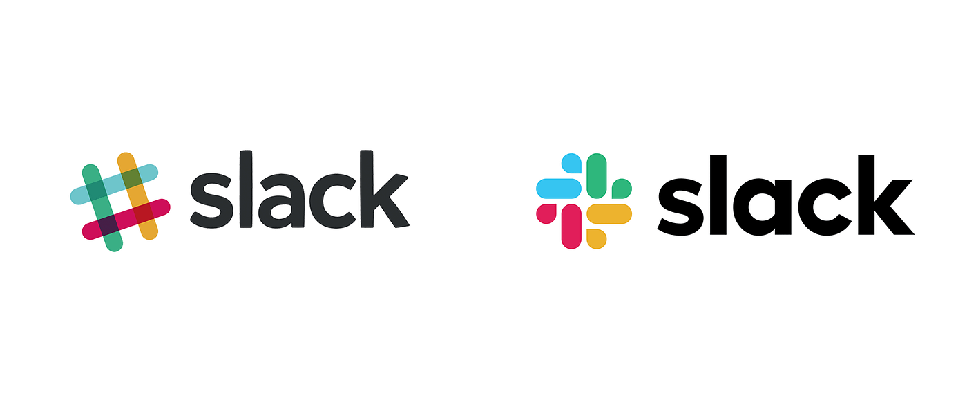
I’d say Slack got the most attention with their redesign this year, with Staples as a close second. In their brief, Slack made a good point that although the slanted hashtag was recognizable, it was dated and hard to use, because the overlay in opacity colors meant the logo had 11 colors. The multicolor overkill meant that it only looked good on a white background and…