Member-only story
22 rules for designing sign up & sign in journeys
Sign-in/up journeys have been there ever since the transactional ecommerce begin. But, after 20 years, we still tend to get that wrong. Most of the time, these are dictated by the platform of choice or the UX preference. Debates rage on, in the interweb, on whether a decision by an organization is correct, user friendly and complies with security practices.
The sign-in/sign up step is a big hurdle the user has to cross to enjoy the services you are offering. A bad SI/SU journey leads to large drop-offs and poor experience.
Today, we’ll try to put all those to rest and create a set of simple rules that should be used in your sign up/sign in journeys on all your products. We’ll start with the simple sign-up and complicate affairs when we reach the sign-in in the middle of another action.
Rules for Sign-Up (or registration)
Rule 1 — Ask for only the basic information you need to create the account
You only need a name, email and password to create an account. If you have a strong SMS marketing presence, a phone number would help — but don’t force it. You can get it later.
If your sign up form goes into more than 2 pages — you’re gonna have a huge drop off.
Rule 2 — Mark what is required and group it together
Every required field should be cleared marked. It doesn’t really help to use * to indicate required, but marking things as (optional) is better than to keep it unmarked. The order should be required items first, followed by optional items.
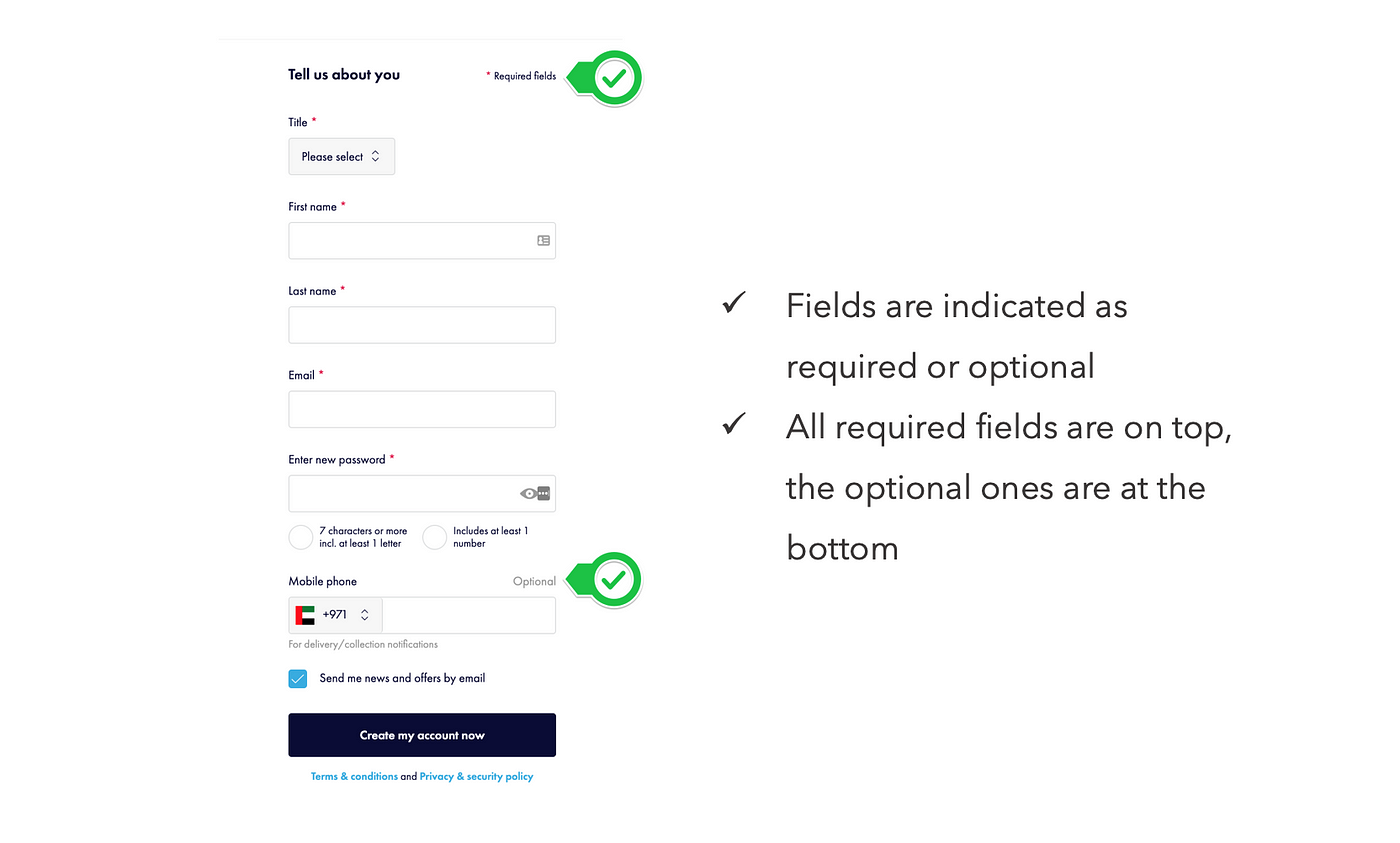
From an HTML standpoint, clearly indicate the field in the input (through the autocomplete standard — see here), to help the browsers autofill the information.
Rule 3 — Indicate password policy, but only stop the common ones
The rule should be to indicate the strength of the password, but if the password doesn’t fall into the common category, don’t stop the user from signing up. The rationale is simple — if they have to come up with a new password, they’ll most likely forget it and the next time they want…

![[How-to] Simple way of generating Wildcard/SAN SSL CSRs for Product Managers](https://miro.medium.com/v2/resize:fit:679/0*_2FD3MS9Bq5_lAHd.jpg)


