23 classic fonts for web designers
 As a web designer, you may have the freedom to deal with font design as other graphic designers, in fact in the field of web design, there is already a very large degree of freedom. This is also in terms of communication in English, based on the fact that it is only a constant combination of 26 letters, which greatly reduces the time for information processing.
This time I will introduce 23 English fonts that designers of Flying House often use when designing web pages. Each of the English fonts below is mostly a relatively complete “character family”, often with “regular”, “bold”, “light”, “thin” and other changes in thickness. These fonts can also be displayed directly as “text” on the web page, so they have good extensibility and freedom. Because not every font can be used on a web page, these sorts of work have been necessary for every web designer before.
In addition, I provide all the font source link under the descriptions of the photos.
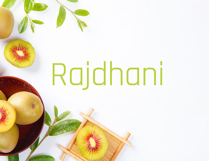
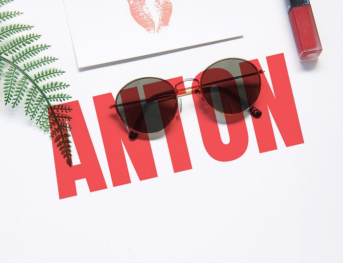
This font is a very standard and commonly used boldface, with a simple stroke design, and it is a very classic font.

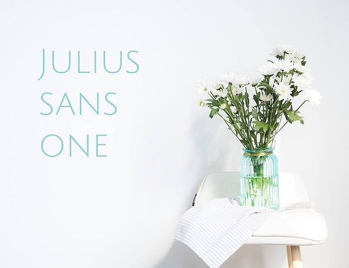
The characteristics of this font are similar to the “young round” body. In the structure of the font, the font is relatively large, the suffix is rounded, and it looks soft and restrained.

Andrew Paglinawan
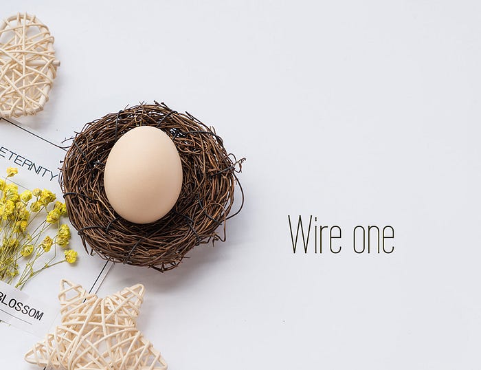
It has the same character as the previous font, but the glyph is taller, thin and long, and the character cavity presents a special rounded rectangle.

It is also closer to the shape of the Dosis, especially the prominent features of the cavity. It seems to see the parallel arrangement of many invisible rounded rectangles, which look neat and regular. The suffix is a regular rectangle, which is different from the stroke shape at the end of an arc.
The boldness of this font is very powerful, also because its font is relatively square and has a certain sense of rhythm. The stroke design is very simple and sharp.

This font is similar to the ROBOTO font, but the character width of the capital letters is narrower, the curvature of the spine is smaller, and it is relatively low-key, which is very suitable for minimalist style web page display.
The shape of this font can be inferred from its name. It is a linear font with a high font height and a small width, showing a compact vertical shape. This typeface character is very obvious, and it will be quite suitable for use in web pages designed based on linearity.
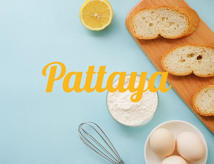
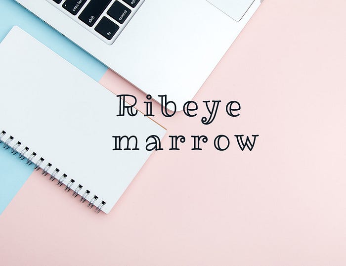
This font has the comprehensive characteristics of serif and handwriting, and smooth strokes can be connected between the letters, the cavity is small, and the overall sense of the glyph is strong.
This font is also “heavyweight” in the boldface, with a vertical structure and simple and powerful strokes, which is very eye-catching.
The stroke feature of this font is that the strokes in the horizontal part are very thin, and the strokes in the vertical part are very thick, forming a visual contrast between them, thus enhancing the appeal of the font itself. The dots of the letters or the ears are designed as dots, which adds a sense of pattern. It can be said that this font is very suitable for display in the fashion industry.

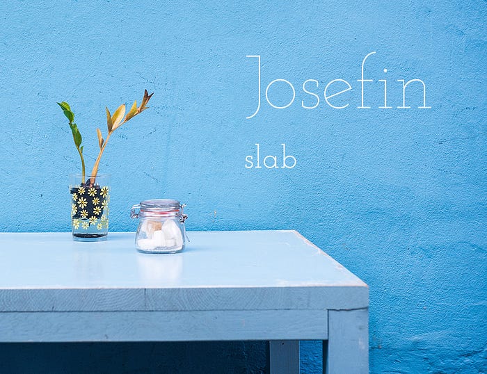
This font is also a relatively thin line design, it belongs to the scope of serifs, Josefin also has a sans serif, the font name is Jossefin, its design feature is the letter, such as the horizontal line of “e” The oblique angle is adopted, which increases the static and dull feeling of the font itself due to the uniform thickness and adds a sense of dynamics.
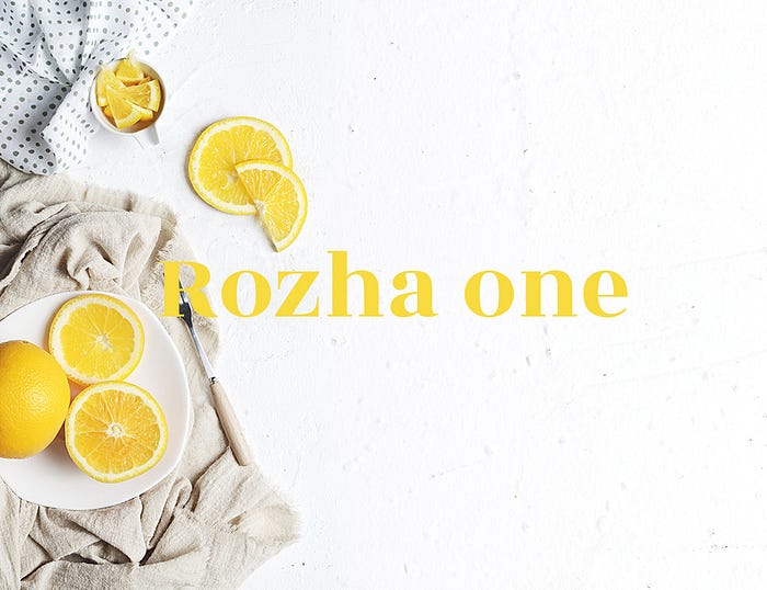
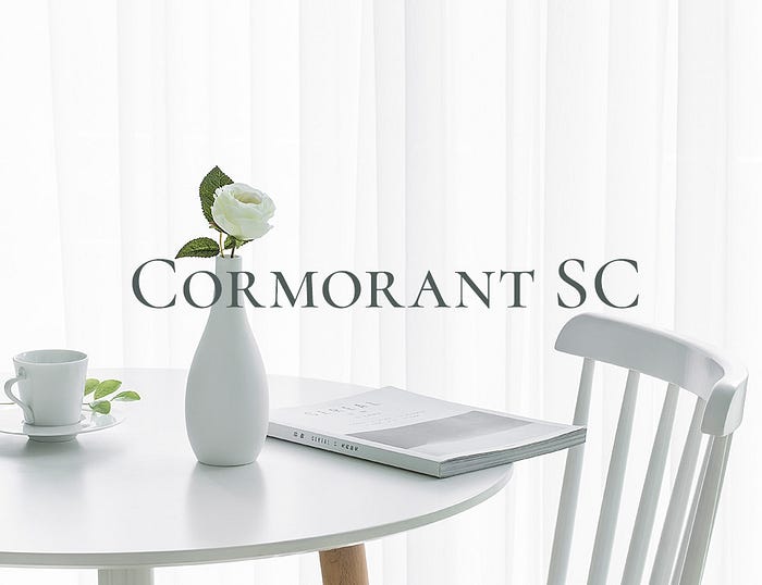
This font is also a very standard serif, the suffix design is a tightened cone, and the horizontal and vertical thickness is quite different. It has the volume of the black body and the elegance of the serif body.
This font is relatively classical, and the suffix has the characteristics of the era of stone inscriptions. Such a font has a sense of history and seriousness.

This font is also a serif, with a sense of volume, a thicker spine, and a strong sense of overall stroke shape.

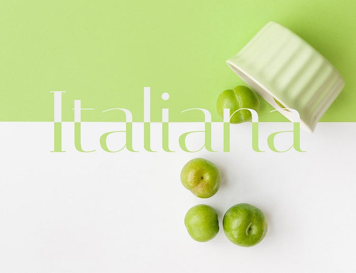
This Italian-style font has a constricted slanting tapered suffix, which has obvious sharp lines. It has an Italian-style classical romance, but also a simple and neat modern style.
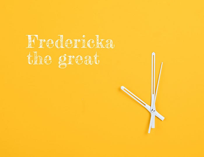
It is similar to the inscriptions on the tablet, with long serifs and very solemn and elegant shapes. Used when the content of the display tends to be classical.
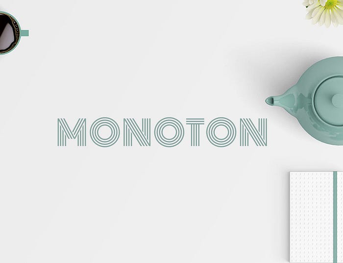
The stroke characteristics of parallel lines are very obvious in style. When displaying content with a similar line style, it is also used at the same time, which is full of unique charm.
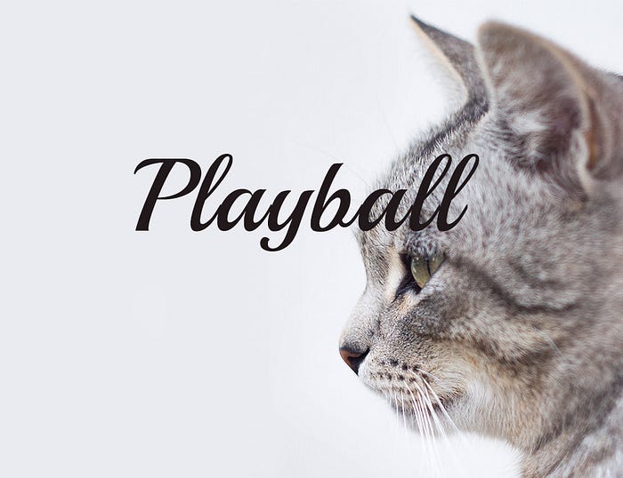
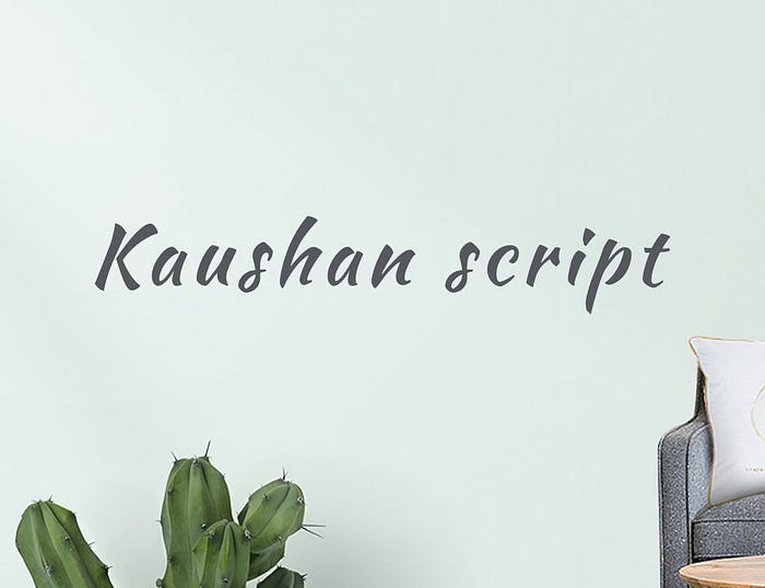
A model of handwriting, with some characteristics of swashes, but not obvious. The personalized style will often be equipped with handwriting.
The chalk writing style on the blackboard forms a unique sentiment in various college styles. If matched with similar chalk-like graffiti, the effect will be better.
The serif font features are not very obvious, and the serifs are arranged very low key. The line thickness of the strokes is uniform, and the design of the W letter is a superposition of double V, which can be used to good advantage.

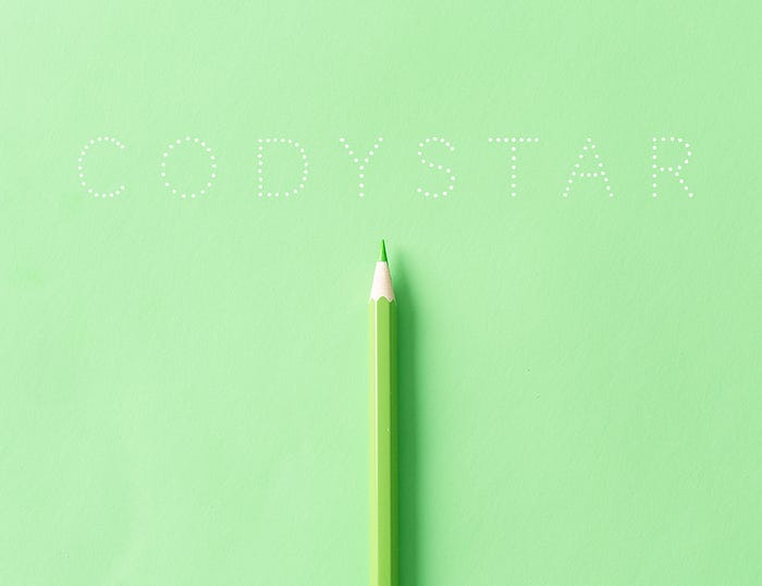
The stylized font with a combination of dots is weak, and the font is more decorative. The cuteness of the dots will be enhanced in the same style of design.
Cute children’s hand-drawn fonts, double-stroke vertical stroke design. The style is special, and it is generally used on occasions with a childish style.
Another expression of hand-drawn fonts, the letters are independent of each other, the font will be more modern. The style is refreshing, neat, and highly personalized, expressing a certain sense of freedom.
Proper use of fonts will bring different visual charm to your design. When using these fonts, you should also consider the overall collocation with the layout and other fonts. At the same time, you must also pay attention to the kerning and thickness of the font. After this study, everyone can realize that fonts are not as simple as words, especially in graphic design. It is also a graphic design element and a carrier of information transmission. Therefore, how to reconcile it, we will continue to discuss this topic with you in the future.

