3 colors for financial applications

“Colors are the mother tongue of the subconscious.”
Carl Jung, a Swiss psychiatrist and psychoanalyst, is quoted to have said this. Jung is most prominently associated with the pioneering stages of color psychology, which has since been used for marketing, design and more. I want to share with you what I believe to the three most important colors and three important lessons to bear in mind while designing financial applications for users.
Blue 🟦
Imagine that you have $10,000 to deposit. You have a choice between two banks, the Blue Bank and the Brown Bank as shown here.

Assume that there is no difference at all between the two banks, save for their logos. Use a card or just your palm to hide one logo and look at the other, one by one. Now close your eyes and decide. Which one will you bank with?
If you are like most people, you might be, ever so slightly, more inclined towards the Blue Bank. Why?
YouGov, a British international Internet-based market research and data analytics firm, conducted a survey in 10 countries across four continents in 2015. They asked one question, “Which one of the colors listed below do you like the most?” and listed 11 options, pink, red, green, blue, orange, purple, black, yellow, white, brown and none of these. Guess, which was the most popular choice? You are right. It was blue. This was true across all countries, including the red communist China. Do you wonder which was the least popular color? It was brown across most countries. However, not across all. For instance, in Indonesia, brown was the third most popular color after blue and red. So, what does it have to do with you (perhaps) choosing Blue Bank over Brown Bank?
(Please check out https://today.yougov.com/topics/international/articles-reports/2015/05/12/why-blue-worlds-favorite-color for details on this survey.)
Since blue is favored by so most people, it is often viewed as a non-threatening color that can seem conservative and traditional. In other words, it evokes trust. Trust is one of the most important qualities that a bank, an insurance company or a financial services firm can hope to establish with their customers. Oliver Wendell Holmes Sr., an American physician, poet, and polymath, has said —
Put not your trust in money, but put your money in trust.
The point is not the color blue. The point is the feeling of trust. Keep this lesson in mind while designing and building financial applications.
Lesson 1 — Build for trust. Not just in form, but also in content.
Design your application for security and reliability to earn and keep the user’s trust.
Green 🟩
What is common to the following three books?
- “Think and Grow Rich” by O. Napolean Hill,
- “Rich Dad, Poor Dad” by Robert T. Kiyosaki, and
- “The Richest Man in Babylon” by George S. Clason.
There are a few things common among them. One of them is that they are some of the best selling non-fiction books of all time, each having sold millions of copies. Two is that they provide financial advice and lessons on living a rich life. Here is a quote from each book.
“Whatever the mind can conceive and believe, it can achieve.” — Napolean Hill
“When you are young, work to learn, not to earn.” — Robert Kiyosaki
“The first copper you save is the seed from which your tree of wealth shall grow.” — George Clason
Do see a pattern? It may not be obvious at first, but it is there. Not only in these three books, but in fact in almost all good books on getting richer and living a richer life. They talk about one thing. Of course, they talk about money. More importantly, they speak of growth.
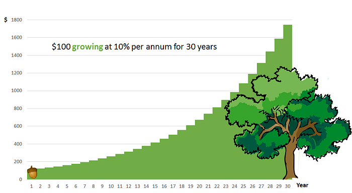
When people think about money, they want security, but they also want growth. In fact, many times the concern for growth overtakes the concern for security. So much so that, lots of people were ready to invest huge sums in tulips in 17th century Netherlands, in emus in 1990's America and are still ready to invest in bitcoins today all over the world. They want to see their money growing like an acorn planted and tended well grows into a mighty oak tree. Green stands for growth.
The point is again to not only think about the color green, but to go beyond it towards the feeling of growth.
Lesson 2— Assist in growth. Both in quantity, as well as in quality.
Design your application to offer the user choices, which nudge them towards growth.
Red 🟥
Why do you earn money? Why do you save some of it? Why do you invest some of it?
We can find clues to the answer by simply looking up the definition of money.
Definition of money
1: something generally accepted as a medium of exchange, a measure of value, or a means of payment.
So, money is simply a medium of exchange. In other words, only a means towards an end. So, the next question is, “What are the ends?” We can find this out by asking people, “What do you need to buy with money? What do you want to buy with money?” Both needs and wants are desires that people have. Each of us each is riding a streetcar named desire. Red stands for desires.
What are your desires? Is it to buy a house? Is it to get your children quality education? Is it to travel the world? Is it to save and invest for a comfortable retirement life? Your desires could be others. Many, more.

The point is to think about your users’ desires. What are the features and functionality that you are going to build to understand their desires and cater to them?
Lesson 3— Cater to desires, including both the needs and the wants.
Design your application to meet the user’s desires, which are the ends which they wish to attain through the means.
Do you know what can we get by mixing different combinations of blue, green and red? A world of infinite possibilities!