Member-only story
3 reasons why we shouldn’t be calling user-unfriendly practices “dark patterns”
Have you ever heard of “dark equations”?
User experience design, or UXD, refers to the creation of user-friendly, user-empowering, and user-pleasing interactions with products. The word “user” really is the focus here. We should design for accessibility, for people of all backgrounds, and should ask real people to test our product before we put it out in the world to ensure the quality and efficacy of our design.
Since many similar design problems are often found in several projects, repeatable solutions — or UX patterns — were born. For example, if you need to break up a single website into different sections or pages, you may use a navigation bar across the top of the page. If your app has properties that can be changed or customised, maybe you should add a settings page. These are commonly used solutions used for specific problems that have been proven to work and, for familiarity purposes, should be used across projects. This way, we reduce user frustration and our solution’s learning curve, since we’re using a pattern that everyone can quickly recognise.
An example of a UX pattern is the existence of buttons with different weights: primary, secondary, and tertiary. The primary buttons should be more eye-catching than the others and represent the main action that the user should do. There are many examples of this across websites, programs, and apps.
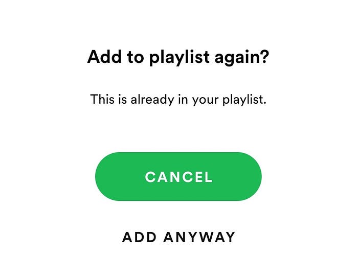
Notice this example, by Spotify:

Think for a second: if you’re adding a song to a playlist, and you have to choose which should be your primary button, should it be “add” or “cancel”? It may seem counter-intuitive, but in this case, it should be cancel.
This is because this option only appears if that song already exists in the playlist. And when that happens, the user probably doesn’t want to duplicate a song. Since primary buttons are what most people will click (especially when they don’t read the message), Spotify is actually helping the user when it uses the primary button for this action: it’s helping them avoid…


