3 tips to create a responsive app with Material Design
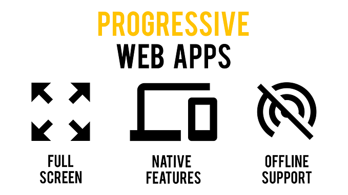
Today the need for apps that gracefully scale from desktop to mobile and everything in between is greater than ever and, at least in my opinion, this is due to the growing interest of developers towards progressive web apps and porting Android apps to Chrome OS.

However, this interest doesn’t always translate to good experiences, with many developer choosing to design two different UIs and often offering a stripped down app on mobile. Because of this, I chose to share three tips I learned while developing Igloo Aurora on how to create a great responsive experience with the building blocks of Google’s Material Design.
Navigation
On large screens
If your app allows to move between views at the same level of hierarchy, I suggest to try and use tabs on large screen devices. I favor this approach because it clearly states what the app’s hierarchy is: the tabs are closer to the top than the views they contain and are thus more important.
On small screens
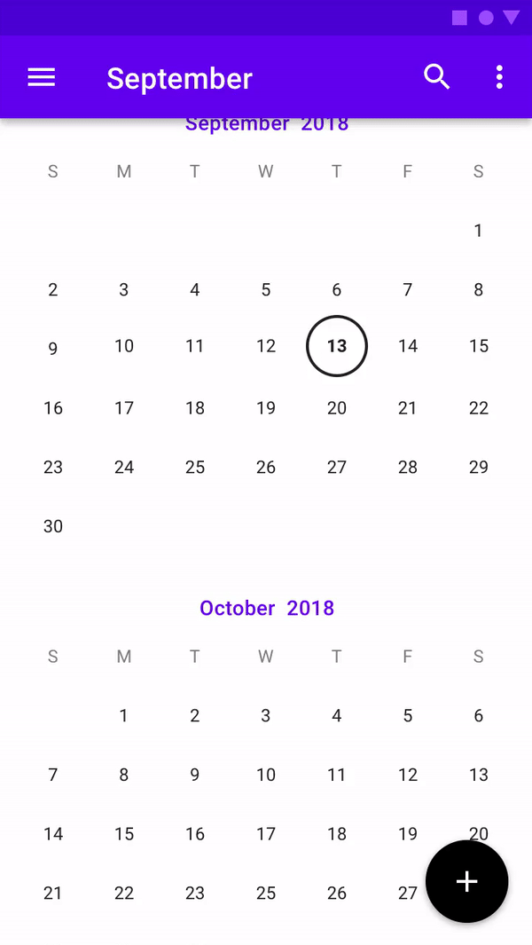
On smaller screens I’d suggest you prioritize reachability over a clear hierarchy by choosing to handle navigation through the bottom navigation component. Although it may seem counter-intuitive to have tabs on the bottom of the screen, it vastly improves the ease of access, since it requires less movement of the user’s thumb to reach it, in particular on 18:9 displays (if you want to read more about optimizing your user experience for these kinds of displays check out this article of mine).
One more thing
It’s frequent to see apps handling navigation through an hamburger menu but I’d advise against this approach because on larger screens it hides all the destinations until the user clicks on it while on smaller screen its being located in the top-left corner of the device makes it extremely difficult to reach while using the device with one hand.

Dialogs
On large screens
In many of your apps you’ll have to display elements that don’t fit well in the main interface but, at the same time, they don’t deserve their own page (e.g. the app’s settings). In these cases dialogs come in handy because they allow you to show these elements without cluttering the main interface and without forcing you to add an entire new page to your app.
On small screens
The solution to the abovementioned problem on small screens is, once more, to use dialogs, but in a slightly modified form: I’m talking about full-screen dialogs.
This peculiar type of dialog fills the entire view (as you may have guessed from their name) and it’s great on mobile devices because its slide-in animation highlights the fact that it is a temporary element of the UI and is thus not replacing the main page but rather just covering it.
Floating action buttons
If you ever worked with Material Design, you’re probably familiar with the floating action button, the most iconic component of Google’s design language. If you’re not here’s a quick recap: the floating action button (often referred to as FAB) is a circular buttons which hovers another part of the interface (usually a list) and allows the user to perform the main action linked to that part of the interface.
On large screens
Up until recently just one type of FAB was available, but in May 2018 Google introduced another variant: the extended floating action button: a wider FAB with a label describing its function. The extended floating action button (or eFAB) is a great alternative to the standard one on large screen devices because it clearly states what the button’s function is, something icons alone aren’t always able to do.
On small screens
On small screens I prefer the traditional floating action button, since it is much more compact than the extended one but at the same time it doesn’t sacrifice visibility. However, if you fear the icon you chose isn’t clear and needs a label, you can display by default an extended FAB and make it morph into a classic one as soon as the user starts scrolling, as detailed in the Google specification.

Conclusion
As you may have noticed, taking the right steps to make your application more suitable to each form factor isn’t that difficult and it can greatly benefit your app’s usability. For these reasons, I really hope that more developers start paying more attention to these details while developing new apps and that you’ll do it too.


