Member-only story
3 ways to improve your visual design skills
Quick tips for visual design newbies

I’ve noticed a trend after screening dozens of junior designer portfolios. Designers (mostly from bootcamps) were heavily focused on UX and evangelizing the Design Thinking mindset popularized by consultancies like IDEO. What lacked was the ability to breath life into designs, and portfolios fell flat in showcasing visual design fundamentals taught in art school.
As of April 2017, a quick search on Glassdoor reveals that companies are hiring more Product Designers capable of end-to-end design.

I started off my career as a graphic designer and through trial and error, learned the art of layout and composition. Reflecting upon my journey, I’ve come a long way since my first school project:

Luckily visual design skills can be learned over time! Here’s one of my recent projects:

Today I’ll share 3 tips to improve your visual design skills.
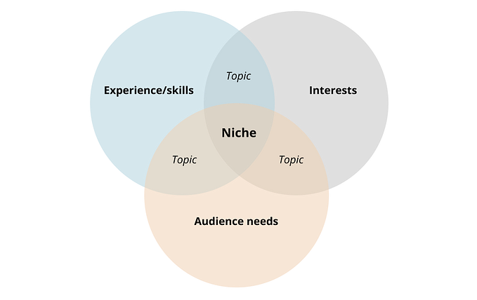
1 — Establish visual hierarchy
Visual hierarchy is organizing information by order of relative importance, and its established by arranging components (typography, lines, shapes, images, color, and space) on a layout. Designs with strong visual hierarchy and composition will communicate a message by seamlessly guiding your eyes. For example, let’s look at how Airbnb arranges components on their website:

Where do your eyes look first and in what order? If you’re not sure, try converting the page to black and white. Notice how your eyes are drawn to larger and darker (more saturated) components.