4 tips for nailing the details in mobile icon design

I recently had the opportunity to work for Collective Health in San Francisco, as both a design intern and a contractor. As a member of the Design Systems team, I worked a lot with mobile app icons and learned about what goes into a high-quality, production-ready icon set.
Icons for mobile apps have their own set of challenges, because you’re working with a lot less space and resolution than on a desktop. Here are four tricks I learned that helped me get them right:
1. Optically matching gray values
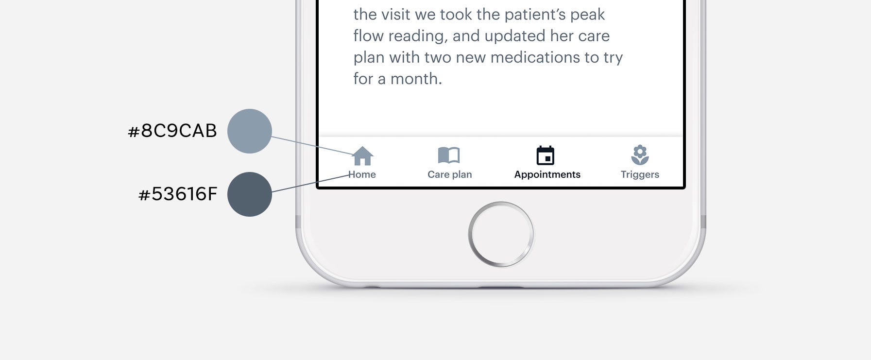
A term borrowed from Tal Benisty: Gray value is the perceived intensity of a particular color on a display, especially in relation to the intensity of the colors around it. Icons rarely exist on their own, and so it’s crucial that you consider how they interact with other elements like text.
For example: if you’re trying to pair an icon with text, matching their gray values is important for creating visual harmony. In general, thinner shapes will appear lighter, while thicker shapes will appear darker. Since text is typically thinner than an icon, its gray value will need to be a few shades darker so that they optically match.
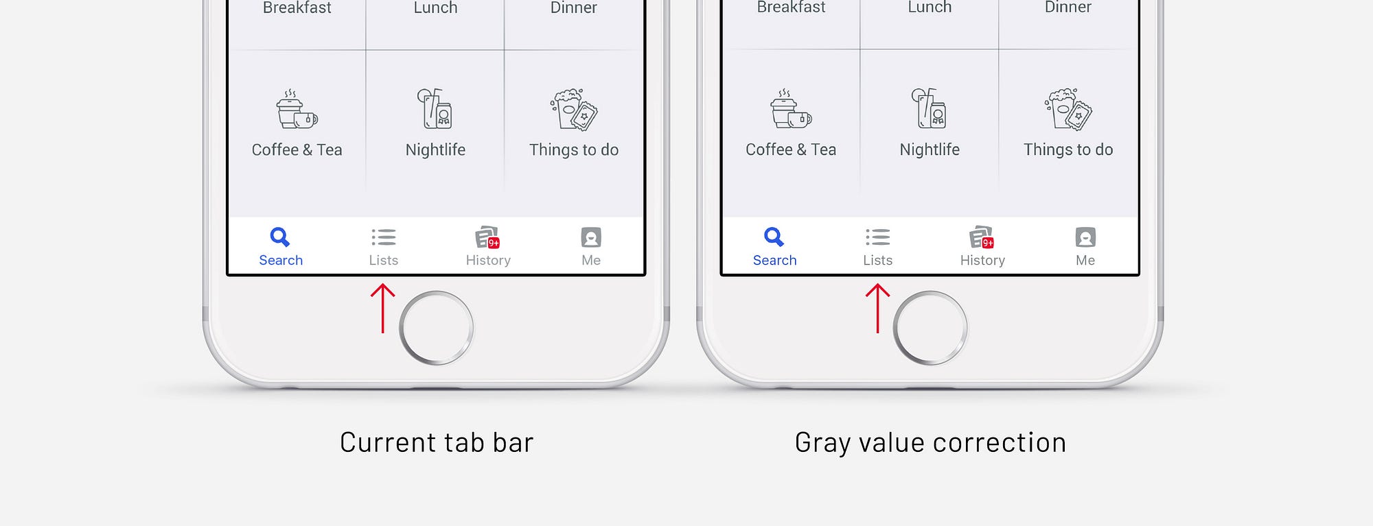
Above is Foursquare’s bottom tab bar, where the label color is the same as the icon–this gives it the appearance of being lighter. On the right-hand screen is a version where I decreased the text brightness with the HSB sliders (yes, it’s very subtle).
Gray value can be applied to any color, not just grayscale values. All that matters here is that if you’re trying to get two elements of different sizes to look like they’re the same color, you’ll probably have to slightly alter the hex values until they optically match.
2. Don’t assume your normal icons will cut it on mobile

At Collective Health, we realized that the normal 32px icons just weren’t cutting it when placed into the mobile app. They looked huge.
We couldn’t take the original 32px icons and scale them down–they just weren’t designed with a smaller scale in mind. I reduced the complexity of many of the icons and made sure they were cohesive with the rest of the mobile app design.
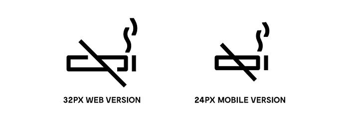
If your icons don’t scale well to mobile, another solution is to change the icon itself instead of making a mobile-only version (this is probably the better solution–simplify where possible!)
3. Pixel fitting
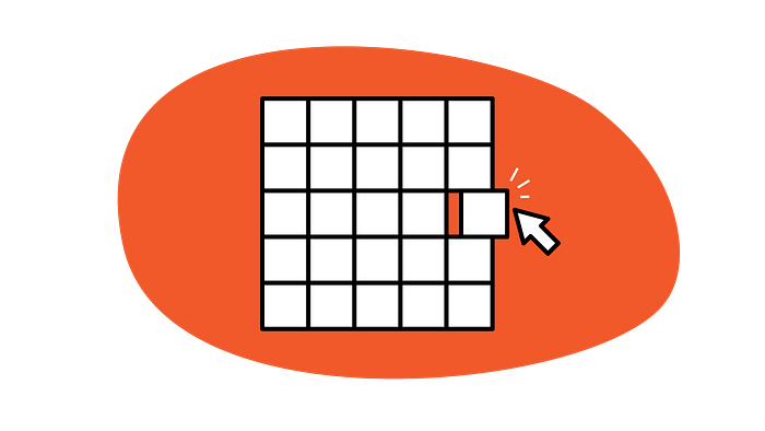
A well-crafted icon is pixel-fitted — meaning that the straight edges of the vector shape fall directly onto the pixel grid. This is especially important for mobile devices, which have lower resolutions than the Retina-screen Macbook you’re probably designing the icons on.
At Collective Health, icons use a line width of 1.5px, so not every edge can fall onto the grid. Take a look at this icon:

The guides show where edges hit the pixel grid. Not all edges can be perfectly aligned, and that’s ok. Where possible, try to align the outer edges of the icon to the grid, it’ll minimize blurriness.
Check out this article by Dustin Curtis for a great primer on pixel-fitting.
4. Mirror your design

Mirror your icon designs on a phone while you’re making them. I was able to correct countless mistakes by watching how my edits on Sketch affected the icon on a mobile display in real-time. This is also good practice for any mobile app design; you’ll catch the errors you wouldn’t see if you only designed on the desktop display.
You can use Sketch Mirror for iOS, or Crystal for Android.
—
That’s it! If you found this article useful, please consider giving a few 👏👏👏!