5 features that would make TikTok better
Design-driven enhancements from a UX Designer.
I promised myself I wouldn’t download TikTok.
Not because I thought I was too cool for the app, or even too old (although admittedly, 15-year-olds performing the ‘Renegade’ dance will instantly make you question that). It was because I knew if I made an account… I’d get addicted, and to quote the forever-memed Kimberly ‘Sweet Brown’ Wilkins, “Ain’t nobody got time for that.”
But then a global pandemic happened…and suddenly I had time for that.
The world came to an abrupt halt, and the little voice in my head convincingly sugar-coated the argument that ‘I wouldn’t be downloading the app as a consumer, but instead as a product designer deeply intrigued with analyzing the intricacies of the app’s user experience.’ Wow.
I mean, it’s true. I am a UX designer by profession. But deep down I knew I would have made up any excuse to justify joining this year’s biggest trend.
And here I am. Now, three months later, I’ve swiped through an embarrassing amount of TikToks, and shared more videos with my friends than my mom does on WhatsApp. I even mustered up the courage to create a few TikToks myself.
And I was right. There’s a reason the app is so addicting: it’s so much fun to use. But the voice in my head was right too: I found myself becoming increasingly fascinated with the subtle elements that made TikTok such a hit.
So, in an attempt to transmute the countless hours I’ve spent on TikTok into something constructive, I challenged myself with the task of coming up with ways to improve the app’s already delightful experience, hoping to sharpen my rapid-prototyping and problem-solving skills in the process.
What resulted was a list of 5 features that I believe would enhance the app’s user experience.
So what exactly are we trying to improve?
The features in this article focus on improving 3 important usability factors of the app:
- Readability — the legibility and ease with which the user can process content
- Customizability — the ability to personalize the experience and pass off larger control to the user
- Findability —the ease with which information contained on an application can be found

1) Full screen mode


Current issue: cluttered overlays on ‘For You’ page
One of TikTok’s greatest features is its ability to display full-screen videos that fill the entire length of one’s phone screen. An unfortunate consequence, however, is that it limits the real estate for a video’s essential elements, such as captions, hashtags, profile icons, likes, shares, etc.
TikTok accommodates for this by strategically overlaying its essential elements on top of videos and limiting its presence to the sides of the screen (particularly the right, bottom, and top). And while this leaves plenty of space in the middle of the screen, it can be problematic for videos that have vital information (like text and key visuals) that then becomes eclipsed by the overlays. Unfortunately, this is only revealed after the user uploads the video.

How might we improve video / text visibility?
Two fixes come to mind.
The first option is a preventative measure that hands control over to the creator. When a video is being created, an overlay could outline the restricted areas of the video. The problem with this solution is that different devices have different dimensions; hence, the restricted areas for each device would vary.
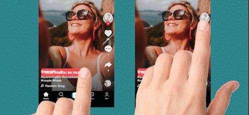
The second option is a feature that is given to the consumer instead of the video creator. With a simple slide-down gesture, the overlaid elements would glide down to reveal an expanded and unobstructed view, allowing the user to experience the video as it was meant to be experienced — in its entirety.
The ‘tap areas’ — sections where this slide down gesture would be accessible — would be located in two places: on the right edge of the screen (where the video’s likes, shares, and comments are located), and the other on the bottom edge (near the video’s caption and hashtags).
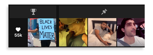
2) Pinned Videos


Current issue: chronologically ordering videos can misrepresent a profile’s content
Like Instagram, a user’s profile on TikTok displays posts neatly tiled in chronological order. But unlike Instagram, TikTok is exclusively a video platform and therefore does not give users the luxury of easily scrolling and scanning a profile’s content. With Instagram, image thumbnails are just cropped versions of the original, so scanning is easily attained. On the other hand, thumbnails for videos only offer one representative frame of what the video has to offer.
Because of this, users don’t scroll on a profile unless they’re VERY interested in the content or they’re searching for a specific video in particular. Outside of these two scenarios, older posts have a high likelihood of getting buried.
Therefore, with the current setting, a creator is as good as their most recent posts.
A first time viewer of a profile will usually click on the most recently uploaded videos to get an idea of what the creator has to offer. Often, this small sample size reflects poorly as a representation of the creator’s content.
How might we better represent a profile’s content?
Altering the order of the posts isn’t a solution. You always want your newest content to be visible above the fold. So how exactly do we accommodate for this?
Adding a section for pinned videos is one idea. In the solution presented in the mockup above, the creator can pin three videos of their choosing to the top of their profile. This would allow users to select videos that best exhibit their niche.
And why stop there? Let’s have some fun and gamify the experience by pinning the user’s top performing post as well. Unlike the 3 customizable ones, this one would populate automatically, showcasing the video with the most engagement (specifically likes). Using game elements like this would incentivize creators to keep creating in order to beat their own high score.
3) Entertainment vs Learn Filter


Current Issue: a randomized feed can leave users with conflicting types of content
If you ask anyone about what makes TikTok great, they’re likely to highlight the algorithm’s accuracy in feeding you content tailored to your interests.
Every like, comment, share, and even the duration of watch time is a data point collected by the app and used to customize your feed with similar content.
Here’s the problem though: your interests changes from time to time, often even within the same day. Sometimes you’re interested in aimlessly watching funny videos, and other times you’re interested in learning a new skill. Having these different types of videos show up in your feed in succession can be counter-productive. Let me explain.
Let’s say you’ve had a long day at work and want to relax. You start scrolling through TikTok, passively watching anything that will amuse you. The first few videos on your feed do exactly that, but then a video with a Photoshop tutorial pops up. On any other day a video about Photoshop would have grabbed your attention, but not today. Today you just want to relax. You’re not in the state of mind to actively learn something, so you immediately swipe up to the next video.
Unfortunately, since every decision on TikTok is documented with the aim to better understand your interests, you’ve now incorrectly voted against similar videos in the future, when in reality you just weren’t in the frame of mind to watch it at that time.
How might we improve content feed distribution?
The easiest way to solve this issue is to offer filters (not to be confused with the aesthetic overlays you use on selfies. I’m referring to the ones that are used to separate content into distinctive categories). The mockup above allows users to access the filters by holding down the ‘For You’ tab.
But what filters should we offer? To figure this out, let’s look at two user scenarios.
In the example above, you went on TikTok to laugh, be amused, and ultimately entertain yourself. What you didn’t want is something that required you to actively pay attention.
On the other hand, there are instances when you want to learn something new, and are therefore primed for a more active viewing experience. Here, that Photoshop tutorial that popped up in your feed would actually have been very interesting to you.
Ultimately, if we tailor our filters to the state-of-mind of the viewer, we can arrive at two basic categories: educational content and entertainment. Most videos can be placed in one of these two categories, and each category coincides with a different type of viewing experience. Typically, when you want to be entertained, you’re passively watching. When you want to learn, you’re actively paying attention.
4) Customizable folders for favorites


Current Issue: favorited videos are unorganized and difficult to navigate
Searching for something you favorited months ago can be a daunting task. Since TikTok displays your favorited videos in chronological order, you’d have to scroll through your list until you recognize the thumbnail to the video you’re in search of. If you’ve favorited many videos, the search can take a while.
Videos aren’t the only media you can favorite on TikTok. You can also save your favorite sounds as well. Searching through your favorite sounds can be an even more grueling task than searching for videos. The naming conventions of user-uploaded sounds aren’t always consistent, often making it difficult to scan through. Unless you know exactly what you’re looking for, you would have to click and play each sound in order to find your match.
How might we improve searchability for favorited content?
When it comes to making apps user friendly, conventions are incredibly useful. The concept of organizing content by incorporating customizable folders has already been mainstreamed so successfully, that it makes little sense to reinvent the wheel here.
Folders allow users to organize their favorited media based on customizable categories. Now you can separate your funny skits that you want to share with your friends from your dance tutorials that you want to practice by yourself.
Folders instantly allow users to find the content they’re in search of without digging through a long, daunting list of content.
5) Linking segmented videos together


Current Issue: videos with multiple parts require users to search through a creator’s profile to finish the series
TikTok users often find themselves coming across videos on their ‘For You’ feed that are part of a longer series (e.g.: “Top iPhone hacks you never knew, Part 9"). Curious to see the other segments, they’ll click on the creator’s profile, only to find that it’s often difficult to find the rest of the series.
This hassle that users face is actually a tactic often used by creators. In search of the other parts of a video series, users are forced to scrummage through a creator’s profile for a longer period of time, falsely indicating to the algorithm that they’re interested in the creator’s content.
But that’s not what TikTok wants. TikTok wants an organic experience that rewards creators for the value of their content, not their ability to cheat the system and annoy users in the process.
How might we improve the viewing experience for segmented videos
This all could have been averted if TikTok offered users the ability to link to other segments of a series.
In the proposed solution in the image above, the app uses the caption editing phase of uploading a video to offer the user the ability to link to another video. By typing the words “Part”, followed by the number within the series (for instance, an example caption would be, “Don’t forget to check out Part 1”), after the number is inputed, a overlay screen would slide up to display their posts from the past that the user could link to.
Once the video is selected, the “Part 1” text in this scenario would transform into a clickable element and styled similarly to tags, duets, and stitches in captions.
And there you have it! If you have any thoughts on the features listed above, please let me know in the comments below. Thank you for reading and have a wonderful day!
Hi I’m Arish. I write articles on all sorts of topics — from UX Design, self-help, to sports. Feel free to connect with me on Instagram, Twitter, LinkedIn, and my website. See you there!