Member-only story
5 “hacks” to drastically improve your designs
Small things that will have big impacts with minor effort

Perhaps you’re new to web design, or perhaps you have many years of experience but need to brush up. You might even have a development background but want to polish one of your projects a bit, or simply built your own WordPress site.
This guide is meant to give a few tips on how to prevent your site from looking like yet-another-website.
It’s easy to throw in the towel and go, “I simply don’t have the ability to make this look good. I’m not a damned designer!” but it turns out there are many tricks you can use to make a big impact that don’t require a design degree.
Here are 5 simple ideas you can use to improve your designs right away.
1. Spruce up (or down) your buttons!
When users are presented with multiple options it’s easy to simply design those actions based on whether their effect is a positive or negative action.

It’s a completely understandable & legitimate option. This is how we’ve designed traffic lights, warning labels, and even buttons on many of the physical tools we use every day.
One thing that isn’t happening in the above image is the importance, or hierarchy, of each element — they both look like they have the exact same priority, which is hardly ever the case.
If this were a purchasing funnel you would, of course, be more interested in having your users clicking continue, not cancel.
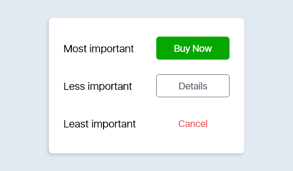
Every action on your site should be divided into a hierarchy of importance, and that hierarchy should then be visualized accordingly:

Sometimes a negative, or destructive/restrictive, button can also be at the top of your hierarchy of importance. In this case you would want to highlight that action and have the “non-negative” action as the…


