5 Navigation UX Tips to Improve the Usability of your Product & Applications
Have you ever encountered a situation, where you visit a website, spend some time on it and suddenly want to get to a particular page/ perform a task, but you are completely lost not knowing where to go? I have.

Navigation is a single most important aspect of any application or interfaces as there are many things associated to it like accessibility etc., The users must be easily able to navigate through, rather than getting lost in the numerous pages in the website, which happens most of the time. One might argue that there is “Search” to help you out but you cannot trust search alone each of the time as research shows that only 30% of the website users use the search function and the majority 70% rely on navigating directly. That is why Navigation menus have a high priority. After all, even the most creative or the coolest feature you build is useless if the user is unable to find it.
Now, what is a navigation menu?
Navigation menus are lists of content categories or features, which are typically presented as a set of links or icons grouped together with clear visual styling distinct from the rest of the website or page design. These mainly consist of navigation bars and hamburger menus typically but often not limited to them.
We find these menus almost everywhere but the challenge here is that often you find people finding a lot of difficulty in finding these and getting confused with menus.
After working on over 15 user-centered products and projects, I have found a few interesting findings and best practices to design user-friendly navigation menus: I broke them down into categories
Making them more visible to the end user
- Start Using Breadcrumbs. Breadcrumbs are a navigation aid to help orient people within a website. This kind of orientation is especially important if people are directed to deeper pages on the site from external sources.

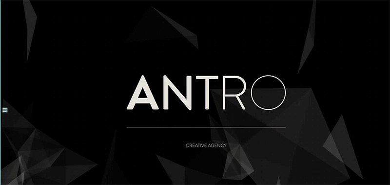
2. Avoid using tiny menus (or menu icons) on large screens. Menus shouldn’t be hidden when there is plenty of space to display the menus.
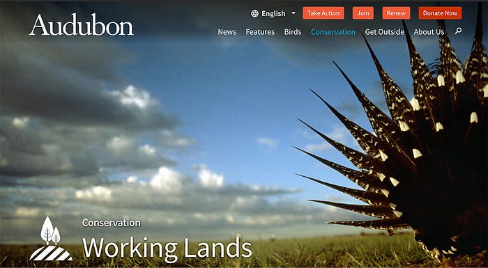
3. Always try to put menus in familiar locations. Most of the times users spend their time on other sites . So, Users expect to find UI elements where they’ve seen them before on other sites or apps (e.g., left rail, top of the screen). Make these expectations work in your favor by placing your menus where people expect to find them. (like shown below)
4. Make menu links look interactive. Users may not even realize that it’s a menu if the options don’t look clickable (or tappable). Menus may seem to be just decorative pictures or headings if you incorporate too many graphics, or adhere too strictly to principles of flat design.
5. Ensure that your menus have enough visual weight. In many cases menus that are placed in familiar locations don’t require much surrounding white space or color saturation in order to be noticeable. But if the design is cluttered, menus that lack visual emphasis can easily be lost in a sea of graphics, promotions, and headlines that compete for the viewer’s attention.
6. Use link text colors that contrast with the background color. It’s amazing how many designers ignore contrast guidelines; navigating through digital space is disorienting enough without having to squint at the screen just to read the menu.
Coordinate Menus with User Tasks
- Use understandable link labels. Figure out what users are looking for, and use category labels that are familiar and relevant. Menus are not the place to get cute with made-up words and internal jargon. Stick to terminology that clearly describes your content and features.
- Make link labels easy to scan. You can reduce the number of time users needs to spend reading menus by left-justifying vertical menus and by front-loading key terms.
- For large websites, use menus to let users preview lower-level content. If typical user journeys involve drilling down through several levels, mega-menus (or traditional drop-downs) can save users time by letting them skip a level (or two).
- Provide local navigation menus for closely related content. If people frequently want to compare related products or complete several tasks within a single section, make those nearby pages visible with a local navigation menu, rather than forcing people to ‘pogo stick’ up and down your hierarchy.
- Leverage visual communication. Images, graphics, or colors that help users understand the menu options can aid comprehension. But make sure the images support user tasks (or at least don’t make the tasks more difficult).
Unique Visual Design for Each Level
People should be able to quickly scan the navigation and understand which links are primary, secondary, and tertiary navigation items. The placement and grouping of the links should establish this hierarchy.
The visual design — such as font styles, font sizes, font weights, and/or font colors, etc. — should all establish the different navigation levels and should be consistent across the navigation. If secondary navigation is implemented, the design should also clearly differentiate between parent/child and sibling links and be cohesive with the primary navigation.
Use Location Indicators
Like with breadcrumbs, location indicators on the navigation help people orient themselves on the site, especially if they are deeper within the website. This clear visual indicator can indicate which section someone is in.
Different Navigation for Mobile vs. Desktop
In NNG’s Mobile, First is NOT Mobile Only, they recommend optimizing the navigation for each device. While it may seem like extra effort to design and develop separate designs for the devices, NNG explains that it’s a better user experience because “different devices have different capabilities of interaction and different screen sizes.”
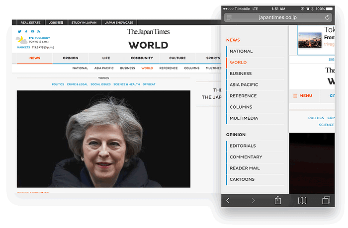
For example, on the desktop, The Japan Times navigation design utilizes the wider screen width and lists out the categories (secondary items) horizontally on a separate bar. On mobile, the same navigation uses the hamburger menu design pattern and when expanded, utilizes the longer vertical space of the phone and lists the secondary items beneath each section title, rather than splitting the primary and secondary levels across two bars. The design is not a direct translation — note how the blue lines are next to the secondary items instead of the primary items, which is an actually closer representation of the design on mobile. Still, there’s a cohesiveness between the two designs while optimizing for each view.
Hope you find the above-mentioned tips useful and good luck creating awesome navigation for your website. May the force be with you ;) Please clap and encourage.
To learn more about me, Visit www.vamsibatchu.com
Thank you for your time. Please clap and encourage me to write more.


