5 Design Principles for eHealth
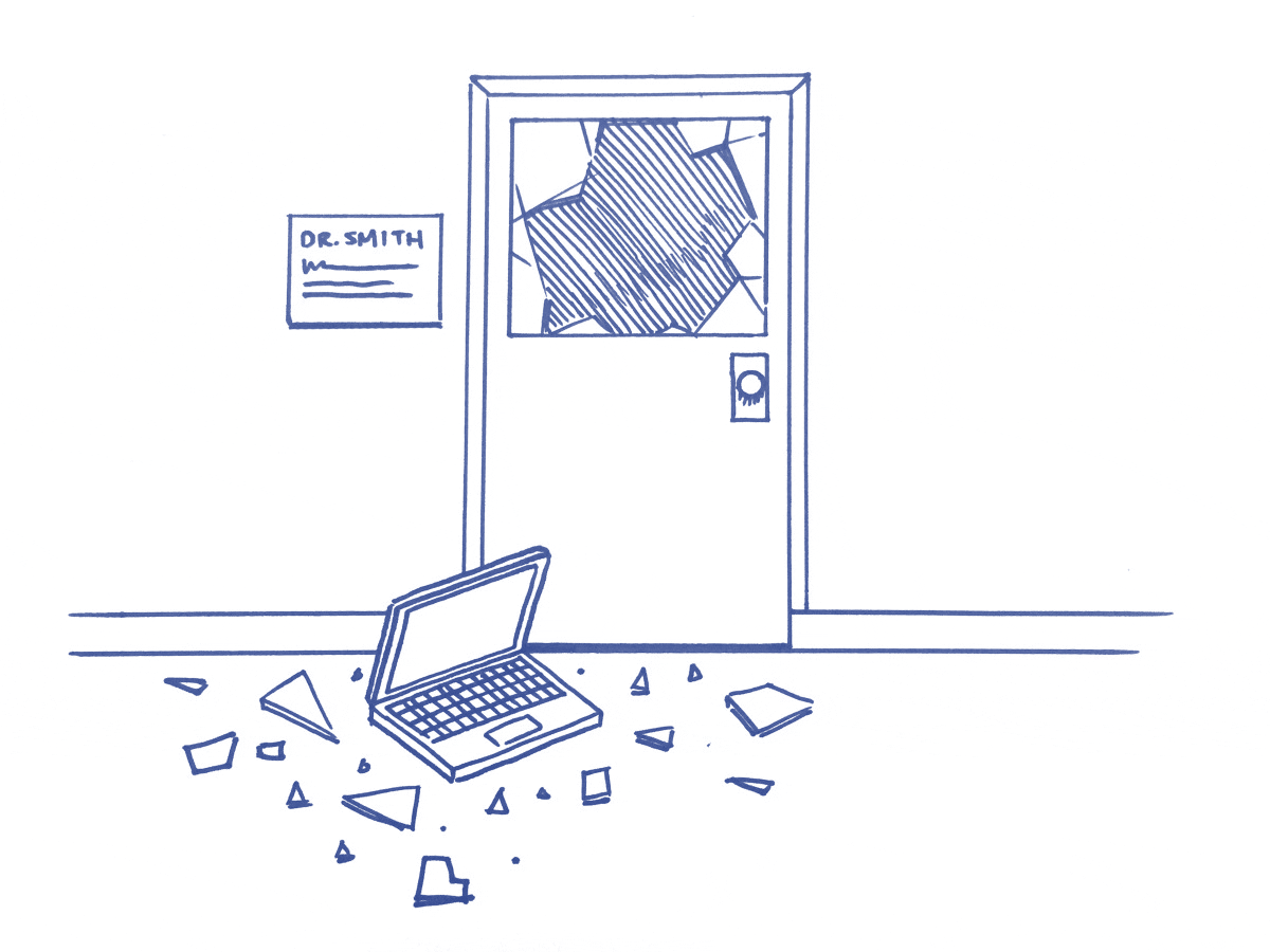
“I’ll tell you how to make documentation easier. Throw all the computers out the window.”
That tip came from an ED doctor during some recent research. I laughed it off at first, but he wasn’t joking. He went on to describe the battle that is recording patient notes. What used to take him a minute on paper is now several painful minutes of selecting check boxes and menu items on his whiz-bang electronic health record.
Doctors in the US now spend an extra 4 hours a week adding patients notes to their electronic health records (EHRs). These systems claim to save time and help people provide better care, but do they?
The problem we see is that e-health products are usually developed as technology projects rather than tools to support healthcare workers. They’re born out of questions like “how can we connect all these systems?” or “how can we keep everyone’s health information secure?” Technology is important, but if a doctor can’t get a clear picture of their patient’s health, none of this stuff matters.
At Navy Design, I’ve spent the last few years trying to understand what healthcare professionals need from their software. We created these design principles after seeing the same user experience problems trip people up again and again.
If you’re creating an eHealth product, consider how you’re addressing the following problems.
1. Assume people won’t receive training
Most health software comes with a training manual, 100 or so pages of ‘click here to do x’. Healthcare workers are also expected to sit a training course before they first use it, but often they don’t get the time. Their clinic is overflowing with patients so they start teaching themselves on day one, fumbling their way through. Or, the training occurs 2 months before they start using it, as a doctor in the Kimberley pointed out:
“The training was great but once I started using it, I’d forgotten everything I learned.”
- Assume your users won’t get training. Make it intuitive enough for them to do the basics like adding patient notes and measurements from day one. Then, teach them how to do more advanced things either in context (videos throughout the software) or on demand (webinars).
- Use their language. Don’t invent terminology that’s unique to your software.
2. Help people add great documentation, fast
Time spent on documentation is the biggest complaint about EHRs. A nurse I interviewed spent 2–3 hours every weekend finishing her patient notes because it takes too long to complete them during her shift. Not only is this time-consuming and exhausting for her, but it creates dangerous information gaps during staff handover.
Why is it so time-consuming? For health information to be useful to anyone else, it needs to be structured or ‘coded’. For example, blood pressure needs to be tagged as “blood pressure” rather than just added as a free text note about blood pressure. But, most systems make you click a thousand buttons to enter structured information. The result? People skip that process and add free text notes that can’t be charted or reported on. They add junk data.

“I know I should write my notes the proper way, but it’s too hard” — Doctor Williams (not her real name)
- Create easy ways to add structured notes. Facebook does a great job of this. If you want to mention a friend in a photo, you just write their name as part of your post. Adding clinical data should be this easy too.
- Support a broken workflow. On average, nurses in hospitals are interrupted every 6 minutes. Provide ways for them to start their notes or charts and return to finish them later on.
- Embrace mobile and everything it offers like voice to text, photos, location and context to help people add info on the go.
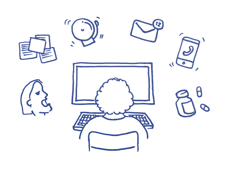
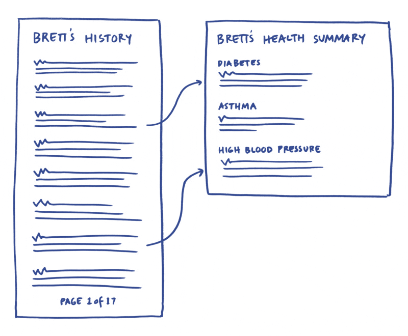
3. Be ruthless about information hierarchy
Electronic health records provide much better access to patient information, but it’s often too much information all at once. A patient’s medical history is a mix of important events like the time they had a stroke, and trivial things such as that bout of gastro. Most systems don’t discriminate between the two, so clinicians have to do the hard work and read through it all, often missing the critical things.
- Bring the important information to the surface. People need access to everything but they don’t need to see it all at once.
- Go easy on the alerts. The more alerts people receive, the less chance they’ll read them. A doctor told me “we get so many alerts they become blind spots”. This is similar to how we ignore website ads.
- Provide amazing search and filtering tools. Just like you’d Google “Italian restaurant in Boston” you should be able to search a patient's record for “Asthma” and get everything related to that.
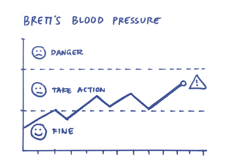
4. Help people make decisions
A chart that plots a patient’s blood pressure changes is a good start, but we can do more to help people make decisions. We can identify trends. We know when a patient’s condition is heading into dangerous territory and we know the consequences. Highlighting these things early can help prevent diseases.
- Recognise and highlight important changes or patterns in a patient’s health.
5. Design it together
This principle really applies to every product and service. Usually, people don’t like or adopt software because they weren’t involved or considered in the design process. I’m not a nurse. I don’t know how to do a medication run or care for a ward of sick patients, so I can’t expect to design something they’ll embrace without their input and ideas.
- Hire a domain expert to work as part of your product team
- Involve end users in every step of the process; problem definition, idea generation and evaluating solutions
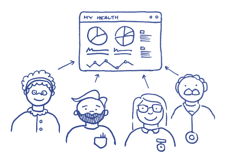
Let’s switch the focus from technology to people and work together to make the health system great for its most important users.

These principles were developed from the work we do at Navy Design, an Australian design consultancy specialising in products that improve healthcare.
Bonus story: How and why we decided to specialise in designing for health.

