Good design is science, not art
Although it probably helps to be a little artistic.
NOTE: This article is for novice designers who want to improve their skills and grow their client base. This article is not meant to disparage art or artists in the slightest. I bear the utmost respect for artists of all kind and couldn’t fathom the number of hours and dedication it takes to pursue art — whether as a career or a hobby.

I used to date a professional painter. Like “pay rent and keep the lights on with commissions” professional painter. Not just an artist, but an Arteest. Now, I know what you’re thinking: “Codey’s dated someone before? Doubtful.” And trust me, I’m every bit as surprised by my dating luck as you are. But we’re getting sidetracked.
I’d see Emma (name changed for privacy reasons) spend months on a single commission. She’d take a few weeks to brainstorm and search for inspiration. After Emma finally decided what to paint, she’d spend hours prepping the canvas. She’d lose sleep with countless late nights as she pored over every detail. I once watched her spend a whole day perfecting the pigmentation on a single shadow.
On one occasion, after putting all that time and effort into a commission, a client said “Hmm. I’m not sure I like it. Can you do something else?” Rightfully crestfallen, Emma recommenced the entire process.
When I first started designing UI and UX, I often found myself in similar situations: spending countless hours on a project only to hear that my design “just doesn’t look right.” It wasn’t until I saw one of Emma’s clients say those same words that I realized my problem: I treated my designs as though they were art commissions.
Treating UI/UX design as though it’s art is bad practice.
When we treat UI/UX design as though it’s art, we do ourselves a disservice for a few reasons. First, treating design like art propagates the fallacious notion that good design is subjective. As I’ll discuss later, good design is objective; it possesses measurable criteria that we can use to assess its value.
Next, treating design as though it’s art spreads the false notion that design is an innate skill that can’t be taught. You don’t need Picasso-level intrinsic artistic talent to master digital product design. Good design can absolutely be taught and teaching good design comprises a large part of my goal for this article.
Finally, treating design as though it’s art severely limits what you can do with your designs. As I’ll discuss later, good design empathizes with its user and creatively solves its users’ problems. When we treat design as art, we tend to prioritize aesthetics and visuals over usability and problem solving, which will deliver a severely limited product 11 times out of 10.
Good UI/UX design is science.
Ultimately, good digital product design is a science. It solves problems, begins with empathy, adheres to the scientific method, is objective, and can be taught. With this article, I intend to prove that good design is a science that can be mastered, and provide actionable steps along the way for achieving good design.
Alright, this intro has already dragged on for wayyy too long. So without further ado, here are 5 reasons why good UI/UX design is science, not art.
1. Good Design solves problems. Art doesn’t (at least not inherently).
Just like science, UI/UX design seeks to identify — and ultimately solve — problems. The very first step of the scientific method is to identify a problem (more on this later). Your designs should not exist solely for their aesthetic value. They should get sh*t done. Art, on the other hand, does not inherently solve problems. I know that sometimes art advocates for certain causes, probes us to think deeply about societal injustice, and asks us to question internal biases. Good art can identify problems. But it doesn’t usually offer its audience actionable steps to solve the problems it identifies. For both science and design, on the other hand, solving problems is the whole point.

Danielle Miller, a designer for the award-winning team over at Clockwork writes, “Smart user experience design starts by identifying a problem and guiding all ideas to solve that problem.” This “problem” could refer to a variety of different needs a user might have. A well-designed e-commerce site, for example, might solve a user’s problem by helping the customer make an informed purchase, with confidence that they’ve ordered the right product. A well designed ride-share app can solve a user’s problem by getting them home safely after a night out with friends.
Successful products solve problems. That problem might be getting a user from unregistered to registered for an event. It might mean communicating a brand’s vision so customers can understand it. Whether we’re talking about an app, a website, or more nuanced digital experience, UX design stands guard against offering features for the sake of offering features. — Danielle Miller, Clockwork
Still not on board? Let’s take a look at some examples. We’ll start with an extreme example of a website that looks beautiful, but is ultimately useless because it doesn’t solve any problems.

Look at corndog.io. Now that is a beautiful website. Very few things in life compare to the beauty of a fresh, crispy corndog. But does it make the cut for good digital product design? It absolutely does not. Because it doesn’t solve any problems; it’s just corn dogs floating across your screen. Let’s shift our focus to a more realistic example.
Before I dissect the following piece of UI, I should note that Outcrowd, the agency responsible for creating it, is utterly fantastic. On the whole, they’re incredibly talented and I can only dream of publishing work even remotely close to the quality products that they churn out on a daily basis. But here’s an example of when they let their artwork overshadow their UX.

Here’s a landing page for Paulini, a fictional travel library for tourists. This design is beautiful. The illustration is tasteful. I can’t overstate how good this looks. But whether a design looks good bears little weight on whether the design is usable. When I look at this landing page, it’s not immediately clear what problems this site solves for a user. I can spot a few links resting cozily in the top nav. I notice a call-to-action. I see some very vague directions in the bottom left corner of the page. But it’s anyone’s guess as to where each nav-link leads, or what I’d be “discovering more” of if I click on the call-to-action. This landing page is art. It’s beautiful. But it doesn’t solve any problems.
So let’s take a look at a design that does solve problems. Now that we’ve considered a couple nonexamples, we should consider a UI that gets it right. And we’ll give Outcrowd a shot at redemption while we’re at it.
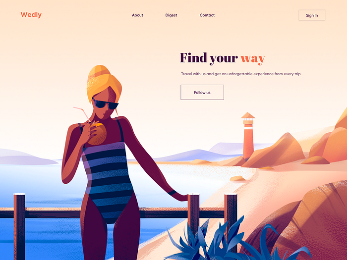
Above you can see a landing page designed by the same agency, for a similar product: Wedly constitutes another fictional travel agency. This design is equally beautiful. The illustration is equally tasteful. The difference lies in this landing page’s usability. This design not only solves problems, but it communicates clearly which problems it solves. The problem? A traveler wants an unforgettable experience — a step above the average tourist trip. This is a website solves that problem by helping travelers plan that experience. It’s clear where each nav link leads. It’s clear what happens when I click the call-to-action. This is top-notch design.
I promised in the introduction that I wouldn’t just point out examples of good and bad design. I told you I’d also offer actionable steps for achieving good design. So how does a designer make sure they’re crafting UI and UX that solves problems? Danielle Miller, whom I mentioned earlier, offers three ways we can master this technique.
First, we need to conduct research. Before we even begin sketching out our ideas for a product or service, we need to “understand how that product or service fits into the user’s life.” If you encounter difficulties during your user research, Fabricio Teixeira wrote an excellent article about what kinds of questions to ask — and how to ask them — during user research.
Second, Miller says that we should constantly be asking “why.” Every button, every paragraph, every element, ask “Why is this important? Why am I adding this?”
Finally, any time you design an element within a UI, ask yourself “what problem does this solve?” If you don’t have an answer, that element is probably superfluous.
2. Good UI/UX design begins with empathy. Art doesn’t necessarily (although it really should).
If both science and design solve problems, then empathy is a prerequisite to both industries. How can you effectively solve a problem for someone if you don’t know that person’s priorities, cognitive and physical restrictions, and other needs? When science fails to begin with empathy, it creates the wrong solution to the wrong problem for the wrong stakeholders. The same is true for UI/UX design.
Let me offer the way my home city of Boston handled the pandemic as an example. When COVID-19 struck Boston, many of our city’s officials and social scientists realized that we have a rather large population of essential workers. I’m talking medical professionals, public transit workers, grocery store staff. We had a huge number of people who simply couldn’t work from home due to the nature of their job, and many of those folks simply cannot afford frequent testing at private healthcare providers. These essential workers also come into contact with hundreds of people each day, highlighting the necessity for the workers to be completely healthy when they clock in, so they don’t spread the virus while at work. Thus the city’s officials and social scientists recognized our problem of needing multiple free testing centers.

Unfortunately, those faced with the task of solving this problem did not begin with empathy. The majority of our initial free testing sites were not accessible via public transit. For one reason or another, the majority of people in Boston with jobs deemed “essential” don’t own their own vehicle. So we had a solution to the problem (free testing sites), but the solution clearly failed to consider the physical restrictions of the people whose problem we wanted to solve. Had our city’s problem solvers begun with empathy, we could’ve avoided this mess. Thankfully, Boston’s officials quickly realized their mistake and worked to correct it. However, this example proves the need for any scientific process to begin with empathy. Good digital product design also begins with empathy. Fortunately for us designers, however, we have a lot less at stake than the transmission of a deadly virus. Let’s take a look at some examples.
When I first began my design career, I didn’t have many design projects under my belt, so I populated my portfolio with some sample projects and redesigns of existing products that I had made in my spare time. For one of these sample projects, I reimagined Wikipedia, specifically the article on our galaxy, the Milky Way.
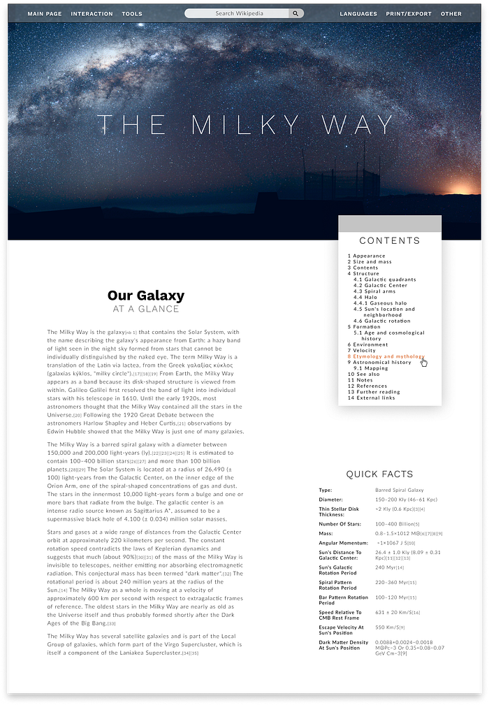
This design is pretty (in my humble opinion). It’s clean and organized. There’s plenty of room for the content to breathe. On the surface, my Wikipedia redesign might look like some good UI. But it is, in fact, utterly useless crap.
My Wikipedia redesign is crap because it didn’t begin with empathy. Wikipedia aims to deliver reliable information to even the most remote, information-starved locations with limited internet access. Wikipedia’s strength lies in its light weight and versatility. Democratizing information means that even the slowest internet connection should be able to access that information. My redesign would require a hefty style sheet. A massive header image and a dynamic table of contents widget would take a while to load, seriously limiting which users can access the site, effectively defeating Wikipedia’s entire purpose. I failed to account for my intended users’ physical limitations.
Like science, good UI/UX design begins with empathy. It requires a designer to intimately understand their users. As we saw with my Wikipedia redesign, focusing solely on the artistic aspects of your designs will inevitably lead to neglecting some of your users’ most important needs. An easy way to begin your designs with empathy is to conduct user interviews at the start of each project. Work with your clients or supervisors to identify your key user base and then contact people who identify similarly. Get to know your target audience by literally talking to them.
I mentioned earlier that occasionally Art has the power to empathize with and give a voice to underrepresented populations. I think that’s a beautiful quality. But did Jackson Pollock take the time to connect with his intended audience, intimately understand their greatest needs, and provide solutions to their problems in a way that empathized with their physical and cognitive limitations? I never met the man, but I’d guess he probably didn’t.
3. Good design follows the scientific method.
Some of the greatest works of art began not with a hypothesis, but with inspiration. And while it’s important for a designer to have several sources of design inspiration, it’s simply not practical for every single website or app you design to begin with inspiration. I’m currently working with a client to design a financial reporting and aggregation tool. A product built by accountants, for accountants. No amount of time spent browsing Dribbble or watching sunsets will fill me with the monumental desire to design life-changing accounting software. Instead, good design should follow the scientific method.
Aside: Before I began my design business, I taught STEM classes at a middle school in Boston. So for this post, I’ll use the scientific method as taught to fifth graders. Some folks who studied the hard sciences in college might be familiar with more complex variants of the scientific method, but for design purposes, we don’t need much more than a 5th grade understanding.
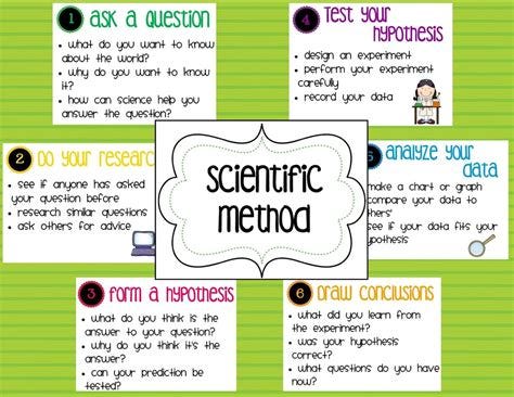
The scientific method begins with a question. Remember that good UI/UX design solves problems. Your question should revolve around the problem you’re trying to solve. If, for example, your problem happens to be that users find it difficult to complete a form on your web application, your question could resemble “How do I design a form with less friction?”
Research constitutes the scientific method’s second step. The point here is to discern whether someone else has already solved our problem. Referring back to the poorly-converting form example, is there already an elegant solution for designing frictionless forms? If so, you can stop here. Study existing forms that convert at your target conversion rate and apply their techniques to your own forms. If, however, you face a previously unsolved problem, your research continues.
The second half of the research phase consists of user research. Talk to your users. Ask them what problems they perceive. Set up a screen-share session and observe your users attempt a form submission. You’ll pinpoint the exact instances of friction and thus narrow the problem.
Step three in the scientific method contains hypothesizing. We’ve identified a design problem by asking questions, we’ve researched potential solutions to the problem and we’ve researched why users encounter this problem. Now it’s time to brainstorm solutions. That’s solutionsssss, plural. A large number of beginner designers will stop here. They’ll design one solution and call it a day. They’ll send their single design to the client and collect their paycheck. But we’re only halfway through the scientific method so far. Stopping here severely limits the quality and efficacy of our designs (which could in turn limit the amount we charge for our designs).
The scientific method’s fourth step involves testing your hypotheses. You’ve brainstormed several potential solutions and now it’s time to test them, in a round of user testing. Use Invision or some other prototyping tool to place your new designs in front of users. If you want to get real scientific, separate your participants into several groups: a control group who uses the old/problematic design, and a group for each of your newly designed potential solutions. (Note: this strategy becomes implausible for small projects with a limited supply of users willing to participate in testing. Just do the best you can with the resources you have.) Again, ask users what problems they perceive and set up a screen-share session to observe how they interact with your new designs.
Steps 5 and 6 are pretty simple: analyzing the data and drawing conclusions. After conducting your user testing, it should become clear which of your prototypes performed the best. That’s the one you’ll want to tidy up and submit to your client. If it turns out that the old/problematic design performed better than any of your redesigns, that’s perfectly okay. Simply repeat steps 3 and 4 until you have a design that works.
Good digital product design follows the scientific method. If you want to charge good money for your work, you’ll need data and results to justify your rates. Adhering to the scientific method can equip you with that data. If you treat your designs like art, you’ll find yourself wasting chunks of time looking for inspiration when you could be following an actionable plan to success.
4. Good design is not subjective.
I foresee heavy criticism from artists for the following paragraphs. I’m certain several folks who have attended art school or hold a music degree will tell me that art is very much not subjective. And they might be right; after all, it is possible to flunk out of art school.
However, when it comes to the art consumed by masses, personal taste dominates the market. For instance, someone who studied music at an advanced level might be able to explain why Punk Rock is overly simplified and takes less technical proficiency to master than some other genre. But at the end of the day, the guys from Green Day comprise some of the wealthiest people on the planet because they created art that millions of people subjectively enjoy. Similarly, the art that decorates my apartment I purchased out of subjective affinity. There exist no criteria or checklists for proving the quality of the paintings on my walls. I simply like the paintings.
Good design differs from art because massively successful designs are objectively good. In fact, UI/UX design can be measured against a set of criteria to determine its worth. A design’s success lies not in the personal preferences of its users; rather, a design’s success can be accurately predicted and measured based on whether it meets a set of standards.

Author and designer Michael Cummings makes the distinction that “[good] design is a craft of service, not self-expression.” He suggests that the key difference between design and art is the people it serves. Since most folks generally consider art as a means of expression, art tends to serve its creator. But since design strives to serve a set of users by solving a problem, it inherently bears an air of objectivity; the design either solves that problem or it doesn’t.
Design is a craft of service, not self-expression. — Michael Cummings, UX design.com
Designer Bronwen Rees offers a similar argument for Toptal.com. She writes, “although a design outcome can be artful,” the design process shares very little in common with art. On one hand, Rees continues, art “aims to aesthetically express personal ideas or feelings through a particular medium.” Design, on the other hand, constitutes “ the result of a number of decisions made by one or more designers trying to solve a specific problem relative to a user; it is then evaluated simply by how successful it is at solving that problem. If unsuccessful, then the design has failed.”
So if good UI/UX design is objective, and we can measure it, what criteria should we use for measuring our designs? How do we know if they’re good?
The Short Answer: If your design solves the problems you intended to solve, it’s a good design.
The Medium Answer: In an article for the Interactive Design Foundation (the largest online design school in the world), author Euphemia Wong lists ten guidelines for successful user interface design. If a design can’t meet a majority of these guidelines, you can objectively conclude the design will fail. I personally recommend bookmarking Wong’s article if you’re new to design and desire an actionable checklist for your designs.
The Long Answer: Don Norman, the man who coined the phrase “User Experience” back when he worked at Apple, and Jakob Nielsen, another UX pioneer, built a free library of UI and UX resources and posted them to their website. The Nielsen Norman Group have compiled hundreds of heavily researched articles meant to provide digital product designers everywhere with the tools to craft highly successful interfaces and experiences. I recently read an article titled, “113 Design Guidelines for Homepage Usability,” which you can find here. Although an incredibly useful guide, the article’s length can prove rather dizzying. If you’re a designer looking to up your skills, I highly recommend spending some time on the Nielsen Norman Group website. You’ll find endless resources and checklists for reviewing and improving your designs.
Good UI/UX design is a science because, like many other scientific fields, it aims for objectivity and its results can be measured. Although the design process can yield a profoundly artistic result, the design process constitutes an entirely scientific procedure.
5. Good design can be taught.
Perhaps one of the longest debates in the art world, the question of whether art can be taught. I think a case can be made for both sides. A student can learn proper paintbrush techniques. A student can learn how to operate a camera. A student can learn music theory. But painting a masterpiece, capturing compelling images, and composing a truly remarkable piece of music often necessitates some level of intrinsic talent. Remarkable UI/UX Design, on the other hand, requires no natural-born genius. Just like the world’s greatest scientists, the world’s greatest designers acquired their skills through extensive study. To prove my point, let’s examine the work of two world-renowned scientists and two world-class design agencies.
First, let’s take a look at the careers of Neil deGrasse Tyson and Jennifer Doudna. Both of these scientists were born naturally gifted. There’s no disputing the inherent brilliance of each of these two scientists. But Tyson didn’t come into this world with an intimate knowledge of astrophysics. He studied the heavens at Harvard, the University of Texas, and Columbia. He conducted research at Princeton. Tyson’s intellect? A natural born gift. Tyson’s familiarity with the cosmos? An acquired knowledge.
The same logic holds true for Jennifer Doudna, who won the 2020 Nobel prize in chemistry for her work in gene editing. Although Doudna has always been an incredibly gifted in an intellectual sense, she was not born with the knowledge that CRISPR-Cas9 could be used for programmable editing of genomes. Instead, she learned about biochemistry at Pomona College and Harvard Medical School.

Like remarkable scientists, great designers can acquire their skills through study. Anyone can internalize the criteria for good UI/UX design, and anyone can practice their craft until their designs meet those criteria. The design agencies Elegant Seagulls and Clay Agency exemplify the quality of output to which a designer can aspire, if they put in the effort.
Both Elegant Seagulls and Clay have won Webbies and Awwwards for their design innovation. But I can guarantee you that none of the designers on staff for either agency knew about the Rule of Thirds or how to build responsive websites from birth. Unlike history’s greatest artists, the greatest designers honed their craft through study, practice, and trial & error.
UI/UX Designer Erik Kennedy (who has designed for folks like Amazon and Soylent) wrote an incredibly powerful article about his journey to mastering good design (and the specific techniques he learned and applies to every design). In the article, Kennedy mentions that the majority of his journey consisted of “being bad and then deliberately practicing.” He says good design can be learned through “cold, hard analysis.”
I learned [design] the same way I’ve learned any creative endeavor: cold, hard analysis … from being bad and then deliberately practicing. — Erik Kennedy
Good design can be taught. In fact, learning constitutes the only way a designer can get good. When digital product designers treat their work as though it’s art, we snub the countless hours we’ve spent studying, practicing, and failing as we worked our tails off to obtain our skills. Don’t discredit your struggle by allowing your work to coalesce into a subjective art form. Treat your design work like the objective science it is.
Ultimately, design is a science, not an art. Artistic folk can definitely go far and perform well in the industry. But treating your designs as though they’re works of art will only stunt your growth as a designer and limit your productivity. UI/UX Design solves problems, begins with empathy, adheres to the scientific method, is objective, and can be taught.
These are just a few things I’ve learned as I’ve worked to grow my design business. What are some things you’ve learned on your own design journey? I’d love to hear. Leave a comment below.

