Member-only story
5 things that are killing your landing page
They are not so obvious as you might think.

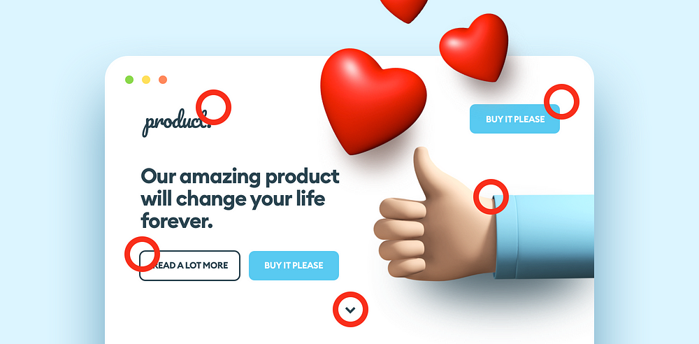
Landing page is a popular, yet quite specific kind of website. It often makes me wonder, why it is so hard these days, to find a landing page that is done well? It would seem that we, as product designers, owners and users, are design-aware enough (compared to 10 years ago) — yet there’s one simple thing that everyone seems to forget:
The major purpose of a landing page is to sell a product or an idea. Nothing more, nothing less.
Knowing that, we should design landing pages with a very strict list of goals in mind. It’s not a beauty or creativity competition. The page should be distinctive, yet not overwhelming. The message should be straight and to the point. The overall visual style should match the product’s characteristics. It should also be appealing to the target group. The shopping experience itself should be as quick, as easy and delightful as possible.
Here are the most repetitive problems with landing pages I’ve witnessed recently.


