5 tips for designers to work smoothly with developers

Design is an interesting field. It’s subject to the eyes of many, and often quite subjective. At times you may feel like everyone is a critic, and well, they are. But that’s okay! Criticism will really help you grow as a designer, especially in the UI/UX world.
I went through this stage, more than once. Learning design was a long road for me, and I had my fair share of criticism. Little did I know, I would eventually become my own worst enemy when I started to learn front-end development. I soon learned that there is a lot more to UI/UX than making something look good, or function nicely. It can’t just be a joy to use; It has to be a joy to develop as well, or things fall behind schedule, get messed up and lost in translation, and a lot of time can be wasted.
So, as I learned development and continued to design for projects that I was later building, I compiled a list of the things I found helpful to my development process, and along the way I noticed that the developers I was working with (including myself) had a far easier time collaborating with me and progressing the project forward. So with that in mind, let me show you what I found!
1. Have a Plan

Having a solid plan in place for the product, no matter what it is, is essential. I used to have an idea thrown at me, only to immediately sit down and start designing thinking, “I can figure out the user flow as I go.” What a mistake that was! There’s a lot of questions behind how a product is going to be used. It’s important to at least begin to answer some of those problems brainstorming before starting to design them. Questions like, “how do we guide the user through app initiation?” or, even questions as simple as “what should the user be able to do with the app?”.
As you start to tackle those questions in fore thought, many of the questions that a developer will inevitably ask down the road will simply disappear, and so will a great number of your design problems!
2. Define a Grid

The grid is a necessity now. Most designers have probably been made aware of this in some way or another, since use of grids is in everything from print media and books, to websites and apps. In fact, grids were used in design even all the way back in the 13th century! Why so important now, especially for developers?
Well, today a quick google search tells us that well over half of all website traffic is on mobile devices. However, laptops and more powerful desktops are still popular, and therefore, a developer has to construct the website to be easily operated on a variety of screen sizes. A big frustration that I sometimes encounter as a developer is having been given a desktop ready design, without any clues as to how a mobile design should even be approached. This becomes increasingly difficult as designs continue to become more and more complex.
So what’s the solution? Start with a grid. I typically design with a 12-column grid. This makes it easy to define spacing between elements (the gutter), and the sizing of each element, while still allowing for quite a bit of flexibility in the number of elements in a row.
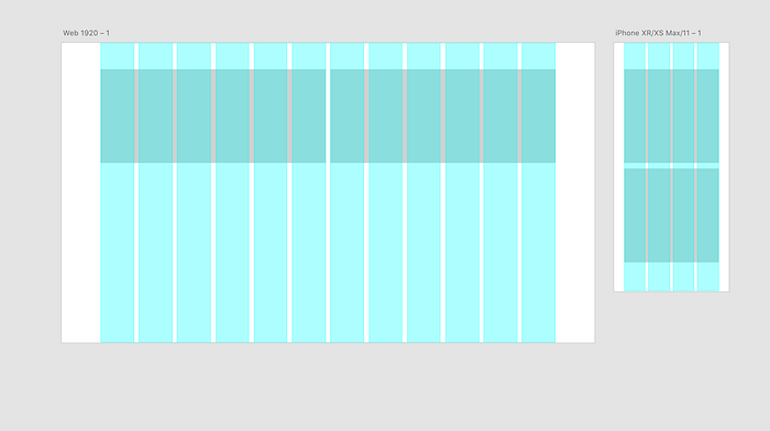
Doing this helps the developer understand the underlying structure of the product. This is because the developer is building the app in almost the same way you are designing, meaning everyone is synced up and saving time. Grids also make responsive (desktop -> mobile) design much easier, since each element can include a set of rules as to how many columns it should take up at each screen size, and how the content should change to fit the layout.
3. Start with a Wireframe
Once you have your grid, it’s time to start rolling on the design. Kind of. Wire framing is a crucial part of the process when interfacing with developers. It’s a good time for both parties to go over the flow of the product and how it will be structured. The goal with a wireframe is to take everything you’ve thought of in the planning stage and start laying out the general foundation of what goes where, without worrying about color, images and content. Do you want to center the content? Should you have 3 or 4 columns of pictures? Where on the page do you want to show articles, and where do you want to show new products? These are all questions that are quickly and easily solved with wire framing.

Basically, go build out the general structure of all the pages using boxes and placeholders until you and the developer are happy with where everything is before you go making it look pretty. This will save you a lot of time down the road.
4. Style Guides
This one should be fairly obvious, and you probably saw it coming. Style guides simplify everyone’s life. Create a guide that shows the colors, along with their color codes (#ffffff). Show the gradients, including its orientation, type, and the color codes for each end of the gradient. Show how many pixels (margin or padding) should be present around each type of element or component.

Also very important is a font hierarchy. Choose only 2, maybe 3 different fonts, and make sure you define the font, font size, weight, and color for each type of text area in the design. This would include titles, secondary titles, subheadings, paragraphs, and links.
Having all of the style guide elements in place will negate the need for a back-and-forth dialogue between you and the developer and will save a lot of communication time, and your far less likely to lose your voice by the end of the day explaining or repeating yourself. It will also keep the developers much happier, which, is really our goal here.
5. Think in Components
This is something you will probably want to do while still in the wire framing stage. I started learning development with a Javascript framework called React. While I won’t go into details on how that works, really it can be broken down into Components, or small bits of re-usable code that can be copied and modified to create many different parts. Design is often (and should) be done in the same way.
For instance, while creating a design for a social media app, you may have a part in the design where an image is posted. That image post has to include several things: the image, the user who posted it, a caption, a like button, and perhaps a button for more options. That piece of design is going to be used more than once. So make it a group, or “component.” Copy that design everywhere you need it instead of rebuilding it. This keeps the design consistent and easy to follow. The more you do this, breaking things down into components, the easier it will be for developers to break down their code into sections that will scale easily and develop quickly.

I personally find it beneficial to break things down as small as can be and re-use them for consistency. For example, on that picture post, I would make a “top bar” containing the user’s name, and avatar as it’s own component. I would then make a placeholder image, and finally, a “bottom bar” including the like button, and the more options button with the caption below those as another component. Putting all 3 of those groups together would create my “picture post” component. I can then re-use each of those smaller pieces anywhere I happen to need them.
There’s a lot more I could put in this article, but I’ll save you the read. I hope these few tips help you out in your next design! Always keep learning and experimenting, and of course, stay creative!

