Member-only story
It’s time we learn to design a proper pie chart
Communicating your data more effectively.

 Pie charts are common in data science — next to the bar chart and the line plot, the pie chart is incredibly standard and simple. A circle is split into several slices, with each slice’s angle representing how large its value is. It is a standard and allows for quick comparison of values, but there’s so much that can go wrong.
Unlike most charts, like bar charts, box plots, line plots, etc., pie charts don’t have an x-axis and a y-axis that are orthogonal — the types of plots humans can more instinctively understand. The circular plot can be more difficult to communicate effectively — so in this article, I’ll present five tips you can use to avoid pie chart pitfalls and deliver the message.
1 | Don’t use bright colors, use vibrant ones.
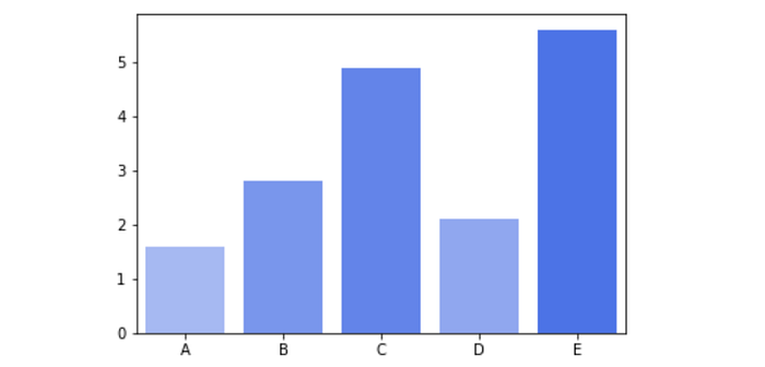
Unlike bar charts, pie charts should have colors that are vibrant. The reasoning behind this is that bars in bar charts are separated.

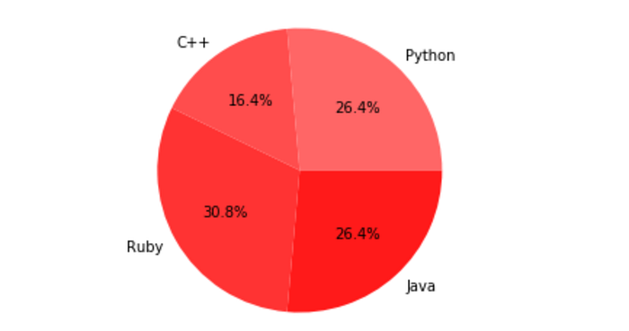
Because they are separated, it’s easier to separate the discrete x-variable into its classes. With a pie chart that is colored too similarly, however, because the slices can be thought of as being continuous (they are right next to each other), it is less easy to pick apart where one slice stops and where another begins, especially for someone with reduced vision (about 1 in 10 men have some form of color blindness).

In addition, whereas bar charts have a clear beginning and end on the x-axis, pie charts are circular. There really isn’t a beginning or an end place to start — so why is it warranted that the darkest shade starts with Java, then Ruby, and so on — and not starting with some other shade or direction?
Instead, use colors that more easily differentiable. While they should still be muted (not bright), it’s much more easy to differentiate between different sections. In addition, it…

