5 UX tips I learned working in Gamedev
Game UI is extra emotional, literal and highly themed. What can we borrow to make our UI/UX work better?
Before joining Clay I worked as a UI artist in a gamedev studio that developed casual mobile games.
Casual games are the ones that are most closely connected with peoples’ everyday lives, as they are designed in a way that allows them to quickly become part of their users’ routines and become an unobtrusive and slick way to escape while commuting or taking a short break. So the UI mechanics are usually directed to guide, hold or attract the attention of the user, who can be easily distracted, tired or can quit at any time.
Game UI is usually emotional and bold, it tells its messages loud and clear. I still catch myself using some of the tips I learned there while designing various digital products.
1. Guide users through their first use
Games often embed guidance in a very natural way right inside the game process as a test run or on the first level. The important thing here is that the user learns how to interact with the game while playing the game itself, not before the game starts. Try to embed guidance in your app experience seamlessly: use subtle animations, neutral colours and fonts and easily skippable non-modal tooltips.

If the specifics of the product demands a lot of learning, do not overwhelm users with several tooltips at a time. This is ineffective, as users won’t remember anything but will be frustrated by the complexity of your app right away. Your learning flow should be straightforward: one clue at a time. After users have already learned one interaction, on the next app launch you can teach them something else.
Tik-tok does a good job at introducing their interface. Its UI features a lot of unobvious gesture interactions, and users are consequently being taught with tooltips, one at a time.

Sometimes you can avoid tooltips and guides at all and just guide user through the test run of the core flow. Instead of showing the empty home screen with a tooltip “create your first habit” HabitMinder at the first launch just guides users straight to the first habit creation.

2. Represent user progress visually
Draw a visual path representing user progress and rewards that they have received before, and will receive on the next steps. Highlight the path they’ve taken, their current point, and what lies ahead. Give them clues as to which particular actions are needed to achieve the next level and what reward they will get.


Not only the user’s current and future status and privileges, but also the growing path behind will motivate them to move further and achieve new levels.
I’m not talking exclusively about fitness/habit trackers — loyalty programs can also benefit from a visual representation of progress. Aside from the motivational effect, a long path is evidence of a lasting relationship between the user and the product, and shows that the brand remembers this relationship and is grateful.

In addition, a visual path showing future as well as past achievements is a helpful instrument in discovering the loyalty program itself and learning its rules in an informal and playful way.
3. Pre-fill user progress
Treating completed tutorial as gaining the first or second level is common in games. At the very beginning of showing user progress, try to mark the first 1–2 levels/tasks complete. This will add bits of satisfaction and motivation to proceed. This also increases loyalty, as the product is showing that it appreciates the time that the user has already spent with it.
Notion uses this approach to prompt the user to explore the app’s powerful functionality: on the first launch it creates a checklist that has its first item already checked.
4. Make use of literal feedback
Collectible items in games always fly to the top bar’s counters in the most satisfying manner: I guess top game developers have spent enough time defining the most addictive and satisfying visual effects and sounds.
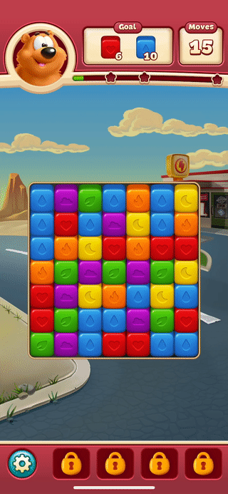
Do not hesitate to use visual feedback when entities on the screen get collected by users or transferred to them. Aside from creating a subtle joyful feeling of gathering, it also serves as a visual clue for where the item can be found later.
5. Make rewards look rewarding
I was always frustrated with the amount of visual sugar that I was asked to add to the most beneficial tier in the in-game store, completed level pop-ups, reward pop-ups, etc. I kept adding decorations, glow, and visual effects, and the clients kept sending us statistics showing that the extra decoration actually made the tiers in the shop more noticeable and attractive and got them purchased more often.

Apply this knowledge when designing subscription plans by moderately giving the most beneficial ones more visual weight and emotion. Make joyful in-app events look and feel joyful. The purchase completion pop-up can have the typical check mark and and laconic copy, but consider adding a rewarding vibe with the use of illustration or animations, creating the feeling of being thanked and rewarded.
As a leading UX agency, the Clay team often uses this approach, for example in this animation made by ◗ Dmitry Tsozik, which celebrates reaching a new level of the company’s loyalty program.

___________
I hope my tips were useful. Don’t hesitate to share your feedback, insights, and ideas in comments.