6 steps to make sure the website you’re designing is accessibility compliant
In the age of inclusivity, accessibility is the most important thing for your website.

By now, everyone and their web designer know the importance of accessible design — the aesthetic, the legal, the business and the user benefits of it and why we need every website to be compliant today. But what remains to be known by people is how exactly to go about creating a website that is accessible, easy to use, and appreciated by the masses.
Enter, this article. Here are 7 easy steps to make sure your website is accessibility compliant.
1. First things first, ask yourself where you are and where you need to go
Before you start, test the accessibility of your current website. This would give you a good sense of where you stand currently and where you need to go. This audit is the best way to plan your roadmap.
Another resource is WCAG. The Web Content Accessibility Guidelines explain how to make web content more accessible to people with disabilities. It breaks down accessibility into 4 main principles:
- Perceivable: Can the content be consumed in different ways?
- Operable: Can it function without confusion and without the use of a mouse or complex interactions?
- Understandable: Can a user understand how the user interface of the site functions and the information on the site?
- Robust: Can different assistive devices (screen readers, for example) understand the website?
Based on these categories, one can get ratings of A, AA, and AAA.

2. Next, start focusing on mindful use of Colour
Visual impairment is one of the largest pool of users that get ignored by the digital landscape.
Colour is a very important visual medium for connecting with the colour blind user base. A best practice here is not to use colour as the only visual means of conveying information. One can use tooltips, thick borders, icons, bold text, underlines, italics, etc. in conjunction with colour.

This example is one of unmindful colour use. The colour selector for the shoes cannot be accessed by a person with any range of visual impairments from colour blindness to complete blindness — as the only notation of use is the colour, and is not text based (and the text is vague)


In these screens as well, it is impossible to know which fields have an error if you cannot understand the colour. This is especially common in error state design.
Sufficient contrast between text and background is a good practice. (A good ratio is 4.5 to 1). Great resources for this are colorsafe and material design which help you generate colour palettes for your designs. Another option for Mac users is the Stark plugin for Sketch — that simulates designs in various forms of colour blindness.
Another obvious tip is to avoid flashing lights in UI or pop-ups as they can trigger seizures and other light-sensitive responses.
3. After that, Content analysis
People with low vision often make use of screen readers to convert text to speech so that the person can hear the words on a site. A way to allow them to perceive images is using well written and descriptive Alt Text.
Another small yet powerful way to assist a screen reader is to add periods in abbreviations (C.I.A. versus CIA). One should offer transcriptions for audio resources, and captions/subtitles for videos.
Text blocks with narrow widths are easier to read for all people, especially those with reading or vision impairments. Because of this, the WCAG recommends keeping a line of text’s character count below 80 characters.
Also, avoid using justified text and users should be able to zoom into your site 200% without having to scroll horizontally. In terms of content, the WCAG explicitly states that you should aim to write at a ‘lower secondary education level.’
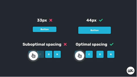
4. Add visual cues
Visual cues are an important aspect of enabling easy and efficient keyboard access. Fonts/buttons should always be large enough to click even with an unstable hand. Allowing users to scroll through links using the TAB key with :focus {outline: 0;} enabled in the backend CSS is another valuable integration.
Generally, forms require three specific items that are vital for accessibility:
1.Clearly defined boundaries
2. Visible labels
3. Helper text
Recent minimalist designs have started to forego these essential items in favour of stylistic choices, which leads to suffering accessibility.
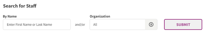
As in this example, clearly defined boundaries for form fields are important for users with mobility impairments and those with cognitive disabilities. Keeping a label on a field is also important as placeholder text goes away when one types, while labels maintain their usefulness even after.
5. Clean up the navigation & flow
Certain navigation elements, although sophisticated cause accessibility issues. Hovering excludes keyboard-only interactions. Very often, UX design uses hover for secondary actions and visibility only for primary actions. People who use speech recognition to navigate require actionable items being visible on the screen. Allow users more time to enter time-related information. Allow users to go back in the flow if they so require, as mistakes can be made by anybody, but more so by people with some inhibitory factors.
6. Test with a large range of users
To seal these design efforts, finally, is also important to test with an inclusive group of users. We must include personas with varying abilities in the testing phase and also employ accessibility-testing tools (such as WAVE and Color Oracle) for the testing.
7. Final checklist
And right at the end, there are resources and checklists we can use to make sure our designs are compliant with accessibility guidelines. One such resource is an amazing checklist that covers all the important points.
And while one can create accessible websites on our own, there is a resource cost that come with it — of time, energy and know-how. Another option to consider is outsourcing these considerations to platforms like accessiBe — which is a fully automated accessibility solution for ADA & WCAG compliance.
Summary
Creating accessible designs is a necessity of today.
Whether you take the necessary steps to hard code accessibility or choose an accessibility software it must be done.
In this modern world, we reserve the power to aim for one where every disability is treated like left-handedness — with an ubiquitous and seamless solution, free from stigma. And maybe, just maybe, the physical world will hear us too.