6 steps to big results: How we redesigned the Sephora app
How we used research and rapid iterative testing to design an exceptional experience that generated results beyond expectation.
Timeline: 3 Months
Methods: In-Person & Remote Studies, Card Sorting, Iterative Testing
Tools: Sketch, InVision, Usertesting.com
Results: ⬆ Conversion, ⬆ App Revenue, ⬆ Average Order Value, ⬆ Monthly Active Users
1. Define The Problem
Adding Micro Features Without Considering the Macro Experience
It’s a common problem with digital products.
An endless list of new features and screens get added over the years, but it’s never “in scope” to look at things like navigation and overall experience holistically.
When in Doubt Just Throw it in the Hamburger Menu :)
The result? A bloated and confusing navigation that frustrated our designers and users alike.

Examples
Track Your Order? Good Luck!

- Open the hamburger menu
- Find the secondary (HIDDEN WITH NO AFFORDANCE) nested menu
- Tap ‘Recent Orders’
So one of the most frequently used features was almost impossible to find. Cool! 😭
Looking Up a Recent Store Purchase? Godspeed!
“How do I find that foundation I got in store?”

- Open hamburger
- Tap ‘Lists’
- Find ‘Restock Past Purchases’ and tap ‘View All’
Not intuitive. The user’s mental model of a list is “something I created myself”, not something auto-generated.
Replenishment is a big business driver. This shouldn’t be so hard. 🤨
Here a Menu, There a Menu, Everywhere a Menu, Menu

- ‘Lists’ and ‘Community’ appear in multiple places
- The ‘Shop’ menu appears in the hamburger and as a tab next to the Home screen.
Why Apps?
They’re important to users and the business.
- Most users are signed in, unlocking huge opportunities for personalization.
- Our most loyal and engaged customers are app users.
- Faster, smoother, more nuanced interaction
- An important bridge between the digital and physical world, particularly with our “store mode” features
2. Building the Case and Getting Buy-In
As a design team we knew that the future was in bottom navs, but we needed to convince our business and tech partners.
It’s easy to just keep throwing stuff in there, and “Amazon has it”, so it must be good, right?
To get everyone on board, we built a case that centered around these key points:
Bottom Navs Boost Discoverability & Help Users to Quickly Form a Mental Model of Your App’s Stuff

With a hamburger menu, everything is hidden.
With a bottom navigation, users can see where they are, where they can go, what the app’s main features are.
Bottom Navs Are Easier to Reach

A bottom navigation is more comfortable for the thumb to reach, especially when navigating with one hand.
Bottom Navs Enable Multitasking (Think Browser Tabs)

In a bottom nav approach, each tab represents a distinct stack of screens that retains its own history as you navigate through them.
You can explore content from our Community in the INSPIRE tab while maintaining a separate product browsing journey in the SHOP tab.
A hamburger menu on the other hand represents just one stack. You can only perform one task at a time, because the root screen resets the stack every time you open the hamburger.
Making the Switch Boosts Important Metrics

Google’s Luke W. (among others) published compelling results which drive the point home. Old news!
Switching from hamburger to bottom nav drives engagement, satisfaction, speed, and task completion — all leading to improved conversion and revenue.
3. Define Project Goals
We got buy-in, got the project on the roadmap, and got to work.

Goals helped us align with the cross-functional (design/product/engineering) team on what we were trying to achieve and how we would get there.

Main goals:
- Reorganize the information architecture around the user
- Migrate to a bottom navigation
- Personalize wherever possible
Secondary goals:
- Drive engagement with non-shopping features like Community & Store Services/Classes
- Update app styling (visual housekeeping)
All while keeping in mind this was not a whole app redesign (things like category, product, and checkout pages were not in scope).
4. Research = Gathering Inputs from as Many Sources as Possible

This took discipline! We wanted so badly to jump straight into design mode.
We restrained ourselves and did the research, gathering data and insights about the landscape surrounding the project.

I’ll touch on the highlights…
Market Research & Consumer Insights: ‘Omni‘ Customers are Constantly Pinballing Between Physical and Digital Touchpoints

Apps are part of a bigger omnichannel ecosystem. Our customers are constantly bouncing between our various touchpoints (apps, mobile web, desktop, stores, social, events, email, etc.). They want to engage with Sephora whenever and wherever they choose.
Analytics Highlights
After some training from our analytics team we were able to self-serve and uncover the following:
Search Engagement Drives Conversion
Users who engage with search convert at a significantly higher rate.
Shopping First, Everything Else Second
Shopping stuff was getting the most traffic. Things like New/Featured Products, Order Tracking, Loved Products.
Teach/Inspire/Play stuff was not getting the engagement we wanted. Things like Sephora Virtual Makeup Try-On, Buying Guides, Community, Services/Classes.

Usability Testing Highlights
To uncover the behavioral “why” behind the analytics, we did a combination of in-person and remote moderated and unmoderated testing into:
- our apps
- competitors’ apps
- apps with design patterns we found interesting
App Users are Focused and Task-Oriented
Users typically know what they want before they open the app.
Task-oriented and on-the-go, checking, buying, replenishing in the app.
“In general, when it’s more explorative, I like to do shopping [on Desktop]. But if I already know what i’m going to get, then it’s going to be on the phone.”
– Kara, Sephora Client
Most Users Don’t Scroll the Hamburger
Out of sight = out of mind.

Users were “blind” to non-shopping features and things below the fold in the hamburger menu.
Users open the hamburger menu with a task already in mind
Because they are in task mode, they were not likely to discover/explore new features.
Card Sorting: Just Put All ‘My’ Stuff in One Place
Representing almost all key screens in our app, we had users arrange nearly 50 cards in ways that made sense to them.

5 key groupings emerged:

The ‘Me’ category was a revelation!
Even though this seemed like a massive category, users felt strongly this content belonged together and struggled to break it down any further.
5. From Learnings to Design Principles

We synthesized all our inputs into five principles which guided the rest of our journey.
- Honor Shopping Intent — Users are here to shop. Everything else is secondary.
- Search Front & Center — Search is a primary way of navigating that drives conversion.
- Make Features Discoverable — If we want users to engage with non-shop features, they should be discoverable and embedded within the core shopping journey.
- Make It Personal — Users’ sentiment and metrics respond positively when apps feel personalized.
- Respect the Omni Journey — Users constantly bounce between stores and digital, so the app should help bridge the gap.
6. Test & Iterate: Let The Users Be Your Guide

We created a long list of ideas for organizing principles and design patterns to explore. Things like:
- Should Search be in the header or a footer tab?
- Should Home and Shop be separate or combined?
- How do users respond to a “More” section? Do they dismiss it as a kitchen sink catch-all?

Information Architecture: Five Unique Versions

We took our ideas for design patterns and IA options and combined them into five unique versions of what the Sephora app could be.
Like fitting puzzle pieces together, this was very difficult.
10 Unique Prototypes, 5 Rounds of Usability Testing
We built out five interactive prototypes in InVision, designing each to be as comprehensive as possible to feel like a real app experience to our test users.

After each round, we cherry-picked the best-performing elements and incorporated them into new prototypes for the next round.

We continued combining, tweaking, and refining until users were able to complete all tasks with ease.

Redesign Highlights
Fresh, personalized, and easy-to-use.

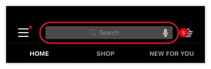
Global Header: Search-From-Anywhere + Loves + Basket

Honoring our design principle of “search front & center”, it’s now built into the global header.
You can jump into search from anywhere in the app.
Loves is also elevated next to Basket.
Research showed users using Loves as a staging area for Basket, frequently moving products back and forth in efforts to meet free shipping threshold.
And although we optimized for thumb reachability, top-right was the most successful placement for basket, as it is still the convention users expect for ecommerce apps.
Bottom Nav Tabs: The Winning IA
The top-performing organization of our app content.

Home Tab: From Static to Shoppable

Before: A static feed of marketing banners. Personalized stuff was hidden in the NEW FOR YOU tab. Not very shoppable.
After: A dynamic feed of product carousels to pull users into the shopping journey as soon as they open the app.
The New for You Carousel: A consolidated view of promos and offers highly personalized for you.
Shop Tab: Now With Visual Navigation

Before: A long list of categories set in serif font was difficult to read.
After: Icons help users scan more quickly and easily. Plus dedicated tabs for Sale & Offers and Rewards Bazaar.
Me Tab: All My Stuff in One Place

Before: Your “stuff” was scattered throughout the app.
After: A consolidated view of all personal and account-related content from across the Sephora ecosystem.
Order tracking and replenishment are front and center. Microcopy helps clarify what the user can find in each section.
Stores Tab: Everything Happening Near Me

Before: Store related features and content scattered across the app — not to mention a store-mode that hijacked the entire app when you walked into a store.
After: A feed of activities happening across Sephora stores in your metro area — plus a store finder and improved store mode to help bridge the physical/digital touchpoints.
Inspire Tab: A Home for Secondary, Non-Shopping Features

Before: These features were scattered throughout the app with no true “home”.
After: Things that support your shopping journey but are not critical to it have a permanent home here.
While these features live in the Inspire tab, you’ll primarily discover them while shopping because they are woven into relevant points along the shop path.
Takeaways & Advice
UI Takeaways
A “More” Tab Fails Due to Weak Information Scent

In testing, users ignored the “More” tab completely and got stuck looking for things in the other four tabs.
Changing it to “Inspire” better described the content within, and drove success way up.
We also added a subtle sparkle animation to encourage exploration.
Don’t Get Artistic With Key Ecommerce Conventions

We never questioned Sephora’s Basket icon but saw a lot of users struggling to understand what it was.
Redesigning to something less abstract solved the problem.
Unify Your Design System to Save Time and $$$

Mweb, Desktop, iOS, and Android were originally designed by different teams at different times with different styles. Launching new omni features was a pain because we had to design the same feature 4 different ways.
We took this project as an opportunity to clean up our iOS design system and overhaul our Android app to match.
Now we can do mostly platform-agnostic design, making change management and new feature rollout much easier.
On Research & Testing
Stop. Do Your Research First.

Resist the urge to jump into “designing the solution” right away — as tempting as it is.
Gather as much info from as many sources as possible to inform your design. Expose this info to design, product, engineering, and business partners so everyone is working from the same knowledge.
User Preference ≠ User Behavior.
Avoid: Asking users what they “want” or “like”.
Instead: Write compelling scenarios and watch what they actually do.
For example, users self-reported that they “like” and “would use” a feature that allowed them to toggle between LIST VIEW and GRID VIEW on search results pages. Analytics and observation from testing, however, revealed that precisely zero engaged with the feature.
Learn from observing how users behave, not by asking their preferences.
Don’t Get Hung Up on Making One Hero Design. Test EVERYTHING. Then, Test Some More.

Many design teams get hung up on creating one hero design right out of the gate.
We challenged ourselves to spread our ideas across many divergent prototypes. This helped us not get too attached to any single concept.
Test, experiment, validate, learn, iterate continuously as your design progresses through the stages of fidelity.
Benchmark! Use a Task List as a Scorecard

We created a master list of tasks that accounted for all the key tasks users should be able to complete within our app.
Everything from key shopping tasks to mundane things like editing a payment method or signing out.
Measure all usability tests with the same ruler.
Survey for Difficulty After Every Task

Tip: Don’t review 600+ hours of testing footage.
Instead: Ask users to rank difficulty after every task. Then look at the metrics and quickly zoom in on problem areas to figure out how to fix them.
On Collaboration
Listen to Stakeholders, But Don’t Let Them Drive.

Dozens of stakeholders wanted their features front and center.
We held multiple sessions to hear their pain points and ideas, but the final decisions resided with a smaller group whose main responsibility was to put the customer first.
Research & Usability Results Are the Antidote to Design by Committee

If you want to get something approved, tell the story of all the inputs and data you used to inform your design.
Show the progression of design through the various rounds of testing.
Show highlight reels and metrics that prove the design worked.
The best thing about this process was near instant, unanimous approval across the business.
Partner with Developers Early

It’s easy to exclude development partners until a design is ready to be “thrown over the wall.”
Avoid this. Our developers were core partners in the design process, contributing ideas and validating feasibility along the way.
By the end, they were much more invested in building the final product, as it was designed collaboratively.
Be Resourceful
Don’t have a dedicated analytics resource? Get trained and self-serve.
Don’t have resources for robust in-person interviews and testing? Use remote unmoderated testing for quick and affordable studies. Or walk around your office and do ad-hoc guerilla testing.
On a tight timeline? Get each member of the design team to contribute to prototyping and test analysis.
Want more research inputs? Set up a meeting with your customer service teams or store associates to hear their insights.
Read your app store reviews! Search Twitter and Facebook for mentions of your app or site.
The Team

Results Beyond Expectation
The new apps were released in September of 2019 and we’ve been refining ever since.
Download the app from the App Store or Google Play, and let us know what you think!
The Reviews Are In!
★★★★★ Easily Navigated~ app improved
Thank you Sephora! You guys have made your app SO much better! Rewards, and categories of products are much simpler to find. Just an added touch to make life brighter (hopefully my skin too with the products I bought)😉
★★★★★ I love this app!
I love everything about this app and they are constantly making it better by adding new features! Its my favorite makeup up — makeup store! I love the rewards, all the features!
★★★★★ Keeps getting better
I love that this app is keeping up with the time. It’s easy to use, and the shipping is super efficient
★★★★★ Easiest app EVER!
It’s so organized the way they’ve Laid it ! Love it! I can always find or search for anything quick & w suggestions if I can’t remember.
…With Some Room for Improvement
Thanks to a handful of scathing reviews, we were able to identify and resolve some flows that unintentionally became more difficult with the new design.
★★☆☆☆ Worse Than Before
Searching on this app is super slow and unresponsive, I usually need to enter my search twice before results turn up. I also hate how it’s not easy to find the sale section, promos, and rewards bazaar.
★☆☆☆☆ If It Ain’t Broke- Don’t Fix It
The update is horrible. Hard to locate and search for things. It’s like the Bazaar Rewards and promos were purposely hidden/made hard to locate. When I open the app there is so much going on- it’s almost overwhelming. Not sure I’ll be using this anymore.
Acting on Post-Launch Feedback
Change is never easy. Expect users to speak up when you move things around and be sure to react to feedback, even after the project goes live.
In response, we’ve made Sale, Offers/Promos, and Rewards, much easier to find across apps and web, including a dedicated Offers tab in the bottom navigation.
Questions? Comments? Let me know! I hope this was helpful. I’d love to hear from the community, so please chime in if you have any thoughts.

