6 tips for designing better mobile sign up forms
It’s important that the process of signing up for your application is a stress-free one, especially since it’s the first experience users will have with your application.
Through my research on what makes a sign up form delight rather than disappoint, I have compiled 6 tips for designing sign up forms.
1. Only require signing up when necessary.
A sign up form as the first screen for an application can deter users from wanting to use it. By allowing some functionality and information to be accessible to users without logging in, users become familiar with your application without committing to signing up right away.
For our mock example, users are able to view and search for products, and are only prompted to sign in when trying to perform actions that require a sign in, such as writing a review of a product or trying to view the “Profile” tab.
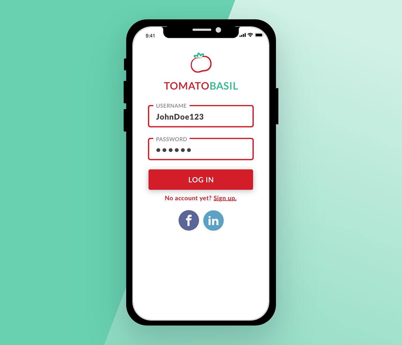
2. Include a social login.
Giving users to sign up for your app through a social media platform like Facebook or LinkedIn allows users to skip filling out forms. It’s one less barrier to users to begin using your app or website.
Social media logos like Facebook’s blue “f” are recognizable to most users, and will definitely be recognizable to a user looking to use Facebook as a way to login to your application, so there is no need to label social media icons on your app screen. Save precious real estate on your mobile screen by keeping the social media icons simple and label-less.
3. Top align your labels.
Users fill out forms faster when labels are top aligned. This is because top aligned labels allow users to move down the form in one visual direction. Left and right aligned labels require two visual directions to fill out.
The only downside? Top aligned labels can cause increased form length. This is why I recommend inset labels as shown in the example. This visual solution keeps your form fields top aligned without dramatically increasing the length of your forms. As shown in Google Material Design, you can also have the text field label in place of the input text, moving from the middle of the text field to the top (if the field is selected). With this solution, your labels will always be visible, but never in the way.

4. Show the value in signing up for your application.
By indicating why signing up for yet another application will be valuable to your user, you’ll have a much easier time getting users to follow through with the process. Clearly define the value your application brings to the user in concise and clear language, prominently placed within the UI.
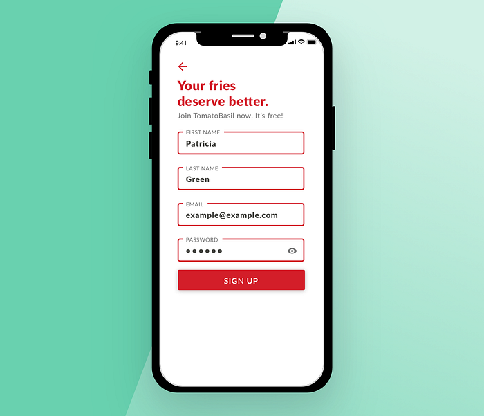
5. Kill the confirm password field.
While common on many sign up forms, confirm password fields lower your conversion rate. Because a password field typically masks the user’s input, a confirm password field is thought to reduce typos. A confirm password field does
Instead, implement an unmasking option, indicated in our mock example with a simple, tappable icon to the far right of the form. This icon is universally recognized and is quickly becoming the standard for signup forms.

6. Define text field styles.
A text field is an input field that a user can type into. It has a range of options and supports several text formats including numbers.
Text fields have two major states: enabled or disabled. In the enabled state, these user interactions are available: default, error, hover, idle & filled, focus, and disabled. Text field inputs can be either empty or filled, valid or invalid. Defining these different states with visual design gives the user feedback when interacting with the interface.


