Member-only story
7 common Figma design problems (and how to fix them)
Practical ways to overcome 7 common Figma design issues, caused by auto layout, constraints, groups, frames, components, and duplicates.
Figma has made designing for digital accessible to millions, but even the most eagle-eyed designers still run into trouble. Whether you’re a beginner or a seasoned veteran, the old adage is true: it pays to learn from our mistakes. Here’s a record of those problems, what they’re typically caused by, and how to fix them—being practical with our time.
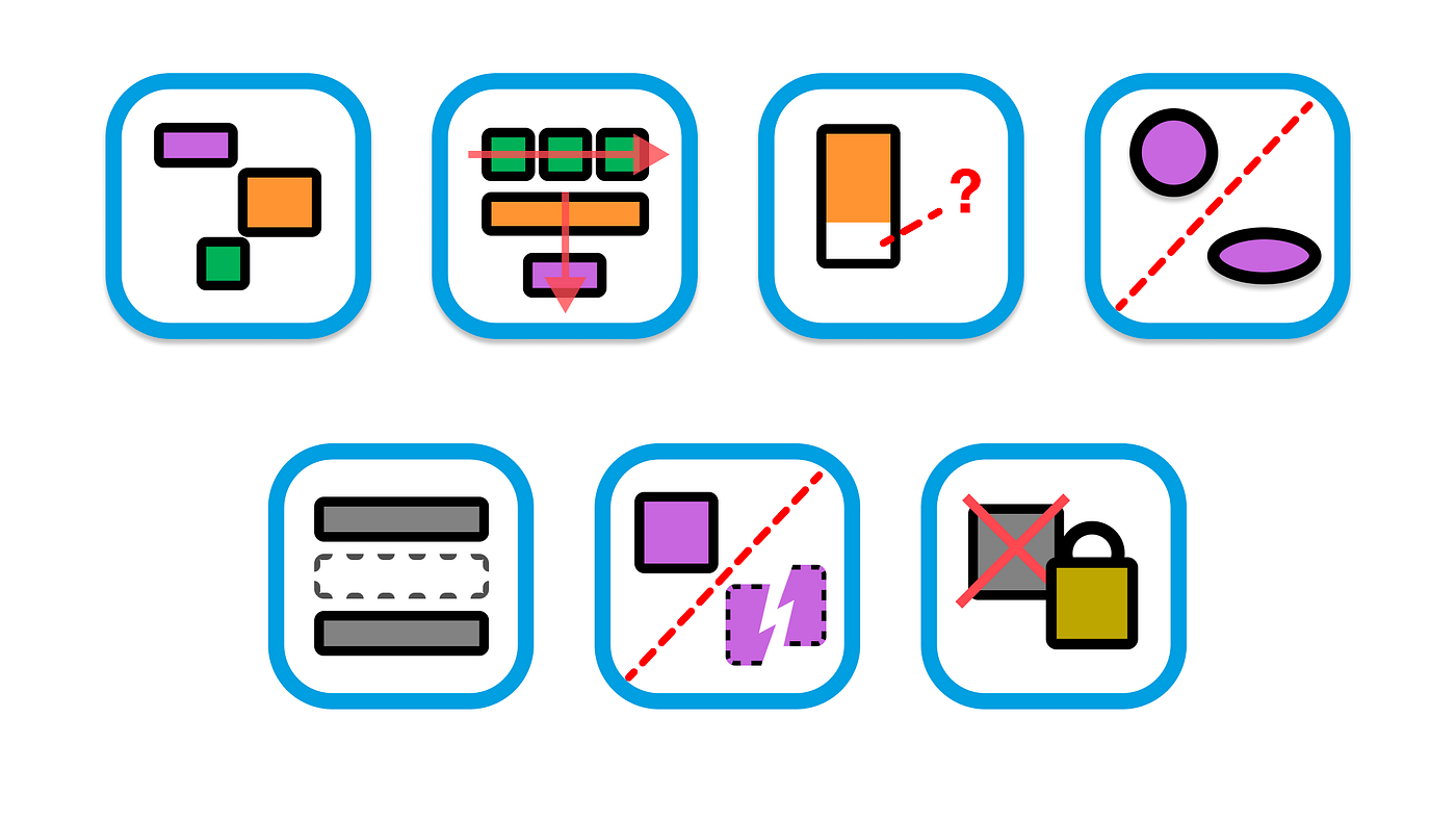
1: Alignment to the wrong side

Common causes: auto layout or constraint settings.
If some of the layers are on the wrong side or centred after applying auto layout, there’s 2 main things you can check.
Text alignment
For text layers, it’s worth double checking the text alignment settings. Often, you may accidentally duplicate other text layers with settings that are different to what you want.