7 Design Commandments
User experience is the most valuable piece of product design here at Onfleet. But working in an agile mode, releasing weekly features and improvements while keeping things under control and not wasting time with meetings becomes challenging. How do we keep everyone’s vision in the same place, regardless of their background?
We needed to establish a set of design principles or how I like to call them — commandments — that everyone on the team can understand and apply in their day-to-day work building the best delivery management software.
Below I present to you our design commandments. They are exactly that, commandments that we need to obey to make Nina — Onfleet’s average user — most efficient and happy user possible.
1. Give Nina exactly the information and tools needed. Don’t hide the complexity, as doing so will only serve to increase it. Don’t show too much, as doing so will distract Nina.


2. Make it easy for Nina to discover information and tools she needs. If she can’t see it, it doesn’t exist.

3. Keep UI elements visually same when they act the same and visually different when they act differently.

4. Keep Nina informed of what’s happening in the interface and keep her expectations aligned with what’s about to happen.

5. Nina is in charge and the interface should be flexible enough to let her accomplish her goals the way she wants.
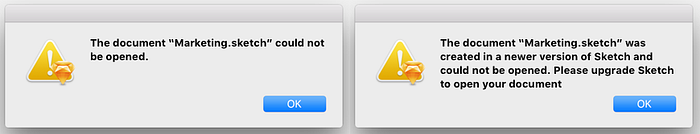
6. When Nina makes a mistake, explain what went wrong and provide guidance on what she needs to do to fix the mistake.

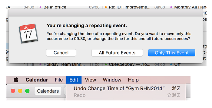
7. Make Nina’s actions easily-reversible and allow for an easy way out if she gets lost.
Establishing a set of flexible rules that can be applied to every aspect of your product is a productivity booster for the whole team. I urge you to come up with yours, or use ours in order to delight your users. Good luck!


