
7 Lessons That Fairy Tales Teach Us About User Experience (UX) Design
By Steve McCarthy
Robert McKee once wrote that “stories are the currency of human contact.” Stories are our way of making sense of the world around us. The greater we make sense of our surroundings the greater chance we have of survival, and the knowledge we gain becomes the value exchange we make when we tell stories. Each story shared is a lesson learned about our world.
Today, our personal narratives play out in a hybrid world of the digital and the physical. We now move so seamlessly between the two that we often forget that the former is still in its infancy. We easily forget that things in the digital world don’t always conform to the laws of the physical world, and this can be frustrating.
The popularity and durability of fairy tales is due in part to their simplicity: they look to teach a singular lesson about the physical world we live in. But these learnings are just as applicable to the digital world as they are the physical, as I explore below…

#1 The Three Little Pigs
UX Learning: It’s important to build on a solid foundation
A good experience requires thought, and thought requires time. Too often websites and mobile applications jump straight from conception into UI design without the planning and architecting required; be that creating process flows, taxonomies, sitemaps, or a content matrix. Imagine trying to interior design a house that hasn’t yet been built.
Three of the five core UX elements are directly influenced by the architecture and organisation of a website. Haste and a failure to plan sufficiently, as the Three Little Pigs fable reminds us, can lead to shaky foundations; in the world of digital this means poorly constructed user journeys, unorganised content and a difficult to navigate website. Once these problems have been created they rarely go away on their own accord, and the website/application owner will be left building on top of an unstable structure and plastering over the cracks forever more.
The good news is that the history of the web teaches us that good architecture is mostly about remembering the basics: create a hierarchy for content; group content logically; use progressive disclosure to reveal content gradually; be consistent with how structural, associative and utility navigation is used; offer clear signposting. There’s a reason why Wikipedia has lasted so long — it executes the basics really well.

I’ve found the best way to avoid the wolf blowing down your website / application is to: a) produce a sitemap, b) write a ‘standards’ document. Both documents should be visual. The sitemap should visualise the grouping and hierarchy of content, while the standards document should list the rules that govern the content e.g. Standard #23: All pages/screens should have an omnipresent primary navigation. Armed with just these two documents alone a website stands a far greater chance of surviving.
Take the time to build a stable structure.

#2 The Princess and the Pea
UX Learning: Users have preset expectations that shouldn’t be tested
Traditionally websites have 3 key structural UI components: a header, a body, and a footer. Together these provide a tried and tested canvas for designers to paint on top of.
Over time, these components have come to include predictable characteristics. For example, a header will commonly contain: the website name (and logo), a primary navigation, a utility navigation, search functionality, log-in capabilities etc. Furthermore, their location within the header even follows a pattern: the brand logo is normally positioned far left of the header.
Not all websites follow this pattern, and some would argue that those who break the rules are pioneering for better, uniquer digital experiences. I don’t intend to challenge this sentiment, but the fact is that currently the majority of the web is made up of websites that DO follow this pattern.
Universal online consistency, or conformity — however you want to see it — increases the likelihood of a user’s exposure to this structural pattern. The more they view a header with a logo in the top-left, the more likely they are to expect it to be there. This means that users have preconceptions about how a new website will work before they even visit it. This is known as their mental model. When discussing digital UX a mental model is best defined as meaning:
The mental composition of digital elements and objects for the purpose of discerning meaning and saving time
For example the general mental model of a ‘house’ is that there will be four walls, a roof, windows and a door. When you approach any house you know that you enter via the door and therefore seek out the entrance that most looks like a door, rather than, say, a window. This saves you time – you’re not forced to evaluate every possible entrance the house may offer. Similarly, many users have a standard mental model for what elements should be included in a website.
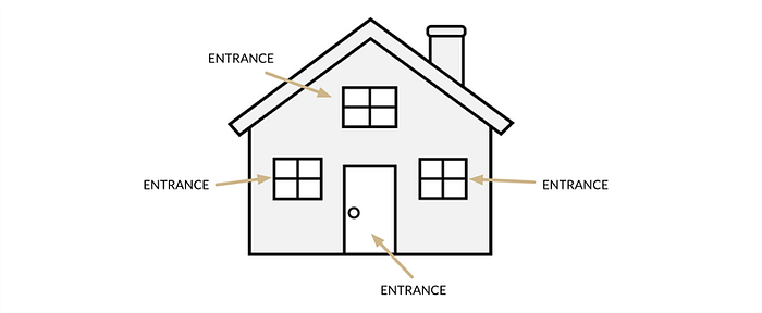
The Princess and the Pea tale teaches us that it doesn’t take much to be out of place for us to notice. Like the Princess, users will have a bad experience if things have been placed where they don’t expect them to be.
Again, creating a standards document can help avoid creating a website that doesn’t meet expectations. This can be informed by research such as a competitor review and validated through user testing. Competitor reviews are often viewed as a way of staying ahead of the competition, but actually they can also help you predict your users’ mental models in advance of them reaching your website or using your application.
For example, say you’re a car manufacturer. It’s almost a given that users visiting your website will have visited the competition. If the competition all have their primary navigation placed horizontally in the header and you have yours fixed vertically to the left of the screen, then your users are going to view your website as different and confusing. Suddenly navigating your website requires thought and effort. Suddenly a simple task has become arduous, and all because their expectations have been challenged unnecessarily.
Users are sensitive, treat them like princesses.

#3 Hansel and Gretel
UX Learning: Users are always looking for a way back home
The fairy tale that is best known for influencing interface design is that of Hansel and Gretel, the two children who wandered into the woods, got tricked by a witch, and thanks to some strategically placed breadcrumbs found their way back home to safety.
Breadcrumbs are now a common feature of web design, especially for large websites where content has been divided into sections and sub-sections. Breadcrumbs serve three main purposes: to orientate, to navigate and to reassure. They orientate the user by informing them where they currently are within the site structure, and then provide a navigation route back to previous levels through hyperlinks.
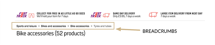
More than anything, though, they provide reassurance. Most online activity involves what’s known as information foraging – the quest for knowledge. Just think about the number of times you’ve ended up on IMDB trying to find the name of that actor you can’t remember. Often, this foraging will require digging further than just a search engine result page (SERP), and it is here that breadcrumbs are their most useful.
Imagine you’re looking to buy a red bow to gift wrap a present with. You search for bows on your favourite search engine and arrive at an online retailer’s web page. If the site has breadcrumbs they might look something like this:
Gifts > Wrapping > Bows
The breadcrumbs provide context to the information you’re seeing and reassure you that you’re in the correct location. If the breadcrumbs looked like this:
Gifts > Sports & Leisure > Archery > Bows
…then you’d be significantly less confident.

#4 Goldilocks and the Three Bears
UX Learning: Anchors help to give information context and emphasis
This fairy tale actually lends its name to a well-worn UX principle: the Goldilocks Effect. The effect occurs when three similar items are presented to a user side-by-side, and differentiated on a measure of a scale. For example three bowls of porridge that can be measured on a scale of temperature.
The combination of scale and specifically three items leads to two important states being created: 1) high and low anchors are formed; 2) a definitive middle option emerges. (This is not to be confused with the Decoy Effect which is a cognitive bias that has a similar purpose, but a different implementation).
Anchors are pieces of information that we latch onto in order to ascertain context from the physical world. They create a baseline for measurement.
For example, imagine you’re buying a precious stone that you’ve never bought before. You get a quote from Dealer A of £5,000. You then get a quote from Dealer B of £10,000. Looks like Dealer A is offering the best deal.

But then you get a quote from Dealer C of £100,000. Dealer A is still offering the best deal, but suddenly Dealer B’s quote doesn’t look too bad. If you’re buying this stone as a gift you might even begin to feel cheap for considering Dealer A’s quote, considering there are much more expensive stones out there in the marketplace.

Quotes A and C create high/low anchors from which we can discern context. Ideally we’d look to seek more information – in this case more quotes – to better understand if A and B are the norm, and determine if C is an anomaly. But when faced with limited information we are forced to find meaning in what we know.
In the digital world, the Goldilocks Effect can be used whenever we want to encourage users to choose a specific option that benefits our business objectives. If we’re selling a service or product online and we want one to stand out (perhaps we have too much stock), then presenting two additional options at opposite ends of a spectrum of scale e.g. price, will elevate its status in the eye of the user. If the two additional options are selected instead that’s ok too, but their presence on the page is primarily to act as props – supporting and emphasising the star product.
Design also plays a significant role in the success of this effect. Colour, proximity, positioning, and weighting should all be used to visually elevate the star product. But it’s the anchors that set the stage.
Once set, anchors can be very difficult to shift in the physical world. It’s the reason why everything always feels so expensive compared to the past. Really this is just inflation hiking up prices gradually over time without us resetting our anchors. For example, I remember the first time I bought a packet of crisps — they were about 25p (the anchor was set). Now, 20 odd years later, when I buy a packet of crisps for 75p I still compare it to that initial anchor.
To borrow and adapt Descartes’ famous proposition: “I thought therefore I am.” The influence of anchors on our perception of the world teaches us that we are the sum of our knowledge at any given time.

#5 The Ugly Duckling
UX Learning: Beauty is relative
I’ll be honest, the moral of the Ugly Duckling fairy tale has always escaped me. Is it about overcoming bullying? Is it about beauty not being on the inside? I’m not too sure.
For me, the most important UX learning for us to takeaway from this particular fairy tale is that beauty is relative to the context in which it is perceived. The ugly duckling is the lowest anchor on a scale measuring aesthetics. Without the ugly duckling the other animals wouldn’t look as great as they do.
This same logic can be applied to CTAs on a webpage. Imagine you have a page with a single CTA (Button 1). This is the thing we want the user to do e.g. buy a product, or add to basket. A user visiting this page has what is known as a Hobson’s choice: the user can a) buy the product, b) not buy the product. Take it or leave it. Most users will choose to not buy the product when faced with this decision.
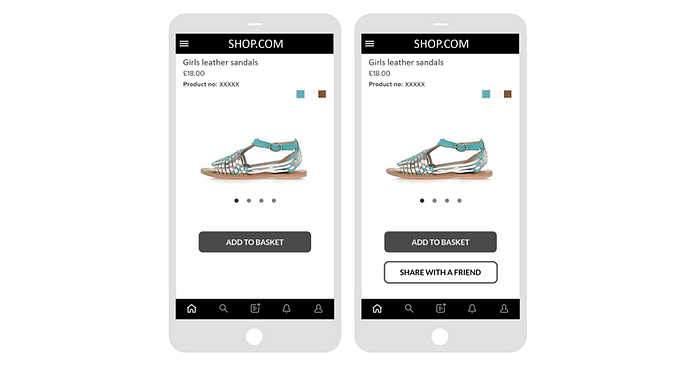
Now imagine that an additional button is added to the page (Button 2). Button 2 is deliberately designed to be something that requires more effort for the user, but still a positive outcome for the business e.g. a link to share the page on the user’s social channels. This button is our ugly duckling.
Research shows that the presence of this second button, when placed in close proximity, improves the conversion rate of Button 1. It’s called the Hobson +1 effect.

#6 The Boy Who Cried Wolf
UX Learning: Don’t mislead your users with false information
Information is delivered to users in many forms as they traverse your website or application; from grouping of content to the colours you use, users are constantly looking to make sense of the world from the signs we create. This concept is the foundation of semiotic theory; the study of signs and their meaning. (I discuss semiotics and UX in greater deal in the article: Do Icons Need Labels?)
A great example of semiotic theory in action is through specific design cues known as affordances. Coined by the godfather of UX, Don Norman, affordances describe the stimuli that afford the opportunity for action. For example, a car door handle affords pulling; its very design encourages a certain type of action that will aid the user in achieving their desired goal: to open the door. In this instance the sign being communicated is: to pull.

In the 2D world of web design, affordances are far harder to come by. In the early days of web design the principle of skeuomorphism was applied in an attempt to mirror the physical world – remember the sense of depth that iOS6 used to provide?
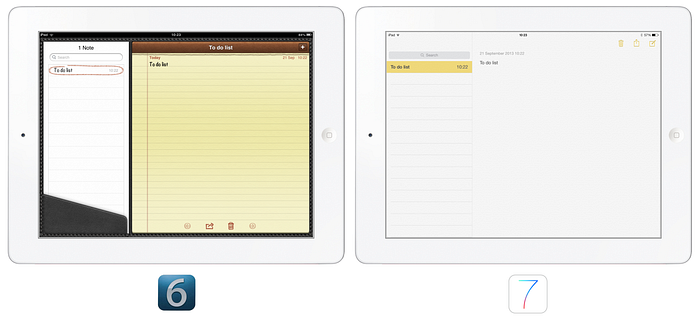
But then flat design took over and we were left with buttons that no longer looked clickable. They had lost all their affordances, and their meaning became harder to interpret.
This left users with a trust issue. Was every rectangle a button? And left web designers with a greater responsibility to ensure that their designs were considered and, more importantly, consistent. After all, meaning comes from repetition of experience. If blue underlined text on one page indicates a clickable link, then we would assume that the same underlined blue text on another page is also clickable. If it is, then we learn. And the mental effort required to interpret that particular element is reduced forever more: blue + text + underlined = clickable link.
Problems arise when we receive false signals. The fable of The Boy Who Cried Wolf reminds us of this. Without thinking of the consequences of his actions, the boy signifies danger to the residents of the town through the audio cue of “wolf”, but when the villagers arrive to find no wolf on two occasions their interpretation of the sign diminishes. When a wolf eventually appears and the boy signifies the danger, his sign has lost its meaning and the villagers no longer trust it.
The same occurs when users visit your site and receive unintended and false cues. This is amplified further if the website is owned by a recognised brand. Brand recognition carries with it the weight of authority. Consistency, therefore, is key — again a ‘standards’ document can help mitigate against this.
Remember: people believe authority, but lie and they will never trust you again.

#7 The Emperor’s New Clothes
UX Learning: Don’t be afraid to challenge preconceptions
What better way to end a list of learnings than with a caveat that excuses them all.
The Emperor’s New Clothes is a cautionary tale of the pitfalls of pride, and a reminder that we should always question what we’re told.
Remember image carousels? A big trend emerged in the early noughties where every website decided to have one on their homepage as a way of displaying gallery images, promotions, and products. Many websites still do.
But the data suggests that these are not very useful, in fact they’re pretty awful. The main reason that they are ineffective is that their primary purpose is to hide and reveal content. This violates one of the most important usability heuristics: recognition over recall.
Minimise the user’s memory load by making objects, actions, and options visible. The user should not have to remember information from one part of the dialogue to another.
As the user scrolls through a carousel they are forced to remember every option in order to make an informed decision. Worse still, we’re hardwired as humans to want to have the complete picture before making a decision. That means if we know that there are 25 options available to us, we’ll probably want to see them all before making a choice. That’s not very user-friendly.
Much like the physical world, the digital worlds we create are constantly changing. The landscape is never fixed for too long, and so cyclical, evidence based learning is the only true way to monitor how user experience evolves as the physical and digital become ever more entwined.
History has shown us that whenever a new digital interface is introduced to the world — desktop computers, touch-screen devices, wearable technology, and VR — the truths we think we know about UX best practice are thrown into question.
In such scenarios the UI design is forced to work extra hard to help users adopt the new technology, often reverting back to basics.
Again, remember how iOS used skeuomorphism to add a sense of depth in its earlier versions when the iPad first launched? This was a deliberate attempt by Apple to incorporate real world design cues to help users familiarise themselves with the digital landscape quicker.
Flat design has since become the norm in web and app design, but now similar discussions are being had to address our lack of exposure to VR worlds. When in a virtual world, would it be beneficial for digital files e.g. a book, to be located on a virtual bookshelf? Skeuomorphism may not be dead after all. And the cycle continues.
The learning here is that when it comes to UX we can never be absolutely certain that what we know today will remain true tomorrow.
Over time the “training wheels” of design can be removed. But knowing when to challenge convention is difficult (it took Apple 6 iterations of iOS before they felt confident enough to adopt flat design).
One proposed solution is progressive reduction, an idea put forward by Allan Grinshtein. The premise of progressive reduction is that as a user becomes more familiar with an interface they have less need for overt design cues. The design ends up being led by the user’s familiarity with the UI — their expertise level.
As their exposure increases, there is less need for the design to hold the user by the hand. This removes the need for UX to have to cater to the lowest denominator, and instead begins to make UX truly personal.
If we were to create a graph to illustrate this point it might look something like this where x+y=10. On the x scale we have the user’s expertise level where 1 = low familiarity with the UI, and 10 = high familiarity. On the y scale we have the interface’s requirement to guide the user, with 1 = a low need for guidance, and 10 = a high need.
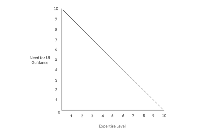
It is easy to imagine a future where responsive design is no longer about a web page resizing to fit specific dimensions, but instead about an interface adapting to the user using it; where User A with a high expertise level receives a very different experience to User B who has a low expertise level.
In some ways this is the natural progression of CRM, where a business’s relational capital (the accumulated knowledge of all previous relationships with their customers) is harnessed to inform the interfaces their customers are presented with throughout their relationship with the business. This is true personalisation; data-driven design at its most influential.
If “stories are the currency of human contact”, then UX design is the minting process, creating a mechanism through which trade can successfully occur.


