A few other things for your accessibility checklist
7 essential accessibility sticking points you might have overlooked in your applications.

There are loads of requirements in order to fully comply with accessibility by WCAG standards. While you might be familiar with the usual accessibility checklist, today I will break down other things in the accessibility checklist that you might not have heard of.
1. Actionable information in a time-based setting
WCAG: Enough Time
Give users enough time to digest the content and take action in their own time or give users options to turn off or pause in the setting, unless it’s real-time events such as auctions, gambling/betting, multiplayer games, scores updates, etc. You should also note that this is directed to components that have actionable information, not a decorative interface. The most common type of component to watch out for is Toasts. Toasts with action should persist for at least 10,000 milliseconds to give users enough time to act on them.
If you want to take it one step further to meet the AAA level, do not give time limits or constraints to the component. You let users dismiss or close the component by themselves. It is also a good UX practice to keep users informed at all times, especially in a time-based setting, so let users be warned of any timeouts that could result in data loss.

2. Preserve information on smaller screen sizes
WCAG: Reflow
I cannot stress enough how paramount this point is; for me, it’s one of the main sticking points that I immediately think about in designing on different screen sizes. You should always test your application in a 400% zoom view. Unsurprisingly, a lot of web applications fail on this test; yes, even famous web applications you know or use often.
Just because you are working on a smaller screen, it doesn’t mean that you can willy-nilly do a content reduction because it doesn’t look nice on a smaller screen. You should strive to keep all the information intact, even on the smaller screen. A great example is the BBC homepage on the top navigation. See here

3. Be careful in the use of space
WCAG: Reflow
Following on from point number two above, watch out for the sticky top navigation or bottom navigation. For example, while 64px is not a lot on an average desktop screen, 64px can eat up almost half of your screen in a 400% zoom view. Make sure anything that has a fixed position is adjusted in a 400% zoom view. This includes the Floating Action Button, Modals, Sticky Navigations, Toasts, etc. Make sure that there’s enough space for the main content to be read or seen and the fixed elements are not intrusive to the main content.

4. Be wise in applying animation
WCAG: Animation from Interactions
Don’t we all as designers love seeing a slick and smooth animation. That’s all great, but please make sure that your animation actually has value in use. The basic principle is: if it’s not necessary, don’t use it. Keep the vanity down in animation use. Let’s focus on being more inclusive in design instead; remember, you are not designing the product just for yourself: not all users can digest parallax scrolling, page-flipping transition, or swirling modal window effects. A vestibular disorder or seizures for some users may get triggered by the excessive use of animation. Ideally for the AAA standard, there should not be page content flashes more than three times per second, unless it’s small and the flashes are in low contrast and do not contain much red.
But do not let this restrict your idea. Animation that is essential to the functionality or information of an application is allowed, just be wise about it.

5. Make horizontal scrolling easier
WCAG: Reflow
I’m personally not a big fan of horizontal scrolling. It feels clunky. Furthermore, not all users use a mouse that allows horizontal scrolling or a touchpad in accessing your application. That said, you are still allowed to use horizontal scrolling but make sure that it’s accessible and not hidden on different screen sizes. Provide functionality that can make horizontal scrolling easier.
Pay special attention to horizontal scrolling in tables. Data-rich tables will inevitably have to use horizontal scrolling. Make sure that your table is flexible enough that horizontal scrolling does not cause any loss of information.

6. Pages and design components are keyboard friendly
WCAG: Keyboard Accessible
A keyboard check is essential during the accessibility check to ensure that all page functionality is accessible using the keyboard. I once made the mistake of having a keyboard trap in the area of the accordion section, where the focus loops around that section infinitely. It’s easy to miss when you have a lot going on in your application.
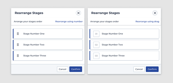
However, the most common mistake I see is on ‘drag and drop’ functionality. This often gets overlooked in accessibility design by not realising that ‘drag and drop’ relies on mouse interaction. For example, if you have the functionality of reordering items, you might want to switch to something that’s more keyboard-friendly or provide an alternative so users have the options to choose from.
7. Skip navigation
WCAG: Navigable
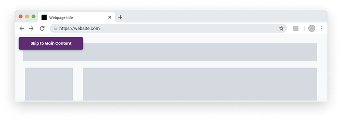
Related to the point above, when keyboard-only users interact with your site or web application, users use the tab key to jump from one link to another link and you might have a lot of links on your first page in the header or top navigation, or in a menu. Users need to keep pressing the tab key every time they land on the page to get to the link they already know they need to get to, or to the main content. By providing the ‘Skip to Main Content’ button right off the bat, you’ll allow users to bypass all those tab clicks and jump to the main content in an instant.
Designing applications that adhere to accessibility guidelines can feel restrictive, or even overwhelming, but it doesn’t have to be. The very essence of designing an accessible and inclusive application is the same essence of being a good designer, that is being empathetic.
The guidelines are all there and laid out for you, read it, learn from it, and apply it in your everyday practice. Rather than thinking that accessibility being restrictive, think of it as a challenge, a challenge that forces you to be more creative, to be more mindful about people’s adversity, to be more inclusive, particularly to the users that have long been neglected because of their impairment.
I’m excited about WCAG 3.0 to further support accessibility better.
Reading Resources (must read):
7 Things Every Designer Needs to Know about Accessibility
Making the Case for Accessibility
Designing for accessibility is not that hard


