7 powerful tips to help improve your Typography skills (Updated)
Small, and easy to put into practice tips to help improve your typography
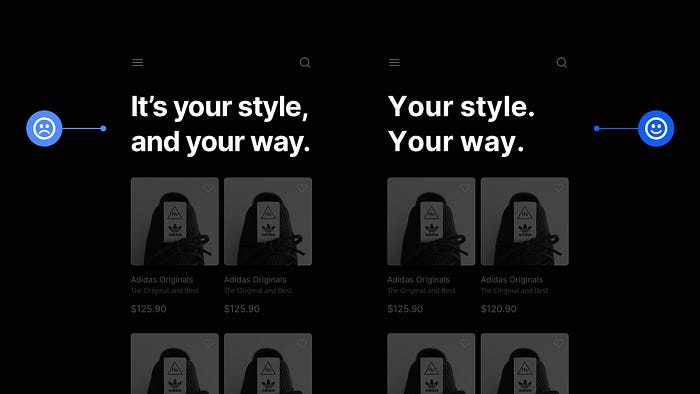
A thorough understanding of Typography is essential in creating great UIs.
Why?
Because most of what you see on the web is content-based, having a better understanding of typography can help you hold the reader’s attention, provide a better user experience, and strengthen the meaning of the text you’re presenting.
I wanted to show you a few tips in this updated article to help you gain a better understanding and feel more confident when working with type on your next project.
Let’s dive on in…
1. To improve the optical balance of your headings, reduce the letter spacing.
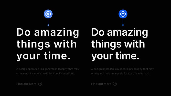
Are you reducing letter-spacing on long-form Body text? That’s a big no-no!
However, when it comes to Headings…
… go for it!
Because your Headings are likely to be much larger and heavier than their Body text counterparts, the spacing between the letters may appear larger, which isn’t always what you want when it comes to achieving that perfect aesthetic.
Even small reductions in letter-spacing can make your Headings more optically balanced, readable, and pleasant to view.
2. Make sure your Headlines and Body Text have the perfect vertical rhythm.
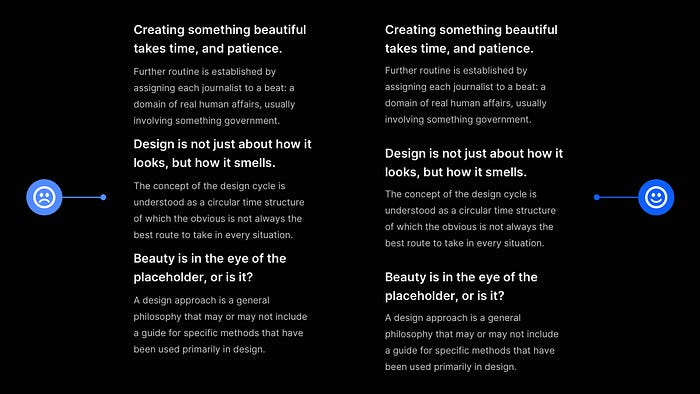
To achieve an excellent Vertical Rhythm and solid Visual Hierarchy between text elements in your designs, you need to look after those margins.
I’ve seen a lot of designs, most notably in article lists, where headings have been given equal top and bottom margins, removing the connection with the body text beneath them.
In situations like this, I always give my headings a little more top margin and a slightly less bottom margin, so the connection between the headline and the content beneath is stronger, and the correct Vertical Rhythm and Visual Hierarchy is maintained across all of the articles.
3. All-caps should only be used for short titles, such as Kickers.

Do you want to use All-caps on your Titles? Cool. Make sure they’re pretty short, preferably one line, as using them for longer texts is not the best practice.
One of the best usages is on Kickers (sometimes referred to as Overlines). These short phrases, usually only a few words long, can be placed above your titles and are ideal when using All-caps.
Also, increasing the amount of letter-spacing to titles (with All-caps applied), can also allow them to breathe and look better optically.
4. If you can keep your titles short, and concise… ‘Just do it’

Keep titles short, concise, and to the point, if possible and appropriate.
People scan titles, so keeping them concise makes it easier to absorb the information.
Remember that this method can come across as abrupt, so you should consider the type of project you’re working on and the intended audience before deciding whether this method, rather than the more traditional format, is appropriate.
5. When looking for a multi-purpose typeface, choose one that comes in a variety of weights and styles.
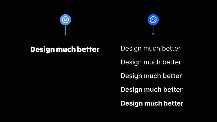
Is the Typeface you’ve been looking at available in a wide range of weights and styles? If you plan to use it for a few projects, double-check that it does.
Of course, there are exceptions, and specific projects may require a more elaborate Typeface with a ‘one style only’ option, but for the vast majority of projects, you want Typefaces with a little more… well… choice.
Even if you only plan to use two or three weights or styles, leave yourself some breathing room if you need to use more later.
6. Choose the correct typeface to give your design the perfect ‘voice’.
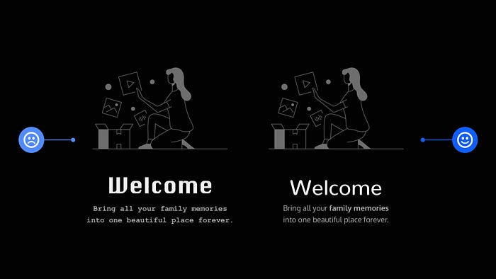
When working with text on a project, the Typeface you choose impacts the voice in which your text is spoken. Loud, soft, friendly, or formal.
Each Typeface has a distinct voice, and the trick is to pick the right one for the project you’re working on.
This can seem difficult if you’re new to working with Typefaces, but don’t be afraid to be inspired by similar projects and draw ideas from them to help guide your judgments and increase your understanding of what is appropriate.
7. Improve Readability by selecting a proper Line Length for your body content.
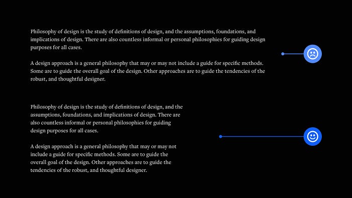
Finding a suitable line length for Body text can be a delicate balancing act.
For a single-column page, 45 to 75 characters is widely regarded as a good line length, with a 66 character line (which includes both letters and spaces) determined to be the optimal length.
Naturally, font-size and line-height play a factor in determining readability, but for line length, stick to the 45 to 75 character limits, and you’ll be fine.
With this short collection of typography tips, I hope you’ve realised how even the smallest changes to your designs can result in better end-results for you and your users.
By the way, you can improve the designs you create, massively, with my Design System for Figma; Cabana is available. Special Offer: Please use the code CABANA35 to receive 35% OFF.
Originally published at marcandrew.me on January 27th, 2022.

