7 tips to design faster
And a why speed is important.
Spoiler alert! It’s not about having the best hardware, drinking a cocktail of red bull & coffee or knowing all the shortcuts of your favourite design tools (although this last one won't hurt you).
In this article I’ll share 7 tips that I believe help me to design fast, and I hope can help you too. To make this a bit more meaningful I’ll also share a real world experience that helps to illustrate these tips in action.
But first let’s understand why do you need to be fast in the first place.
Why?
Designers often want time. Time to get inspired, think, explore, brainstorm, meditate, check dribbble, scroll a couple articles on medium but only look at the pictures and read the titles… you get it, it’s all part of the creative process.
As a designer I can’t really argue with that.
However, in the real world, more often than not you’ll find yourself in a situation where you need to deliver something yesterday, and in such situations you just have to deliver.
Next to that lives the "fact" that, when you have a relaxed deadline you’ll probably waste most of the time looking for "inspiration", leaving you in a position where you have to sprint to deliver something.
Basically, whether you have a tight deadline or you just want to procrastinate, being fast will only help.
You're not in a rush? You don't procrastinate?
First of all… 👏 GOOD 👏 FOR 👏 YOU!
However, being fast is not only handy when you have to deal with tough deadlines, it can also help you stand out as a designer.
As you might already know, designing is an iterative process, you try again and again until you get to the best solution. If you’re fast, you can try more things, understand what doesn’t work, improve it and potentially you’ll get to an even better solution.
You can also go the extra mile and deliver more than what is expected, blowing away your client or boss. Moreover, when you do more you don't just improve your chances of coming up with something great, you also improve yourself, because practice does make perfect. There's no such a thing as talent, you get good at something by doing it over and over, and the more you do it, the better you become at it.
With that out of the way, let's get to the tips.
1. Define your goal

When you're in a rush it's tempting to jump into "design mode", however that approach might actually slow you down. I rather take some time in the beggining to reflect and think what I want to accomplish before I start, because then, when I actually start I have a clear target.
Not defining a goal is the same as if you go practice shooting with your eyes closed. You might hit something but it's way easier to do so if you can see your target.
This shouldn’t take you ages though, don’t use it as another excuse to not get started.
2. Don’t wait for inspiration

There's no such a thing as a "creative block", you might not be able to design great things all the time but you can design something, just get to it.
If you're aiming for quality you might be waiting for that strike of genius to strike, and you think that is not wasting time because in the end it's all worth it, right? After all, quality is better than quantity, am-i-right? NOPE, this is just a fallacy.
While you’re waiting for the muse to show up, someone else could have put down idea after idea, maybe not so great ideas in the beginning but through the power of iteration, this person can keep on improving, maybe a crappy idea then becomes something nice if you take just a slightly different angle and in the end they will have a better result than someone that was waiting for that one brilliant idea to show up, which might not even work in reality.
This story/experiment from the book Art & Fear illustrates this point really nicely. TLDR version: A teacher announced to his class that they were going to be divided in 2 groups, one would be evaluated solely based on quality, the other on quantity. When it came to evaluating the work, the ones of highest quality came from the group that was going to be graded based on quantity.
This means that quantity leads to quality, so instead of waiting for the best idea to fall from the sky, 👏 JUST 👏 GET 👏 STARTED.
This leads me to the next step.
3. Sketch, sketch, SKETCH!

Independently of the problem I have to solve, I always like to start with sketching. It’s one of the most efficient ways to put abstract ideas into something tangible and see if they can work.
It costs you very little time you're not invested or attached to these ideas yet, which makes it easier to throw them away if you need to.
It might sound counter productive, because if you want to be fast, "doodling" might sound like a step in between you and the final thing, but it's not, because you just don't know what the final thing is yet. You're experimenting, so you better do it in a way that is fast and inexpensive.
4. Share your progress

I'm a firm believer that is best to share your work sooner rather than later. You’ll get other perspectives and you might just get the feedback that you need to take your idea to the next level.
You might also realise that your idea doesn’t work or get a suggestion that means you have to throw away everything you did so far, if that’s the case, you rather do it early in the process, when your investment was minimal and you're less attached to the work.
Another advantage of sharing the work is dividing the sense of ownership with others, for instance, if you're working in a team and you share your work with colleagues, when you go to a design critique it's more likely that they'll back you up, and help you sell the idea.
5. Listen

Sharing doesn’t mean anything if you don’t listen to the feedback that others will give you. Make sure to listen what people have to say and then decide whether or not it’s something that you need to take into account.
When you're designing it's really easy to get lost on your ideas, it's also easy to discard ideas that come from people, that might have less expertise in the subject than you. However, I believe it's important to remember that you’re not designing for yourself, you’re designing for others, so you can never rely solely on your own opinion.
With that said, you're the expert, listening doesn’t mean that you have to blindly execute whatever others suggest, it just means that you don’t ignore it. You take it to heart, you detatch your ego from your design and really try to see wether or not it makes sense to do something about it.
6. Design in stages

If you want to move fast, you can't spend time in details when you don't even know if the base idea works, you need focus on what is important. That's why I like to break things in stages, so I can have check-points where I can share something and see if it makes sense to move to the next fase.
These will very much depend on what you're trying to do, but here's a very loose guideline:
Stage 1. The general idea — This can be a very rough sketch that illustrates your logo; a couple wireframes that show an interaction flow; or some keyframes that show what the animation is going to be, as I said, it really depends on what is the task at hand, but usually the sketch is always a good starting point.
Stage 2. Expanding the idea — This is basically when you do a rough version of what your idea can become, but don't worry about details. Back to the previous examples, this can be your logo with a couple applications; a very rough prototype; or an animatic.
Stage 3. Finalising — This is when you're close to be done, and you start crafting your logo using proper grids and golden ratio; you make a higher fidelity prototype; or the final animation.
This won't just help you focus, it will also help others look at your work and give feedback adequate to the stage that it is in, for instance, you'll avoid getting comments about color when you're just trying to see if the general idea works.
In short, it's never a good idea to do something from top to bottom and then share it, because you'll spend time on details, you'll get attached and you might realise that is was all for nothing.
Optimise your time and focus on the right thing at the right moment.
7. Take breaks

This is another one that might sound a bit odd, but the moment you take a break and step back from the problem might just be the time where the solution occurs to you.
This happens for the same reason why the best ideas come to you when you're in the shower or exercising, there's actually a proper scientific explanation for this but I'll just dive straight into my (dumb) version.
The fact that you stop actively trying to solve a problem gives a break to your brain and you let it "run" in the background. Subconsciously, you're making a series of insightful connections and without even realising — DING— an idea pops in your head.
This means that taking a break not only allows you to make some awkward conversation next to the coffee machine, it gives you energy and gives your brain time to digest things and to come up with new solutions.
In short…
Optimise your time, so you can invest in the right thing at the right time. Don't design in isolation, step away from your design and get other perspectives, this will only help you move faster, even if it sometimes means that you have to start from scratch. See the bright side, the sooner you realise that, the better.
Meanwhile, in the real world…
Back in July 2016 I was pulled into a project that needed some help, won't go too much in detail why, what you need to know is that I had a single week to design an on-boarding for this app and, funny coincidence, this happen to be a week where I had to travel to Amsterdam (I was based in London at the time), which automatically means spending time in traveling, more meetings and “catch-ups”, thus less time to sit down and actually make something.

Luckily, I didn’t had to design EVERYTHING. Before I was pulled in to this project the design & marketing teams had already settled on what we wanted to communicate and roughly how many screens we would need for that, which left me to focus only on the illustrations and story.
So I started by…
(1) Defining my goal
I established what I wanted these illustrations to accomplish, which was basically the following:
1 — In some way, they need to match the message/copy (duh!).
2 — They should follow a logical and continuous flow.
3 — If users don’t read the text and only look at the visuals they still get the message (as much as possible).
4 — As a whole, they should tell a meaningful story related with the app.
Given the nature of these (a series of screens that you’d see one after the other), I thought it would be a good idea to take advantage of that and tell a short story, making them feel like a logical sequence rather than just a series of miscellaneous illustrations. I figured this would help the user to understand and retain what we’re trying to communicate a bit better, since a story is easier to remember than a list of features.
After this…
(2&3) I didn't wait for inspiration, I jumped straight into sketching.
After knowing what my goal was I started making some really crappy sketches. In the beginning I rather focus on the idea rather than style. Once I find an idea that I think might work, then I start to refine it a bit further and see if it still holds up, only then I start to think about moving to the computer.

My approach was to create the 5 illustrations and see how they could work together, first with something VERY rough and eventually working it up to a more refined sketch.
By the end of the morning I had all 5 screens at the level of the third sketch above and at this point I could have gone straight into illustrator to make all the illustrations, but I decided to…
(4) Share it

After roughly defining the illustrations, I put them together with the copy to get a better feel of the flow. After sharing with the team everyone seemed happy with the story/flow and we agreed this was a good direction so I proceeded. By the way, I didn’t book a meeting for this, I just shared it directly with some key people and asked for feedback, because I know that getting into a meeting at this point in the process will just generate unecessary discussions.
As you can see, I was…
(6) Designing is stages
First stage was the story, which was at this point completed, the next two were the illustration style and the transitions between screens.
Since the story for the illustration was basically settled, I started to explore how the final illustration style could look like. For that I focused in just a single illustration, so I could get the sense for the final style before I spent time doing the rest.
This really helped to optimise my time, because I could define the style more quickly if I only had to worry about one illustration, and I wouldn’t have to tweak five illustrations if the style I defined had to change.
When I made the sketches I already had something in mind that could fit with our brand, which helped to move things along a bit faster, this was my first proposal:

I wanted the illustration to seem friendly and uncomplicated, with focus on the character and objects in the foreground, leaving the background a bit more stylised, low contrast. The color pallete was inspired by a video campaign we had at that point in time.
After sharing it once again I had some feedbback that I though deserved to be addressed, so…
(5) I listened
And this was the result

What changed? We concluded that we needed to change the character a bit, in order to make it loosely match one that was used in an introduction video of another app. We also decided to make the overall color pallete reflect a bit better the colors the user will encounters in the app.
After these adjustments I thought I was close enough to advance to the next stage so I decided to make the rest of the illustrations.

Then, I shared it once again with some colleagues and decided to try a few more variations in the color palette, landing on the next version, with a slightly more saturated background that better matched our brand colour at the time, and also brought a bit more life to the screen.

Through the refinement process, I didn’t just change colours though, there was a lot of small refinements and adjustments from the first “final” style to the actual final illustrations. One example below shows some of the changes.

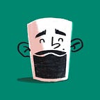
Our character ended up with a slimmer body, more hair and a face make-over. We also added a little steam to the coffee icon. ☕️
Note that some of these tiny things actually came out when I was sharing this with other people. When you’re deep in the process sometimes is difficult to step back and see what can be improved, that’s why I think sharing and listen to others is key.
There's one more thing left to mention, because during this week I was traveling and had a few meetings I couldn’t skip, I was “forced” to…
(7) Take breaks
This was sometimes annoying because I felt it broke my flow, but on the bright side it gave me perspective. Looking back I think some of those breaks were actually helpefull because I was “forced” to talk about something else, taking my mind completely out of what I was doing. Which meant that when I got back into it I found things that I could improve that I didn't notice before I left the computer.
Have some left-over time? Use it!
You might think that I was done just there, but because I managed to move things forward quite quickly I had some time left to dedicate to the last thing on my list, transitions. Since these were a sequence of illustrations, I wanted to define how each illustration would transitions to the other.
I know that what was expected was just a simple carousel, I could just not bother and go with that, but if I have time, why would I do that?
This was something that I actually had in mind since the beginning, so I made sure to consider it when I made the illustrations.
I made them with a clear background and foreground, also made sure the horizon would always line up, this would allow me to have a parallax effect when transition from one screen to the other, making the sequence seem even more integrated and a bit more pleasing to the eye.
To communicate this more clearly to the engineers I created a very simple prototype with principle.

Looking back, and after almost 3 years it's easy to see what works and what doesn't, but regardless I think this is a good example how you can move quickly with something as simples as a sketch.
In this project, it allowed me to communicate with all the stakeholders, get feedback and iterate without wasting much time.
Moreover, it shows the importance of sharing and listening to the people you work with, to make better things together.

Ideally, I would have liked to have a bit more time to try a few different directions in the beginning, and to nail down some details in the illustrations, however, I can't say I'm not happy with the result, we managed to make something that met our goal on time.
That was a long one, so if you made it this far, you deserve…
One extra tip…
My extra tip is to time-box your "search for inspiration" time.
Don't get me wrong, I believe it's super important to see how others solved a similar problem, because you don't need to reinvent the wheel with every design problem you have to solve. However, you most likely do this everyday, you know what is out there, you know the trends.
So, set a time limit and after that GET GOING!