7 UX features for a better product page
During the process of designing your webshop, it’s always important which pieces of information you decide to include and where you decide to put them. You can do it by digging yourself into research or by simply following your intuition but, in the end, you always need to test and observe and again test and observe in order to get the best results for your customers.

You may think you will be able to predict the behavior of your customers on your page, but you should never decide solely on the basis of your own assumptions; if possible, you should always test it with real customers. You never know what interesting facts you’ll learn; something that you thought was the right choice for your project, might turn out to be a very unsuitable one for your clients.
You always need to test and observe and again test and observe in order to get the best results for your customers.
But let’s start with the visualization. This is the first impression your client gets when they visit your web shop and if they like what they see, it is more likely they will stay and scroll through your pages, search for all the information and reasons why to buy from your shop and, at the end, visit the product pages.
So what are some of the good features of a product page that will convince your customers to buy your products?
1. Product description
How many times have you searched for a product and the purchase of that product depended on the product information?
If the product page doesn’t provide enough information about the product, you inevitably start to question the usability of the product and the credibility of the company — which of course increases the abandonment rate of the page.
Try to avoid the kinds of situations that could cost you your potential customer. You need to persuade the customer why your product is better than the product from your competitors (e.g. by highlighting the benefits). Explain how the product works, from which kinds of materials it is made, why these materials are the best, which features does the product have, how you can use it and in which situations.
Furthermore, make sure you clearly state which components are included in the purchase. For an easy and quick view, you could also make a table with all the specifications so your customers can easily visualize all the features and benefits.
Below, you can take a look at a great example of a product description:

2. Pictures
The best advice we can give you when it comes to graphic material is to provide pictures of high quality, showing different perspectives, so the customers can see the product better and also check all the details. Give them the option to click on the product, which will show them a bigger picture, where they can see the product up close. Make sure to have at least one “in scale” image of the product visible at the very beginning; it is better for the customer to see the actual size of the product straight away.
Don’t forget to show pictures of any accessories that come with the product and of course try not to show any accessories that are not included. You don’t want to confuse the customers or disappoint them, but if the photos nevertheless include additional items, let them know that they do not come with the purchase.

Some shops decide to not only provide the picture of the product but also a 3D alternative, where you can scroll around the product to have a better look, just like you could if you were in a physical shop. It’s undoubtedly a cool feature but you still need to consider why you would put it on a web shop. Would the customers really appreciate it? Is it a good feature for your product or it is just an eye-candy for your page?
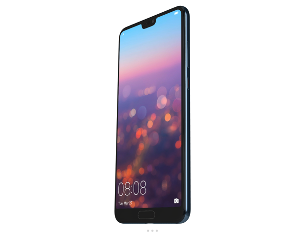
When talking about bigger shops with a whole array of products, speed could become a problem with this feature. It will slow down the page’s load time on a product page, so really think about whether or not this functionality is the right choice for you.
3. Video
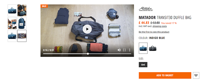
If you have a product that is not regularly used in people’s everyday lives, you first need to show your customers what your product looks like and how to use it in action. That’s why we would warmly recommend using videos that will show your product, where you can explain the features of a product in person, where you can show how the product works and so on.
4. Colors
Do you have different color swatches for your products? Awesome! If it’s possible, show them by using thumbnails or colored icons. When the customers choose the color they are interested in, the best practice is to show them only the product with the chosen color and, of course, from different perspectives.
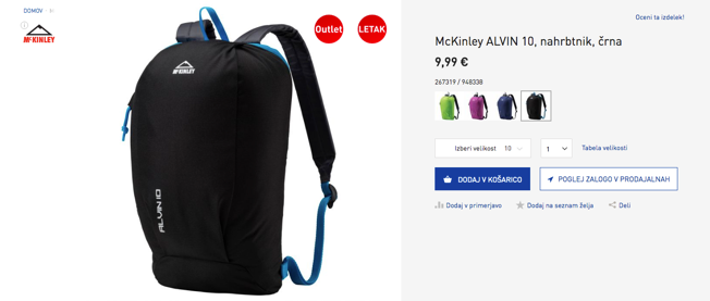
Another good example is Iglu Šport, which offers its customers a slightly different experience with color swatches. They placed their thumbnails on the left side and when a customer clicks on one of them, they automatically select the color of a product on the right side, where they have a dropdown menu with all the colors. There, you also have an option of selecting the chosen color, which will make the biggest picture in the middle automatically change to the selected color.

5. Availability in physical stores
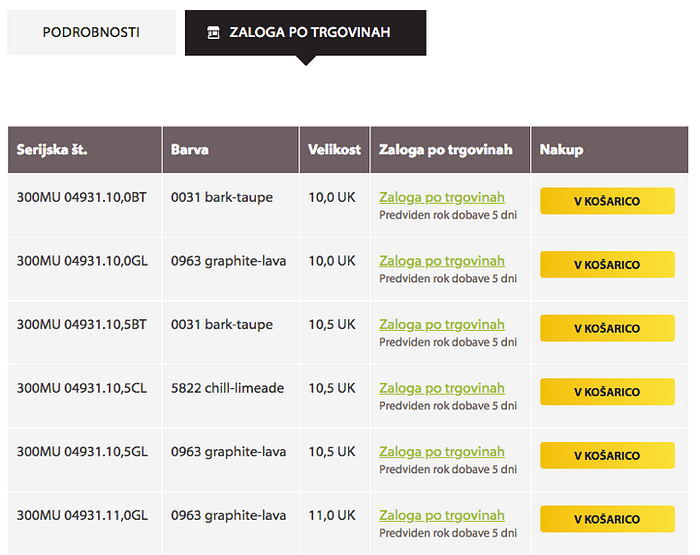
A cool feature for all retailers who sell their products in more than one physical store is the feature with information about product availability in stores in different areas. Sometimes, customers just want to get more information about the product or to see and try it on in person, so they’re more than happy if they get information in which shop they can find a certain product. If the store with the desired product is near, they can always visit the store and buy it there.

6. Testimonials
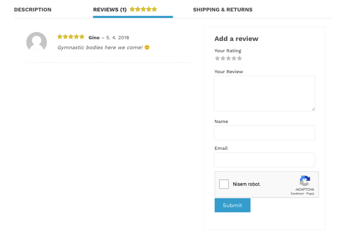
What could be better than satisfied customers? Customers who show their satisfaction on your website! Testimonials on product pages can be very useful for all other customers who are considering buying the same product.
They are especially important for those products that are very much alike and where customers could have a hard time deciding which one to choose. A good testimonial could just be the reason why a customer decides on a certain product.
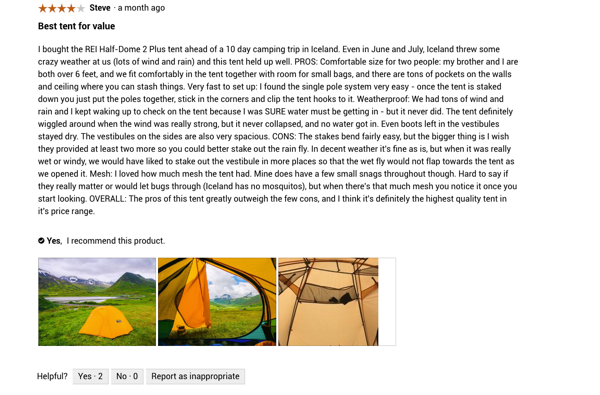
A good practice for portraying effective testimonials is putting a name and picture of the customer next to the review. Of course, you can’t always get a picture from the customer and they could always refuse to be exposed on the website, so sometimes the safest choice is asking for their name and maybe their age and education or their place of residence. When choosing what to put next to the review, you must always think about the type of information that best suits your products.

A good idea is also presenting star ratings near the product, where they can be seen as quickly as possible since customers often search for reviews. KingsBox decided to expose them above the main title of the product. It is important to also include the percentage or the number of votes.
An example of good practice is also using the button with the ratings or clickable stars, which will automatically take the customers down to the section with all the star ratings and user opinions.
Important hack: When you are setting the input fields for testimonials, remember that it is much easier for customer to send you a review if they can do so as a guest. Don’t make them log in first in order to give you a review — you will undoubtedly loose some of them.
If you’re looking for another example of good practice that will bring you credibility with your customers, think about using real photos of product from previous customers on your website. User generated content is only one way of improving the shopping process and conversion rate in your e-commerce shop.
7. Alternative and supplementary products
Alternative and supplementary products are a great way of helping the user’s purchase behavior by finding them additional products that best complement their choice. By doing so, the users don’t have to search through all the product lists until they find the right product for themselves. Product alternatives let the user jump from one product page to the next until they find a relevant item for themselves. It’s an effective way of keeping users on your product pages and of navigating them around your website so they can find the product which suites them the most.
Suggesting alternative and supplementary products on your product page is not only good for business but also great for usability. What could be better than that? ;)


By now, it’s probably clear that suggestions for alternative and supplementary products serve different purposes.
The first one is about the customer finding the right product for them (by means of similar products), while the second one is about finding complementary items to “complete the purchase” (by means of add-ons and accessories).
The following good example is by Status:

Conclusion
Managing a web shop is no piece of cake, but if you do your research and wisely place your information on the website, you are one step closer to convincing your potential customers into a purchase. If you also follow our above-mentioned tips, you will definitely be on the right path. Regarding the tips we gave you, you should of course think about which ones are appropriate for your brand and which ones make sense for your web shop.

