8 first principles of software design
A short summary of ten years of design engineering research.

First-principles are the building blocks of knowledge and basic assumptions that cannot be deduced from any other proposition or assumption.
I wrote this post to summarise my thoughts after transitioning from UX design to design engineering. These principles are the result of over ten years of journey through the complexities of development with a non-technical mental model and a curious mind.
1. Elements of the interface can be rendered together or separately with each other.
This principle is a result of the research I’ve done on state machines for Views programming language. As part of Views, we’ve implemented an experimental state management pattern that was based on this binary fundamental fact that two components can be displayed together or separately on the screen, and there is no other way to arrange what’s going on in a given view.
The states rendered separately need action to link between them.
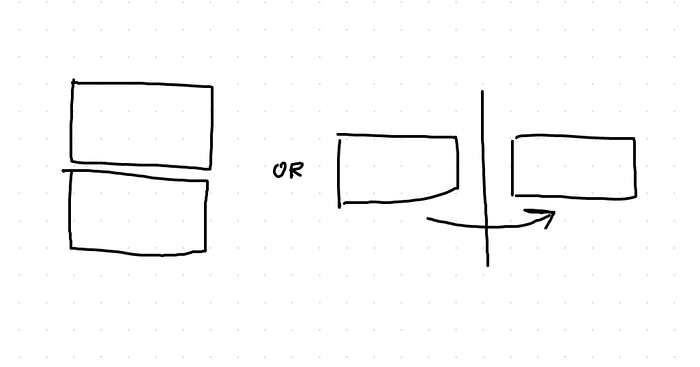
This dualistic nature of the state is fundamentally true for any application of any kind. This way of thinking about the state helps to simplify patterns, like menus, popups, tooltips, drawers, toasts and leads to declarative state machine models.
2. Software contains three layers: data, logic, and interface.
Obvious? Great! It wasn’t apparent to me, and for sure, I wasn’t thinking about how tightly connected these layers are in the working code.
The connections and the mutual dependencies make the data and the logic inseparable part of the interface. When I stopped thinking about them as nicely laid out layers and saw them as a complex mesh of interconnected elements, it helped me understand how the software works.

For example, there is a difference between a dropdown of fixed choices that acts as a switch for more selection choices and a dropdown of fixed options that saves the selected value in the database. The first one, the switch, doesn’t need any validation, instead, it needs conditional logic. The second one, the value selection, might need validation check, loading and error states, plus the interface to inform the user about what’s going on. On the surface, both dropdowns might look and behave the same way for the users, but underneath, the logic and data are fundamentally different.
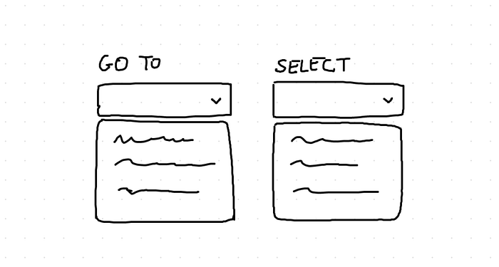
The intertwined paths of working solutions made a big impact on how I think and plan design system components. For example, I would define specific errors for format validations or create a separate dropdown component for a specific type of data. It’s hard to say how much the system architecture knowledge impacts my design work. When I’m wandering around in the engineering world, I feel like a fish out of water, but when I’m back to my pond, I think smarter by a long shot with all the things I’ve learned.
3. Interface components can be organised in three ways: horizontally next to each other, vertically above each other, or stacked on top of each other.
Another straightforward principle, but beneficial when planning layout implementation.
I came up with this simple distinction a long time ago when planning containers for Views programming language, and since then it became a standard for many design apps like Framer, Webflow, and Figma.
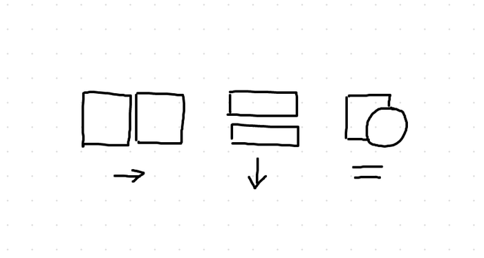
The principle defines all possible layout options inside of a container, and it’s true for any container.
4. Apps are lists of lists.
This realisation came to me about a year ago when we’ve been trying to figure out data mapping for Views programming language.
It is a handy principle to keep in mind when thinking about the information architecture of the software you’re working on. From menus and news feeds to dynamic content pages and dropdowns, everything is or could be 😉, a list.

From the data performance perspective, it’s not favourable to turn every object/field into an array/list, but from the conceptual point of view, a list of one is still a list. A list of no elements is still an empty list.

As we see more no-code abstractions taking over in the software engineering space I think we might see the lists become more ubiquitous. The list, as a pattern, is inherently more extendable since it’s ready to show any number of items by default. List are also better from the UX perspective since they give real-time and consistently unified feedback about the state of the interface, if things are loading they show a loading state, or when there was an error in connection the error is shown instantly. Despite if lists will take over or not, the principle refers to a list as a concept, not an implementation detail.
5. Modular systems better respond to change.
This might come as obvious in theory, but it’s hard to implement in practice. The main challenge is to keep clear boundaries when refactoring towards modularity, and there is always refactoring!
Universal Principles of Design describe Modularity as harder to design than a mono-system and only hints a significant benefit, the ease of change.
For that benefit on its own, and there are others, it’s worth taking more time when designing a modular system.
The rule is for each module to be as isolated from the surrounding elements as much as possible. This separation of concerns is one of the main React concepts and prevents the domino effect of bugs and fixes.
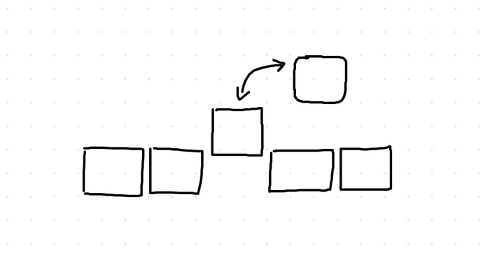
Highly modular systems usually contain many modularity layers like Design System Components, Services, Event Schedulers, and Server-less Lambdas.
The more we divide each layer to smaller pieces, the harder it will be to control the fractured flow of information, but we will get higher flexibility with each additional piece. At this point the modularity principle has a direct correlation to Flexibility — Usability Tradeoff principle that says “As the flexibility of a system increases, its usability decreases”, and that decrease is something to watch out for.
6. Every click means effort.
It took me some time to understand the weight of every additional click in a flow, but since I got it, I can’t stop myself from assessing experiences by a number of interactions it takes to get a job done.
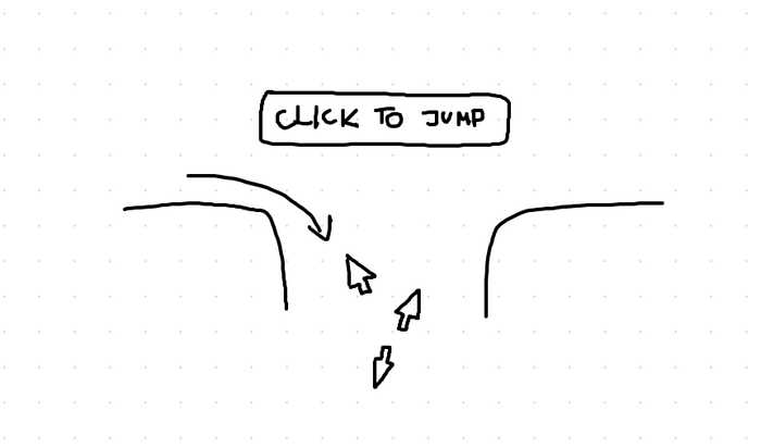
The rule of thumb is to cut down as many interactions as possible. One way is to use scroll instead of “show more” buttons which would navigate out of the feed. The excellent example of using scroll instead of a click is the horizontal scroll between multiple post images in Instagram mobile app.
7. Edge cases represent 20% of total usability and bear 80% of implementation complexity.
If you are looking at the overall features set of a system, you will see the main actors, lists, forms, content pages, but you won’t see the second plan heroes, the loading states, validation errors, data formatting requirements.
The edge cases are usually not necessary for the system to be operational, but they do make a big difference to user experience.
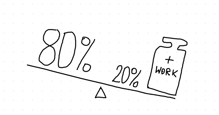
Your understanding of this principle comes very handily during a release scope shaping and feature prioritisation for early minimum viable product releases.
In most cases, leaving the edge cases to the next phase of the implementation might speed up the launch of your app for weeks at times.
There are dangers of not dealing with edge cases upfront. Confusing experience, bad or partial data, weird interface state, to count the most gruesome.
8. Working code is the ultimate source of truth for everyone, including the users.
I’ve got the importance of working code after starting a close collaboration with engineers. When I was in my design world of mockups and prototypes, I didn’t even care much about the code itself. After all, my ideas mattered, the code was only making them possible.
I couldn’t be more wrong and here’s the reason why I transitioned to design engineering — my customers, so called end-users, the folks that press the buttons to get something done, they don’t see my drawings and prototypes, they interact with an implemented version of the experience I’ve designed.

This principle helped me to convince myself that I need to contribute more to the final user experience, get my hands-on the working code with a goal to make the UX as good I possible.
Going hands-on was the most challenging design decision I’ve ever made and by far, the best one.

I’m actively researching this problem space, so this list might change in time. Reach out in comments if you can think of other first principles that are not mentioned in this post. Thanks for reading and for your comments in advance!


