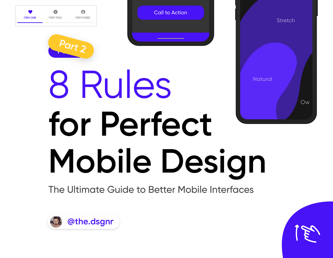
Part 2
8 rules for perfect mobile design
Every passing day more and more products are becoming mobile-first, the reason is simple, mobile phones are devices we can carry every day.
The problem is, these devices are being developed every day, new forms, bent screens, notch displays, meaning it’s not easy to design for them as it is for the web.
1. Readability
Mobile devices have small screens as compared to desktops, fitting in a lot of information in a small mobile UI can be challenging.

2. Accessibility
Design for everyone, consider multiple holds. These are three common types of holding a mobile, design the main actions within these areas.

3. Spacing
A small screen doesn’t mean small text, or less space, don’t let text or other elements overlap. Improve legibility by increasing line height or element spacing.

4. Padding
New technologies are being presented every day, as a designer you need to stay up to date, for example, Curved displays increased padding my some pixels to avoid unwanted touches.

5. Make it Responsive
When you think about mobile screens think of designing for the smallest screen, then make it responsive to larger screens.

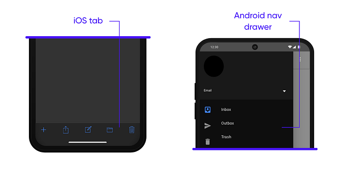
6. Navigation
Try to use standard sequences for your navigation menu, like the iOS tab bar or Android nav drawer, don’t try to reinvent the wheel. Users are familiar with these common patterns, so your app will be more intuitive to them.
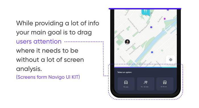
7. Visual Weight
Visual Weight in UI comes from a combination of a lot of elements, colors, text size, spacing, etc. What catches your eye?
8. Usability testing
Usability testing defines how good your design is. Testings offer a fresh perspective on things that might have escaped your attention, sometimes even a possible redesign.
So, before you deliver a project to the development team remember to handle testing.
Tools you can use:
- UserTesting.com
- Enrollapp.com
- Test it by yourself, on your colleagues or on the potential users.
You can use a camera to record their interactions.

