8 tips to improve your workflow in Adobe Illustrator

This week I’ve been forging background illustrations for my website, epdillon.com (*edit: I’ve since changed the website). I’ve been using Adobe Illustrator to do all the major casting, dabbling in Figma only to temper the colours. Fresh from the design furnace, my hands are a-crackle with renewed Adobe skill. Scintillating shapes and amazing anchor points are mine to command! I roar in the face of vectors! (cue insane theatrical laughter and the eruption of volcanoes). Before I completely run away with myself and forget what I’m on about, I present to you 8 tips to make your life with Adobe Illustrator a little bit sweeter. Like a treacle sponge cake. A pleasantly warm treacly sponge served with a side of fresh fresh knowledge. Mmmm. You can’t smelt cake, it’d taste horrible.
1| Always work from reference
Conduct thorough research before picking up your pen. Create an image collection on Pinterest. Have a look through Designspiration, Dribble, and/or Behance for designs that inspire you. Look on Typewolf for font pairings that work well together. Use Adobe Color to help pick and play with colour. Follow Instagram profiles like ocean.ui, ui_gradient, ui.insomniac, colours.cafe, coolors.co and save collections of design tips and colour palettes. Google image search artists and designers that you admire and save images of work which excites you. If you’re a visual or web designer, you can use a browser extension called Fontanello. You use it by right clicking on websites you admire so you can find out the details behind their font styling. I always check out this designer UIX Ninja for design inspiration. When illustrating I might use 3D model sites like Sketchfab or CGTrader for figure reference. Look at creative blogs for coverage of trends. Aaron Draplin’s design talks and videos are always great for inspiration!
Pablo Picasso is famously quoted as stating “good artists borrow, great artists steal” and that’s the same with design. By gathering styles you admire, imagery which inspires you and fonts that work, you give yourself a running start from which fresh ideas can flow. This is something which should be going on in the background of your practise all the time. I watch all kinds of YouTube videos covering wide ranges of topics from drawing to business. This series on how a design agency builds a brand from scratch is great food for thought. Concepts used to better ability in one creative area are often transferable, this video on bettering drawing practise is a good example. The core message behind it is learn to look at a range of images and deconstruct them, incorporate elements you like into your own practise: that sites font; this adverts colour scheme; that apps illustration style; this videos animation style. Originality comes from how you combine elements together.
During this initial design phase make quick thumbnail sketches as ideas spark. Try to get as many quick sketches down as you can. By working in pencil you can iterate much faster than you can on a computer. There are a decent range of plug-ins available to help bring your pencil lines to life. As soon as you feel things are starting to move in the right direction and you have a range of solid ideas to develop further move everything onto the computer and start pushing pixels around. Here are some other basic tips and some help with how to approach texture. Here is a list of online tutorials to further improve your basic skills.
2| Customise your Workspace
Each project requires a different set of tools. Making those tools more obvious and accessible improves your ability to get the job done without all that “where the f*** did I put pathfinder!” nonsense. If you’re not editing text you don’t need the Character and Paragraph Panels displayed, they’re just eating up space! Remove them! Select panels you want to use from the Windows menu and arrange them on either side of your work area. Save your new workspace under a simple descriptive name for future access. It sounds like a lot of work but it really isn’t. Stop being lazy, you’re making your job harder! This video and this one do a good job of explaining what you can do.
3| Modify your tools

The current version of Illustrator CC allows you to enable and disable tools in the Tools Panel. You should have a look in there before you start your project and pull out anything that might be handy (it all works by drag and drop). Alternatively, get rid of tools which are irrelevant to your needs. If you do this before saving your workspace, your edited Tools Panel will be saved along with it for instant future access. Useful if you do lots of similar jobs. There are a great many tools available to supplement your workflow. Go down to the bottom of the Tools Panel and click on the icon with the three dots in a row (this is a menu icon referred to in UI as Meatballs — no joke). Clicking on the icon expands the Tools Panel out with a wider menu listing a whole heap of tools and their keyboard shortcuts. If you would like to make or amend keyboard shortcuts for tools you can go to Edit — Keyboard Shortcuts (or hit Alt+Shift+Ctrl [Option on Mac] +K). Check out this video about it.
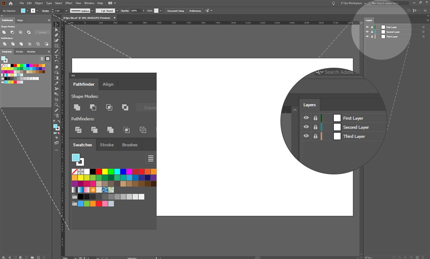
4| Name your layers and sublayers.
If you ever need to share your files with another designer, they will worship at your feet for taking the time to name each layer correctly. It separates the amateurs from the pros. The basics are covered here. Only you know what Layer 1 and Layer 11 contain, that is, until you forget. Don’t get cheeky with me and choose something like Bob or Susan — we are talking about short descriptive naming. It’s a bad habit and everyone falls victim to it. Correct layer naming will dramatically cut down time spent searching for assets. That’s right, you or someone else may need to open up that file again and retrieve something from it at a later date. Save your colleagues, and yourself, the stress of wading through a ton of layers. It makes my fingers twitch just thinking about it!

Mea culpa, in the past I was particularly bad at this. Once I brought destruction on myself when I had to artwork some book covers containing around 50 unnamed layers, each filled with ungrouped unnamed sublayers, to produce 25-or-so uniquely different covers. Each with their own set of alterations. In times like these Illustrator will invariably decide to crash all of the time. I started to panic staring into the abyss. Some mornings I still wake up screaming about custom typography… Anyway, if you don’t want to wade through hell just to make one little change, ending up burning with frustration or wanting to stick a gun in your mouth, name your layers. Every. Single. Time.
5| Design in grayscale. Pick your colours in Figma.
Boom, ‘nuff said. Not really. I’m going to put it out there, and you may not agree with it, but this is how I stand on the matter. Illustrator sucks at refining colours. The program’s only redeeming features in this regard are the relatively new Recolour Artwork tool (which has all kinds of handy features) and the global colour swatch setting. The colour and swatch interfaces are generally unintuitive. Menus within menus within menus. I don’t think Adobe packages as a whole provide a particularly great experience for those wanting to navigate and fine tune colour properties. This is coming from a guy who has used Adobe software for around ten years — so I’m at least pretending to know a little bit about what I’m talking about.

A good solution to this colour problem has been a program I’ve discovered relatively recently — Figma. This is a fix only for digital products and not those requiring CMYK for print, for that you will have to go elsewhere. So, why Figma? Because Figma natively uses a H/S/L colour picker which responds to simple multiplication (*), division (/), addition (+) and subtraction (-) commands right there in the top-layer entry fields. (I covered this in my 3 tips for getting the basics right when doing visual design article, only in regard to type-size entry fields). Why is that important? Because it produces lighter, more vivid colour than the H/S/B colour picker built into Illustrator — and in which there is no H/S/L option. In Figma you can easily desaturate colours to check their values in grayscale to help you balance out the contrast your layout needs to work most effectively. In my experience I’ve noticed that the H/S/B colour picker in Illustrator contains more grey tones, and whilst using it you are far more likely to fall foul of muddy colours. It is a challenge to maintain colour saturation whilst changing the brightness without the colour appearing to shift into a tone. More importantly, you can’t quickly check your values in grayscale without fiddling about. Figma is a low-resource program, so we can use this to our advantage. We can have both Illustrator and Figma open at the same time on our desktops and easily dip in and out as we go about our work — refining swatches in Figma then copying the hex code over into Illustrator. Or, we can export the frame holding the swatches from Figma as a PNG, place it into Illustrator and colour pick from it.
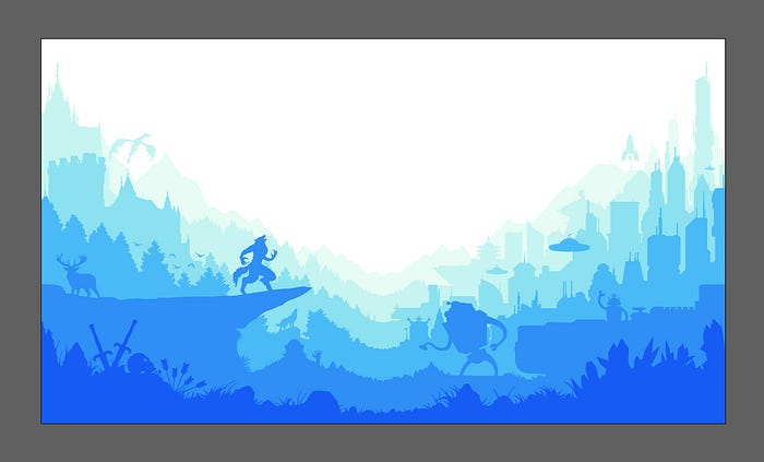
The H/S/B colour picker does come in handy when you are dealing with depth and balancing. For example, let’s say you are making a layered illustration of a landscape for your website. The layers in the background will require a slight desaturation and muting to generate a stronger separation from the midground. We want to emphasise the distance between fore- and midground by softening the hues as if there might be a slight veil of atmospheric mist in-between each of the layers. The foreground colour must be the richest in the illustration. Lowering the contrast towards the background helps make the layers easier on the eye and seats them more comfortably against white / off-white backgrounds, without giving an appearance of over-saturation — I describe colours like these as looking slightly acidic in hue.

So how are we to proceed? What I propose is that in Figma you make two sets of swatches: one full colour; one greyscale. Take them through to Illustrator. Use the grayscale swatch set whilst you’re illustrating and designing. Convert the swatches into their colour counterparts when you’re moving into finishing up. Now go through each layer from back to front slightly desaturating the colours with the H/S/B colour picker. We are talking slight nudges to round off some of the vividness. Not every layer will need this, but those colours sitting in the background on the lighter side of your palette will need the most attention. This is especially the case when those colours sit against whites / off-whites or strong dominant colours. You want those colours to appear as if they are receding into the background, not fighting it or sitting on top of it.
Phew! Here are a few final words about colour. When you’re making a colour palette and there is a gradation through tints / shades / tones from dark to light, use a little technique called hue-shifting. For each swatch below your dominant colour slightly nudge the hue entry field number up or down a few places (pick a direction for all the swatches and stick with it). In Figma you can take this further and use the multiplication (*), division (/), addition (+) and subtraction (-) commands directly in the entry fields in the H/S/L colour picker to create a consistent scale curve of hues providing you with a nice breadth of colour to work with.
Recently, I created a nice palette typing /1.1 (divide by 1.1) after the hue and lightness values, then duplicating the resultant swatch and applying the same division again and so on consistently for each subsequent swatch. Play around with it. I think it produces better results than changing lightness values by increments of ten each time and bumping the hue manually. If you don’t like it and want to stick to nudging values in the entry fields with the arrow keys that’s your call.
So why hue-shift? It breathes life into your work. It provides a spectrum of warmer and cooler hues. When held against a set of swatches incrementally increasing or decreasing only in brightness, hue-shifted swatches feel dynamic and lush. I was introduced to designing in greyscale whilst taking this course.
6| Make Artbrushes.
Say you want to make repeating shapes like blades of grass. You don’t want to sit there endlessly making custom blades of grass, that’s insane, and more importantly, it will take forever to fill a wide area. Let’s face it, we as Designers are always running out of time. So here’s how to save some. In this example, making grass, we want to find a solution that will allow us to do as little as possible to enable the greatest amount of variation to fill the widest space. We can start off making a few basic grass shapes by editing ovals, using the Pathfinder Panel to cut shapes or drawing something custom with the brush / pen / or pencil tools. We only need two or three shapes. And by basic I mean an oval pointed at each end for one and then duplicated and cut it in half lengthways for two, done. Essentially, you’re creating a fill which can be applied to any number of paths simultaneously (or in quick succession) to produce that sweet grass you so so desire.

However, all grass is not created equal. Some blades are tall, some blades are curvy and some blades are short, etc., etc. Variation of blade stems from the length and shaping of the paths you apply the Artbrush too, so the brush fill itself doesn’t need to be overly complicated. But I’m getting ahead of myself. Select each of the shapes you’ve just made individually and go to the Brushes Panel or if it’s not open, hit F5, click on the Hamburger icon (UI terminology makers seem to love using food names) in the top right and select New Brush. Select Artbrush from the list and hit OK, it will work fine with all the default settings so hit OK again to finish. If you wish to, you can play around with these settings later to produce different effects. Now, when you select a path you can select your new Artbrush from the Brushes Panel and it will automatically apply to the path. The colour of the fill will be the colour of the original object you made into an Artbrush.
7| Make symbols.
Carrying on with this grass theme, lets say we’ve made a bunch of curved paths all in one place and have applied our new Artbrush options to them. Throw a selection around these paths and expand them with Object > Expand Appearance. Now merge them all together with the Shape Builder Tool or use the Unite Tool in the Pathfinder Panel. Right, now we have what looks like a clump of grass. Cool. Now open up the Symbols Panel (Window > Symbols) (or Shift+Ctrl [Option on Mac] +F11) select your new grass clump and click New Symbol in the Symbols Panel menu. Go into the Tools Panel and locate the Symbol Sprayer Tool. It may be hidden by the meatballs icon. You can double click the Symbol Sprayer Tool to change the intensity and density parameters amongst other things but for now simply have a go at spraying. You can now create a high number of grass shaped vectors that can cover a wide area with ease. Boom.

This is a basic walkthrough of symbols and there is much you can do with them so just have a play with all the settings to see what you can make. One word of warning, the Symbol Sprayer Tool will spray symbols the same size as the original shape that was saved as a new symbol. If you want to have it spray smaller symbols to give a more detailed effect you will need to make sure your original shape is the size you want it to spray as before saving it as a symbol. Symbols can be used for many time saving things. I’ve seen people save artworks of differently dressed people as quick access symbols to try out logo designs and get an idea of how they might sit on clothing. At the bottom of the Symbol Menu in the Symbols Panel you can save your Symbol Library and export it, for future ease of use for yourself, or for sharing amongst your team. Symbols and Artbrushes are all about speeding up workflow, spend some time experimenting and think about how you can use them to your advantage.
Here is a good video on Symbols. Libraries can be shared between Adobe products and can help speed up your workflow, as in the case of designing UI elements in Illustrator and importing into XD to compose your product design.
8| Save quick snapshots of your work as you progress and email them to yourself.
Take a break away from what you’ve been doing for fifteen minutes and do something else. Take yourself off for a walk or something. After your break, look at the snapshots you emailed yourself on your phone and/or other devices. Look at them on a PC if you design with a Mac. Look at them on a Mac if you design with a PC. Look at them on as many different sizes and types of screen as you can get your grubby little mitts on. Always be thinking multi-device. Are the values working? Are you struggling to make out particular details? Do the colours work? What is standing out to you most? By taking a break away from our work we help to disrupt our insular perspective on what’s going on. Viewing at different sizes forces you to look at the work . It’s all too easy to lose perspective and so lose sight of what needs changing when working on a project for long periods of time.
For more Illustrator tutorials check out this extensive list put together by Sid Edwards.
After writing all that I’m knackered so I guess I’ll leave this one here. Until next time!

