A better way to create typography design systems

True to the title of this post I’m going to share a much more efficient and effective way of creating a typographic design system for your next project. I spend a fraction of the time I once did setting them up and am then able to hand a developer the ready-made CSS they need instantly. The work of hours now takes seconds (literally).
To do this myself and Jamie Gilman (the dev half of Our Own Thing) built a browser-based tool called Archetype that would help us to achieve the following:
- Make picking appropriate font pairings easier and quicker
- Save loads of time creating rules-based styling and spacing for all the various typographic elements required for a design system (all whilst viewing how they will actually look in the browser)
- Generate the required CSS for your new styles at the touch of a button (an amazing time and effort saver for developer hand-overs)
- Export directly into Sketch to use as a part of your design system docs
Let’s get on with it shall we:
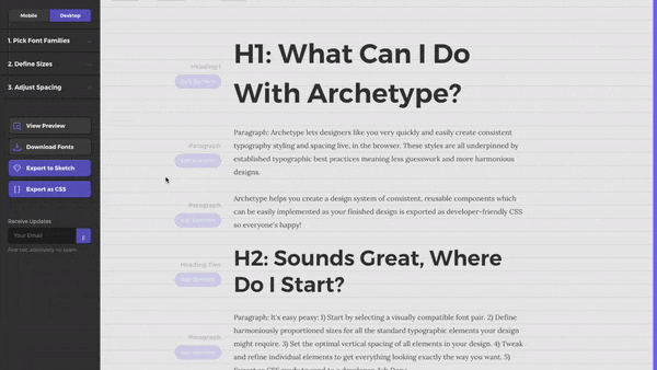
Step 1: Picking Fonts
I’ll leave the principles for actually selecting compatible fonts to this blog post which covers the essentials. All we need to know for this process is that selecting and previewing the fonts you want to use in Archetype is incredibly easy. Just hovering over the font list on the left shows a preview of that font on the right whilst clicking selects it, easy.

If you want some inspiration there are some suggested pairs and if you stumble across a pairing you are particularly fond of you can add it to your favourites for future reference.
Step 2: Define Sizes and Visual Hierarchy
Now we get into the really clever stuff. Establishing harmonious sizes for the various typographic elements (H1, H2, paragraph etc) you might use in a project is often done arbitrarily or by eye. The more battle-hardened among you will have employed a modular scale before to make more meaningful selections but Archetype makes it easier than ever to use a scale to set up and preview how your typography will look once live in the ‘wild’.
Modular What?
A modular scale is simply a set of numbers whose sizes have some sort of relationship to one another. To achieve this a base size is scaled by a specific ratio (eg the famous ‘golden ration’ often found in nature, 1.618) to produce a range of values, the ‘scale’. Picking sizes for your typographic elements from this scale means they will appear more visually harmonious than if using arbitrary values selected by eye.
In Archetype the default values for a modular scale are already set up for you and the full range of typographic elements are each assigned a size from the scale automatically to make this job easier.
You can tweak the base or ratio value on the left to adjust the sizes in your scale. Then it’s a case of just selecting which size from the scale you want for each of your elements (if you want a larger H1 size for example).

The real kicker here is that you can view your selections updating live in the browser preview behind with your selected fonts for an instant, realistic preview of how the visual hierarchy you’re creating will look.

This stage is a massive time saver in establishing an impactful visual hierarchy based on meaningful sizes in just a few clicks. So much better than endless tweaking in your design software of choice which render slightly differently to the browser anyway.
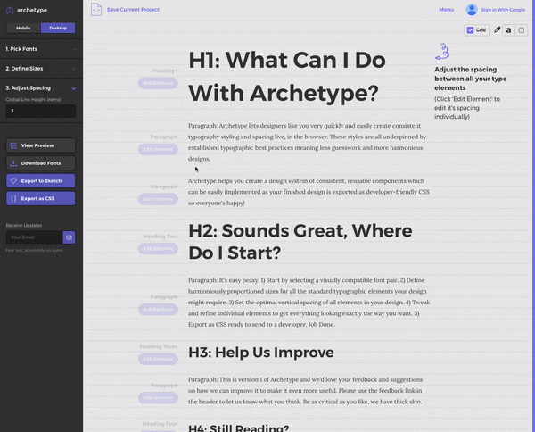
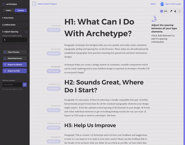
Step 3: Adjust Spacing to Create Vertical Rhythm
It’s important once you have an effective visual hierarchy to establish a pleasing vertical rhythm that compliments it. This is done by adjusting the vertical spacing and line-heights for all the various typographic elements to make them easy to read and the content structure obvious. As humans we tend to associate items that are arranged closer together as being related in some way so this is especially important to get right in your typography design (e.g having the right spacing between a heading and it’s corresponding content to ensure they are clearly related).
This is where things start to get really interesting. Selecting appropriate element spacing by eye and with a view to any potential future application in your project is fraught with difficulty. It’s very laborious in Sketch (et al) to make sure spacing between elements looks right no matter in what order they might appear in future content arrangements.
Archetype makes this possible in just a few clicks with the ability to preview the changes live on all the elements at once saving buckets of time and endless pixel pushing. The great thing again is that previewing in the browser shows you exactly what your end users will be seeing.
A default baseline grid is automatically applied which can be very simply tweaked to edit global line height for all elements at once. For typography purists who want to stay on the grid a few seconds is all it will take to get every typographic element looking appropriately spaced.
This can often be very effective and using multiples of the baseline grid to space elements is usually considered best practice in typography however I prefer full control of how individual elements are laid out. For example, a smaller heading can sometimes look too far away from it’s proceeding element if using a multiple of a baseline grid that looks great for H1s and H2s. As mentioned above humans associate grouped items as being related and too big a gap between some elements can make it more difficult to see what is related to what.
For this reason we can now click on any individual element and tweak the spacing properties for it either globally or only for specific relationships (e.g tighten up spacing only between a H4 when followed by a paragraph and nothing else). This is really powerful because yet again we can see everything happening live in the browser instantly to all elements at once. So with a couple of clicks we can see what our changes are doing to all of the spacing relationships. It’s such a massive time saver I’ll never go back to doing this manually.
What About Mobile?
Both a visual hierarchy and a vertical rhythm need to work across the various devices they might encounter and you may notice the ‘desktop/mobile’ toggle at the top left of the Archetype menu panel.
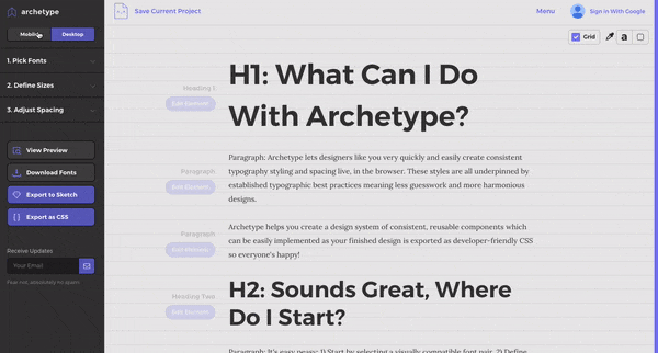
By default all the styling and settings we’ve created thus far are for desktop and will also be applied to mobile but switching to ‘mobile’ allows us to tweak our design to work better on smaller screens.
In this early version of Archetype we have gone with mobile and desktop but in a responsive world we recognise that other breakpoints will be required so will be adding these in future updates. You can subscribe for these updates on the site by the way.
Step 4: Exporting Your Masterpiece
Export as CSS
So we’ve perfected our typography design in the browser preview, now what? Well, how useful would it be to simply download all the CSS required by a developer to implement the typography styling we’ve just created? Well just hit the ‘Export as CSS’ button and your wish shall be magically granted 😱.
Jamie (tech half of Our Own Thing remember) and I have found this to be one of the most valuable benefits of this system because of the time and effort it saves in going from design to build. I simply send Jamie the styles generated by Archetype and he adds the sheet to the project, done. The work of hours now takes seconds.
Export to Sketch
Now the developer is happy what about us designers? Well we can export the typography styling we’ve created directly to Sketch. This can form the typography page of our design system automatically with all the correct sizing, spacing and fonts (as long as we have them installed).
Hitting ‘Export to Sketch’ and installing the plugin Jamie created is the first step in this very swift process. Once added to Sketch simply copy the code generated by Archetype, hop over to Sketch and create a new document. Now run the plugin and paste the code you copied into the text box when prompted.
Shazam! as if by magic your typography appears in the new Sketch doc. It will even add the text styles as re-selectable type styles inside Sketch for use throughout your project. Take a look at this instructional page for a more thorough step-by-step guide to exporting to Sketch and to grab the required plugin.
That’s It!
There it is, a much improved process for creating your next typography design system that will save you shed-loads of time and hard graft, sweating over a hot Wacom tablet/keyboard.
We hope you find this process as valuable as we have, it would be great to know what you think of it and if it has helped you in any way. Jamie and I are looking to improve Archetype based on actual feedback from real humans. Just let us know what you think in this Google Form. You can also subscribe for future product updates on the site (we’ll never spam you, we’re not those guys).
You may also like some of the other tools we’ve built such as our gradient generator or our title capitalisation tool. Take a look and let us know what you think.
Happy designing.

