A colorblind person’s guide to using color
Designers need to get it together already with this stuff.

I have seen this problem so much more than I used to. Maybe it’s because I am paying more attention, maybe the world’s care for color has been lessened. All I know is that color seems to be a vast mystery to many designers out there, and that’s pretty atrocious.
Before we get started on my snarky ass talking about color, let’s get something put out there. I am partially colorblind. I have Red-Green Color Blindness, which is some combination of Protanomaly and Deuteranomaly. This essentially puts me in the 0.5% of women out there that have it. People with Red-Green Color Blindness typically can see those colors, only when we see reds and greens of similar value, they get very muddy and we can’t really tell the difference between them. If you want more information, www.color-blindness.com is a decent resource. That being said, I find it hilarious to see people’s reactions when I tell them that I am an artist/designer that is color blind. It’s even more fun when I tell them that I taught color theory for quite a few years, they always seem amazed when it’s really not that amazing. Once I explain everything in how I design as a partially color blind person, you’ll get why it’s not a big deal at all.

We are currently living in a world where designers and products often think of color accessibility as the last thing anyone needs to worry about. Which frankly is rather asinine. Out of the many vision-based disabilities out there, it is the most common behind nearsightedness and farsightedness, it is the most under-reported, and it’s among the least likely to be corrected. Why so many designers out there do not simply check their usages of color, I don’t know. I like to think that we just lack the time to seriously confront it and audit our own work for these issues. For an industry that touts empathy as one of its biggest characteristics, they tend to lack it when considering color blindness, most even refusing to address it until a client specifically complains. Well just understanding the basic theory behind color and a color blind person’s perspective on a project should help very much.
First, when looking at color and how it pertains to a user’s experience with it, we need to understand basic terminology. We have hue, value, shade, and saturation when dealing with individual colors. When looking to compositions of colors, terms we need to pay attention to are contrast, chromatic, monochromatic, harmony, and all of the glorious multitudes of composition terms like primary, tertiary, and all that mess. Really we will be mostly looking to the terms for individual colors.
Hugh, I mean Hue!
Hue is the “color” you are essentially looking at. Blue is a hue, as is red, green, orange, etc…. Hues are the spectrum at which we operate, it is the base layer to this conversation. For me, hue is surprisingly the least important in regards to my color blindness. The use of hue in design is what gets us to harmony. Its only real purpose is to establish the color you are attempting to use. What is more important are the other terms we are about to go over, the first of which is value.

Valuable Values.
Value is what people like to call lightness. It is a leftover term from pigments, and was often used to explain how much white was mixed into the base color or hue. When talking about value in design, it often pertains to much more than the dilution of white into your pigment, it also deals with saturation in general, and luminosity. Luminosity isn’t one I listed above, mainly because everyone thinks it’s different and nobody uses it in conversations about color really. Value on the other hand, immensely important. When you combine the lightness and saturation of a hue together you essentially get a color-blind person’s nightmare. With the form I have, if the two hues are of the same value, the same lightness and saturation, I simply cannot tell the difference between the two. When designing for these situations, if you refuse to change your colors, adding little aids like patterns and symbols to a color object can help people like myself immensely. I generally will continue using an app that has this option built into it, whereas if they don’t I generally shop around for one that does, or one that designs the colors more inclusive to begin with. It’s not hard, and next up is shade.

Shadiness…
No, it’s not when someone casts shade on you as an online nemesis, it is the amount of black pigment added to a hue. As with value, shade also inherently pertains to saturation, as diluting the hue with anything will affect saturation. Shade is also immensely important to understanding how a color-blind person sees the color you use in a design. As with value, if two colors are of the same shade, we simply can’t see the difference. One thing that helps that is something we call temperature. Temperature is another small-term you see sometimes, but is not immensely important. When talking about the color black, or rather the lack of light that is black, in pigment, we need to address temperature. Just go down to the craft store sometime and look at how many different tubes of black paint you can find. You’ve got Lamp Black, Ivory Black, Paynes Grey (it’s basically black), my favorite Mars Black (actually pretty grey), and so many more. The options are endless, and they range from being named by the person that created it, to the minerals used in its creation. These individual blacks all have a temperature. One of the reasons why Mars Black is my favorite, is because it’s temperature is warm. It probably has iron oxide pigment mixed into it, but a warm black doesn’t compete with dark purples and blues for me. I can differentiate the colours better based on the simple push to a different temperature of black. When you are looking into design for the digital space, taking a black from #000000 to adding some warmth in your hue strip, and bringing it up out of 100% shade to say 99%, can make all the difference to some of us. This also pertains to whatever is considered your black in design. If it lacks any hue, it will cause problems at some point.
Saturation Station.
Aside from the air in the Southern US, saturation also pertains to the intensity of the pigment you are using. When you have your purest form of pigment, you are at your most saturated point. As that percentage of pigment drops, so does the color’s saturation. It’s not a big leap from thinking of lightening and darkening a hue, through dilution, as being effective to the saturation. Saturation is not a truly synonymous term for brightness either. Though brightness somewhat refers to saturation, richness also does as well. You can have a rich color that isn’t bright at all. When you are physically dealing with saturation in color, you are mixing pigments with other pigments, without the use of white or black. Part of the reason many paintings from the enlightenment are so astoundingly bright and rich is that they didn’t use white or black when mixing hues. Their black was, for one example, a really rich ultramarine mixed with another extremely rich color like iron oxide red, and the gods only know what else. Paints back then are always having traces of things we would consider odd, like maybe a proper Oxblood Red. You can probably figure out what was in that. With color blindness saturation is key in how it pertains to shade and value. If the color’s saturation is the same, its value is going to be similar or the same.
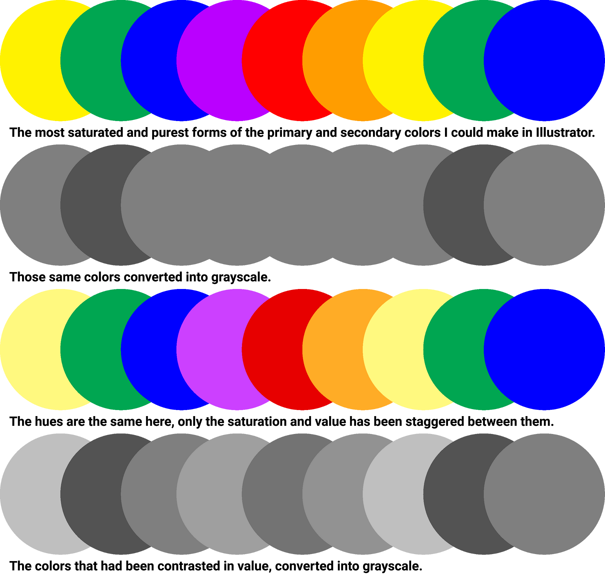
So Jennifer, what does all this equate to when talking about designing with color and color blindness? Well I will tell you, it has nothing to do with my students that used to chuck a green and red ball at me to see if I could see them or get hit in the face by them. It’s actually less fun. For people that are similarly disabled to me, we need to just make sure when we are working on designs that we pull our colors from different values and shades. If you aren’t sure if you are doing that well enough, there is a handy little test that’s easy enough to do for y’all normies out there. Convert the image or design to grayscale or a monochromatic (single hue) palette. This removes hue from the conversation. It essentially means you need to have enough contrast (the difference in shade or value) for anything to be differentiated. Without contrast, you essentially have a Robert Ryman painting (actually my favorite painter), or in an extreme, a single visual object when there might actually be hundreds in the design.

Pay attention to your values and shades to make a color blind person happy. When working on a palette, don’t just pay attention to hue, stagger your saturations between the hues. The more contrast you have in the palette from a high value to a low shade, the more accessible the design will be for us. And just one other thing, if you’re in doubt, and you haven’t succeeded in the grayscale test, ask your friendly neighborhood colorblind person if they can use your design. We can be very vocal about it, just don’t hurl it at our faces like my students did.