Member-only story
A complementary color scheme inspired by color deficiency

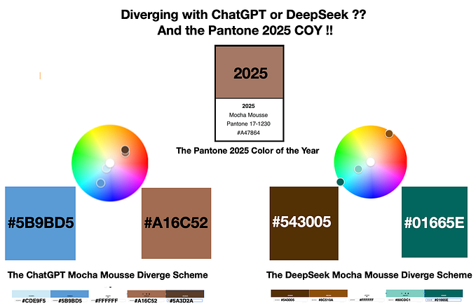
In this writing, I discuss how color deficiency simulations can inspire fresh color schemes for your data visualizations and graphic designs. This situation happened to me while I was building a diverging color scheme with the 2022 Pantone Color of the Year, Very Peri. After I created and applied a diverging color scheme to an area chart visualization, I performed color deficiency tests. The results from the tests showed a diverging color scheme that I would not have otherwise considered. The final solution resulted from revisiting the principles of complementary color harmony. This writing steps you through my journey. Let’s get started by examining a few fundamentals about Pantone’s Color of the Year efforts and the process of creating color schemes.
Some Background on Pantone and their Color of the Year:
The Pantone company produces the Pantone Matching System (PMS) and the Pantone Fashion, Home + Interiors (FHI) System, proprietary color spaces. PMS is used primarily in graphics for printing, packaging, and digital media. FHI is used in a wide range of other industries including fashion, cosmetics, fabric, plastics, and paints. When Pantone PMS inks are applied to a physical color reproduction process, it is often possible to accurately match the colors from your digital data visualization to hard copy output. I highlighted this journey from digital to hard copy in a prior Nightingale writing on “A Split Complement: Moving Beyond Digital to Printing a Physical Visualization”.
Starting in 2000, the Pantone Color Institute began defining a “Color of the Year” from the existing inventory of PMS and FHI colors. Surprisingly, for 2022, the Institute broke with this tradition and defined a new color, PANTONE 17–3938 Very Peri, as their Pantone Color of the Year. Below, I show a visual summary of the Pantone Color of the Year starting with 2000 and ending with 2022.
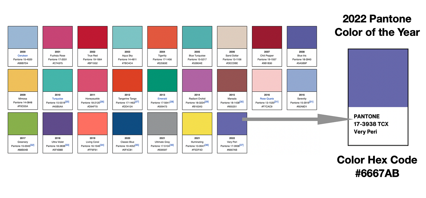
with the 2022 color, Very Peri — Hex code #6667AB, highlighted.
The color for a given year is selected by a secret panel after considering color trend analyses that span the entertainment industry, all areas of design, fine art shows and collections, social media, new technologies…