A few lessons in form design
Some basic but helpful reminders
Forms are an important component in interaction design. From selecting dates to providing text input, they can get complex very quickly. As such, it is important to design something that handles multiple scenarios or error states. I have been working on designing a form for scheduling appointments these past few weeks and have learnt a few things which I am going to share here.
Designing the happy path
In my experience designing forms, it is important to show the success of the user each step along the path to the finish line. Designing this way also makes it easy to construct your invision prototypes and helps get the basic idea out the door. My biggest realization was that I wasn’t spending as much time designing the happy path and was missing out on communicating the right details to the developer. For example, some questions to think about when designing the happy path are –
- What happens when the form is loading?
- How does the user begin filling the form?
- What happens when the user clicks on the form field?
- What is the default state of the form fields?
- What does it mean to successfully finish interacting with a form?

Use progressive disclosure when necessary
Not all forms are alike. Some forms are better served with all the fields active at once and some others are better served with only the necessary / compulsory fields shown first. Sometimes, the user could be having a lot of cognitive load when the whole form is shown right away. For example, one of our forms required the user to pick a date before filling out any other information as it was dependent on the date. Instead of showing all fields at once, we decided to show only the date field as active. This immediately made clear what the user needed to focus on when they landed on this page.

Think about the loading state
A noob mistake to make is to not think about how the form loads before the user sees it. Most forms are static, but some forms like the appointment scheduler that our team was designing were dynamic. It may be a simple spinner or a fancy animated loading state, but some sort of loading state as the data loads is a useful way to provide visibility into the system status. If you do not design a loading state, your form will feel stuck and as a result clunky.

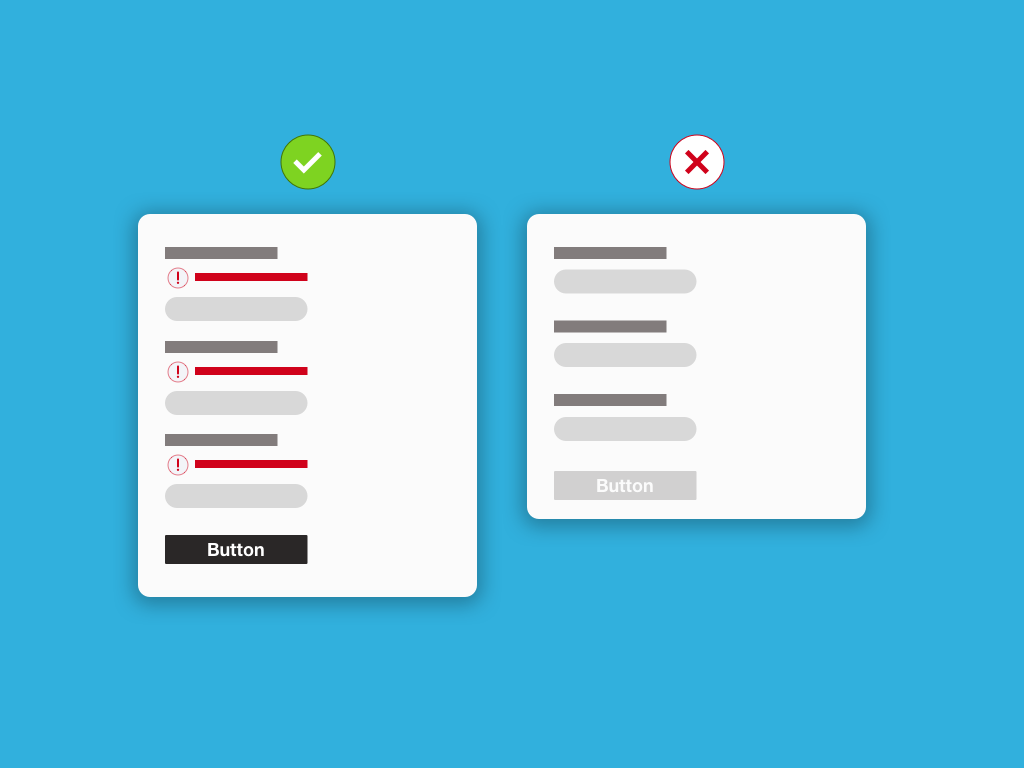
Make error states color-blind friendly
Designing for error states is a messy but fun process. While it is a no-brainer that you have to cover all error states, there is one little important detail that most forms miss — making sure that color blind users too can see your errors. So what does this mean? Instead of just throwing red error messages with red-highlighted form fields, design an error icon that goes along with the error messages. This makes the error clear for everyone.

Explainer text
Any design is an exchange of intent. Forms are no different in that the user gives information to get something in return. As we seek information from the user, it is important to explain why we are collecting that information. This is where explainer text comes in. It simply explains why we’re collecting the information that we are.

Do not disable the submit button
Some forms disable the submit button (for the lack of a better name) until the user has filled out all the required fields. I initially designed the form in a similar way, requiring the user to fill out all required fields before enabling the submit button. There is a problem with this approach — It is for one not at all accessible, and secondly, doesn’t provide any feedback at all when clicked. Keeping the button enabled provides you the opportunity to highlight all the errors on the form as well.
The only time it is okay to use disabled buttons is when you have a single form field and there is no other way to proceed.
PS — please do not use the label “Submit” when creating buttons. Buttons at the end of forms work best with clear labels that reflect the overall user goal.
Conclusion
Good form design accounts for multiple scenarios and is easy to fill out. If I were to share one lesson from designing forms, it is this — Forms need to reduce user-anxiety as much as possible, as you may be collecting important information that could have a huge impact on the user’s life.
In summary, here’s all the points we went through –
- Carefully design the happy path first, step by step.
- Use progressive disclosure to collect the most important information first.
- Design the loading state to account for delays.
- Make your form’s error states color-blind friendly.
- Explain why you’re collecting the information that you’re.
- Do not disable the submit button, as they lack feedback.