A full-stack designer’s take on a daily lettering challenge
Have you ever wondered how every single letter you see around has a unique personality and purpose? We often come across interesting interpretations of alphabets and numbers in print, on television, on your phone, on commercials, on buildings, in the grocery store. Pretty much everywhere.
Typography and lettering have been so intertwined with our everyday lives that we do not think twice about them. But believe it or not, every single alphabet on a piece of text has a huge influence over the visual impact of the message, setting the tone and mood for the reader.
In the 1400’s, Gutenberg invented movable typefaces, giving the world a cheaper way to obtain the written word. And that caused a revolution — typography became more than just a decorative element and evolved into not just an important form of art, but also a language itself in our contemporary society.

Fast forward to 2018. 1st August, 2018 was when Kerala Designers Collaborative (KDCo) launched the second edition of the 30 Days of Malayalam Letters campaign — the day when almost all social media sites got flooded with Malayalam letters being designed and interpreted by artists and designers in many ways, celebrating creative possibilities of type.
Modelled after the 36 Days of Type project, the campaign was launched as an initiative aimed at celebrating the Malayalam language as well as the creativity of the artists and designers of the state.
Till then, I hadn’t really participated in any daily challenge side projects — primarily because of the lack of motivation and time. So for me personally, this was quite an exciting opportunity to explore the artistic boundaries of type. I took the plunge and jumped right in. Although one thing kept me thinking — how do I make the challenge more fun and leverage the opportunity to grow my skills on parallel domains as well?
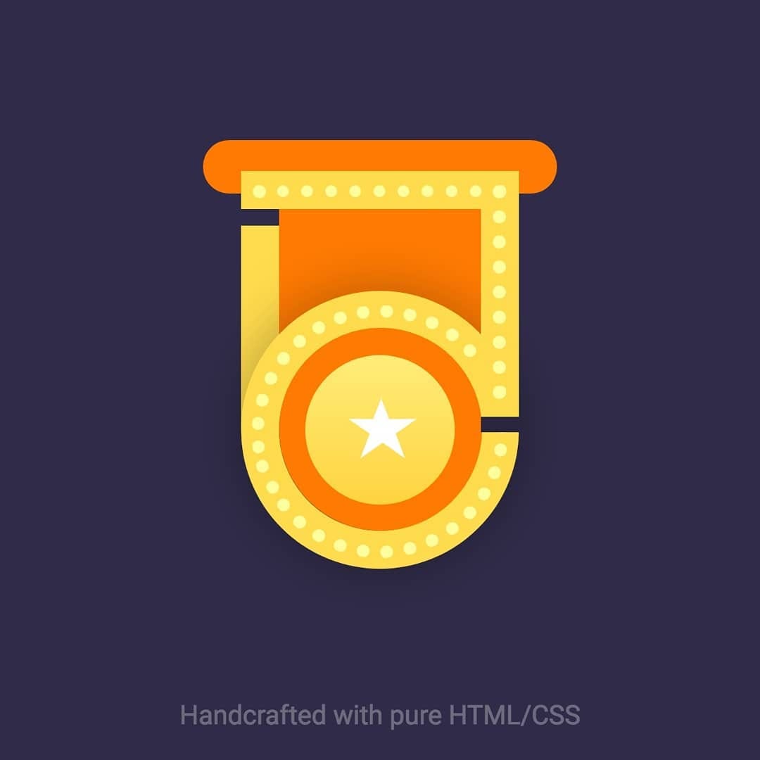
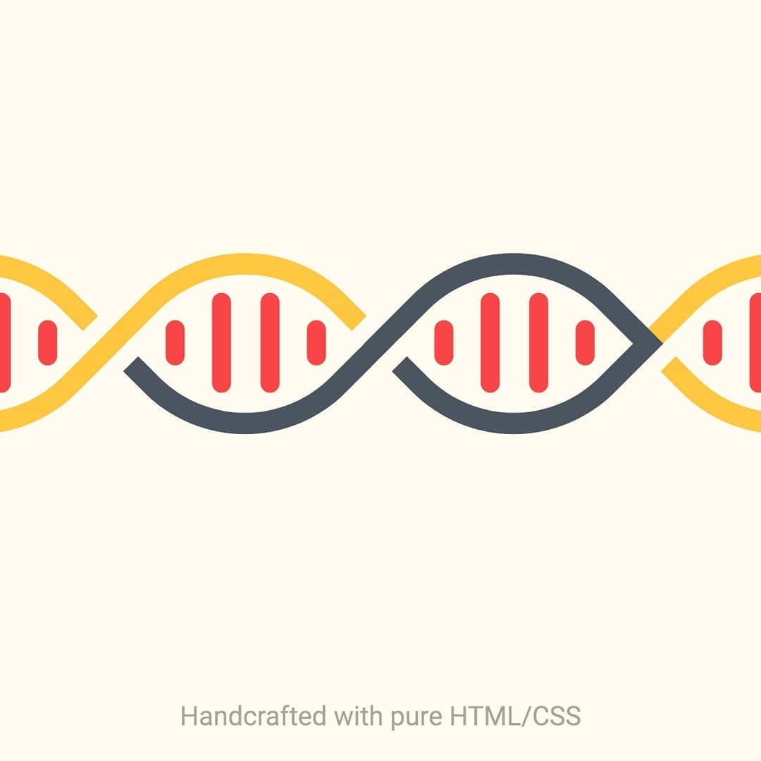
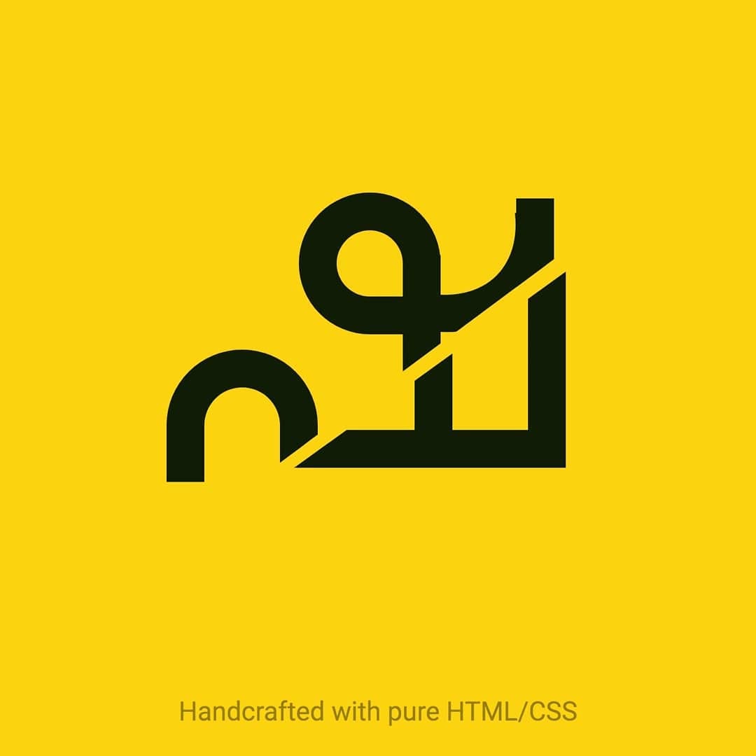
That was when I came across Lynn Fisher’s Single Div project. Needless to say, I was fascinated by the way she used CSS as an artistic medium to create amazing artworks, with just HTML and CSS! (For the uninitiated, HTML is the markup language of the web and CSS is used to style it).

Lynn’s process made me realise that CSS image crafting lies in an interesting intersection between vector illustration and front-end web development.
Creating a CSS image is essentially designing a vector graphic but instead of using vector illustration software (i.e Illustrator, Affinity Designer, Sketch) you are using CSS code in place of your toolbar.
Though not advised for a production workflow, I knew this could help me refine my web development skills while probing creative limits of type as well. So I was all buckled up for the ride, ready to explore one alphabet each day, crafting them in pure HTML/CSS.
An exciting start…
The initial few days were all about setting up the tone, mood and mental models right and exploring how to interpret complicated letterforms with code. It was indeed fun working on a rough pencil sketch marking a skeleton of the letterform, and then using Codepen to code it up.


…but there’s always more to explore
Plainly coding up characters seemed like a mundane job to me after the first couple of days. That was when I started exploring the creative side of the letterforms, translating them to the visual language. For most of the letters, this relation would be marked by some of the symbols, objects or references, predominantly used in the language while for some others, it would be the peculiar structure itself. Brainstorming and discovering this relation turned out to be the most interesting part of the whole process.


Special Days and International observances were my constant inspiration. While most of the letterform representations came naturally (Ya [യ] — Yakshi [യക്ഷി], La [ല] — Lahari (ലഹരി)) certain other ones were very much linked to specific contexts (Tha [ത] — Thozhan [തോഴൻ] — World Friendship Day, Pa [പ] — Paattu [പാട്ട്] — World Music Day). The best part? Marking that connection between the observance and the letterform of the day.
During the days I didn’t feel like I was in the zone, exploring new things was my charger for inspiration. Dribbble and Behance, you be the best!


On the 15th of August due to the Kerala Floods, we discontinued the campaign as we realised it was not the right time for creative indulgence. Although just for 15 days, the campaign definitely helped me explore newer dimensions of web programming & scripting, while instilling a deeper appreciation for typography and lettering.
What did I learn?
The sense of achievement you feel after visualising and implementing each letterform is so beyond words, and every single appreciation and recognition of your work boosts your confidence multifold. When you feel accepted and appreciated in the community, you get more power to keep going and do better.
Being engaged with the community is the best thing to learn and grow yourself both professionally & personally.
All thanks to Kerala Designers Collaborative, you guys rock!
Also, did I ever think of skipping a day in between? Well, to be honest, yes. But believe me — making up for it tomorrow is much harder than creating a small one today. Just put your inner critic to sleep. And if you are not happy with today’s work, don’t just quit — because you always have a tomorrow.
- HTML code for all the artworks mentioned above could be found on this Codepen Collection
- Have briefly explained the story behind every artwork on my Instagram profile