Member-only story
A good reason to say no to grouped column (and bar) charts
#30: Panel bars
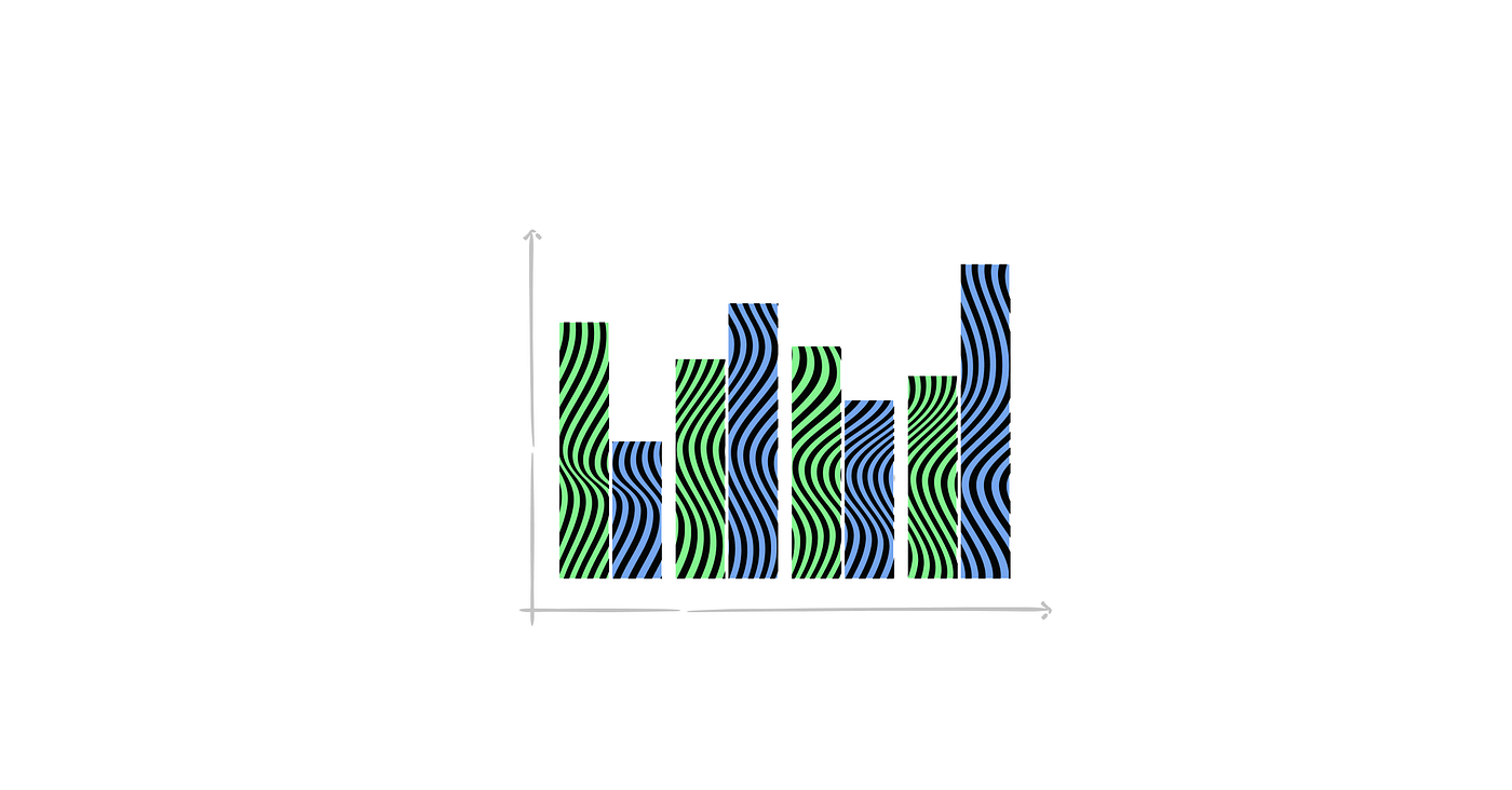
When we use stacked columns (and bars), we force the audience to do two things simultaneously — filter out the category they want to focus on and analyze data. Once they find something interesting, they have to refocus to read the label and then… repeat the whole process. This task is difficult because we overload our cognitive load by doing two tasks simultaneously. Additionally, we risk creating an optical illusion if we present numerous categories — like all countries in the EU. Having multiple bars makes assigning them to the country headache-inducing.
This is the case when you try to analyze the relative population change among different types of regions in European countries. Eurostat squeezed nearly 60 columns into one chart to present how the population of each of the three types of region will change during the upcoming 30 years. Theoretically, this gives diverse comparing options — we can analyze the change in one country, compare it with the average, or focus on the specific region type shift. But take a moment and try to do this to see how insightful that chart is.