Your guide to Data Visualization for Comparison
A step wise guide to getting better at data visualization.

Data visualization is a field that involves maths, science, psychology and design. There’s a set of data that needs to be presented to the user in a format that is easily understandable and is insightful at the same time. For some people the skill might come naturally, but for the rest like me, it might not be the case. In order to get better at data visualizations it’s important that we first know and understand what are the most common forms of data visualizations that humans have gathered so far.
Like the Part 1 of this series, we’ll talk about some other forms of data visualization that can be used for comparison. This part includes — Rectangular Heat Maps, Geographical Heat Maps, Butterfly Chart, Waterfall Chart & Span Chart.
Given below is an elaborate explanation on all of these, however, if you prefer a shorter version our Behance project serves the need. Check out A guide to Data Visualization for Comparison Part 2 on Behance.
#6 Heat Map
Heat map represents the variable under comparison for various categories as heat signatures. The hotter a certain category appears the higher is the value of the variable under comparison for the category. Heat maps allow easier and faster readability of the data in order to identify the extremes. There are various types of heat maps — Rectangular, Circular, Spiral, Geographical, etc. The most commonly used heat map is the rectangular one where the heat signatures are presented in a matrix. Have a look at the example to understand what I’m referring to. As you can see, if we were to replace the grids with the values of the variable, it would give you a table.

The rectangular heat map here demonstrates the traffic on a website via various channels over a period of 4 years. Looking at the heat map you can easily decipher which channel contributed how much to the traffic every year relatively. Now if you wish to showcase the absolute values too, you can put this on top of the heat map. This makes the heat map more useful to the user. Depending on the data and the use case, heat maps make use of either specific set of colours which will have defined range of values for each colour, or it can make use of gradient colours in which case the entire gradient represents a range as shown in the example.
Best Practices for Heat Maps
- Ensure a high contrast between the colours used to represent extremes of the heat signature or intensity (too cold and too hot, or high frequency and low frequency)
#7 Geographical Heat Map
Similar to the rectangular heat map above, in this case also the variables under comparison are represented by heat signatures. In a geographical heat map, the categories under comparison are the geographies (continents, countries, states, etc). You might have seen this in the weather reports on news channels. The geographies under comparison can have a clearly defined boundary, or they might not depending on the data and the use case.

To grasp the concept better, the example here shows the traffic on a website from various states of the United States of America. This would immediately give the user an idea to which states are contributing the most and least towards traffic.
Best Practices for Geographical Heat Maps
- Just like the rectangular heat map, use contrasting colors to represent extremes of the heat signature (too cold and too hot, or high frequency and low frequency)
#8 Butterfly Chart
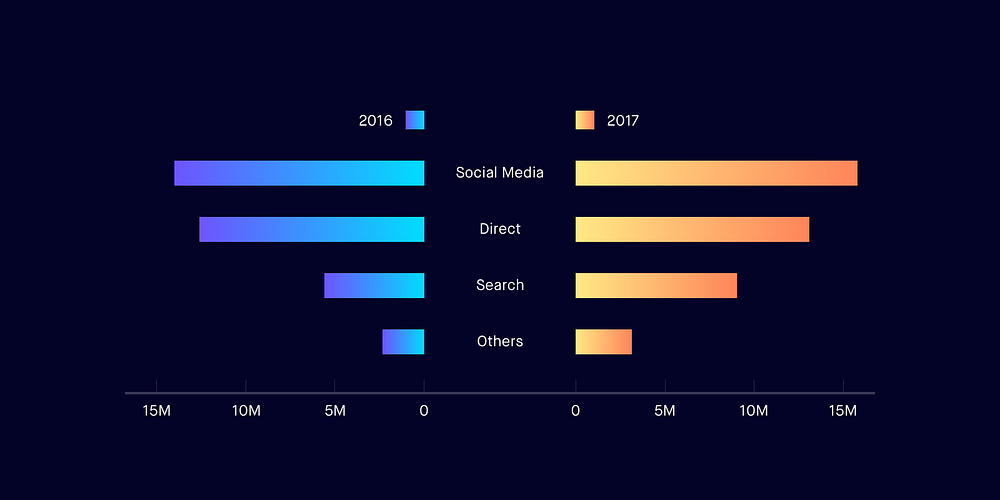
This badass chart is also known as Tornado chart. It’s called so because of the shape it takes. Butterfly chart is like two bar charts compared to each other representing comparison of two data series. It allows comparison between two groups on the basis of multiple categories side by side. If it sounds too complicated, have a look at the example here. This chart is very commonly used to compare teams and sportsmen during sports match telecasts. The variable under comparison remains the same for all the categories here.

The example above draws a comparison between the traffic on a website in 2016 and 2017 (groups) from all the channels — Social media, direct, search and others (categories). In this case, the variable under comparison is the number of visitors. The graph also appears somewhat like a butterfly, each side making one wing of the butterfly.
Best Practices for Butterfly Chart
- Plot the bars horizontally as it allows you to accommodate a lot of categories for each group
- Show the scale on both sides of the graph so that the user can determine the value of the bars easily
#9 Waterfall Chart
Waterfall charts demonstrate the cumulative effect of positive and negative values in a sequential manner on a variable. It helps us understand the effect of the positive and negative values on the variable under observation, allowing us to draw a comparison between the initial and final value of the variable. The variable is drawn as a bar resting on the X-axis with the initial value of the variable plotted against the Y-axis. The sequential negative and positive values are depicted as floating bars that affect the initial value leading to the rightmost bar which represents the final value of the variable. These charts are named waterfall charts because they look like a waterfall.

Check out the example above that draws a comparison between the inventory maintained by an e-commerce platform in the first quarter of the year (Jan to April). Let’s look at the month of January. The yellow bar is the inventory at the start of the month. The red bar, immediately after the yellow one, denotes the number of units sold that month. The green bar denotes the number of units procured that month. If you subtract the red bar from the yellow bar and add the green bar to the remainder, you will get the bar on the right — the inventory for the month of February.
Best Practices for Waterfall Chart
- Ensure that the bars depicting a change look visually different from the regular bars.
- Denote negative values in shades of red and positive in shades of green as they’re fairly accepted colours for a decrease and increase.
#10 Span Chart
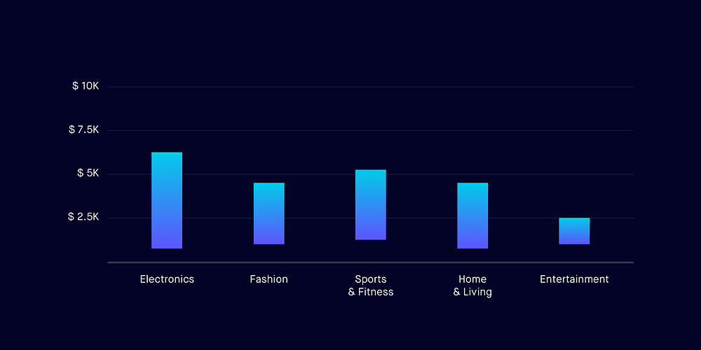
Span charts allow us to draw a comparison between ranges of data. Categories that span across a range of values instead of a specific value can be compared with the help of span charts. To represent the range the maximum and minimum values are plotted against the Y-axis. The space between these values is covered with a solid colour denoting the span of the category. Visually, this might look a lot like a waterfall chart, but they are not at all similar in terms of functionality. Span charts can be drawn vertically or horizontally, whichever is convenient. Well, enough of the theory, check out the example below and it should clear any doubts that you might have.

The graph shows the price range of various categories (electronics, fashion, sports, etc) available on an e-commerce platform. Because we’re comparing ranges of price, it’s obvious that nothing is sold for $0, which is why most of the bars don’t touch the X-axis.
Best Practices for Span Chart
- Pick the scale for the value axis cautiously. It’s important that the data is represented in the maximum size possible allowing the user to read it with more accuracy.
Don’t forget to clap for the article. Follow me for more in this series.
Special Thanks To
Prerna Pradeep, Shailly Kishtawal, Tanvi Kumthekar, Rajiv Pennathur and Suvojyoti Ray for helping with the article. :)
Find me on:
Check out some of my previous articles at the links below
- Designing search for your product
- Floating Action Buttons: Bottom Right or Bottom Left?
- Using interactions to shape user behavior patterns
- Designing notifications for apps
- Where should you put the Search?
- Why is clapping 50 times on Medium so difficult?


