A guide to designing user-friendly and functional dashboards

I have been working on designing complex, data-heavy dashboards for quite some time and I have designed a lot of dashboards and every new one is an exciting challenge for me to solve. And I am sure at some point in time you would have come across designing data-heavy dashboards. Therefore, I want to share a list of useful guidelines and resources that I use to design a beautiful, usable and functional dashboard.
What is a Dashboard?
“A picture is worth a thousand words” — in this case, it’s true, the Dashboard design is the art of communicating and interpreting raw data into insights and meaningful patterns that are easily consumable.
It is a powerful tool for organizational change. A lot of business-driven decisions are based on tons of data and let’s face it, no one has that much time to go through the data line by line. As UX designers, we need to present these huge chunks of data in a way that is simple, intuitive, user friendly and easy to consume by the user.
At the same time, we need to carefully and thoughtfully represent the data, as the wrong interpretation of the data by the user might lead to unintended repercussions.
So, How do we approach this?
Who?
Like any other problem, start with research — identify who are the users, what is their goal, what is their current process/ how are they gonna make use of this data?
- Are they trying to measure, monitor, and manage operations over a period of time?
- Do they want the trends to make strategic decisions?
- Do they just want to see/keep track of the key KPIs of the whole organization for a period of time?

What?
Next, we need to find out the essential data/KPI that is meaningful to the user and prioritize the various data points.
- What are the main triggers that the user looks into the data?
- What are the KPIs that help them make the decisions?
- What happens next, if there is a drop/increase in the numbers?
- How often do they review the metrics and frequency?

How?
Once we know who are users and what is the information that they are looking for, we can figure out how to display the data.
- Start by figuring out the function of data visualization i.e, what we want to communicate to the users? Use the data visualization catalog to get an idea of what type of chart/graph to use for which function.
- Next, decide on how the users will navigate and interact with the data. Create wireframes and test it out with the users and iterate.
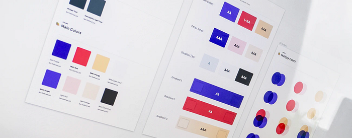
- Then comes the aesthetics, pick the right color combination, font and layout.
- The color plays an important role in the dashboard design, as should tell the users something about the data, and draw the user’s attention to the information. For example, use red color to focus the user’s attention on key information like KPIs or status.

Summary
Things to keep in mind:
- Choose the right type of visualization for the charts.
- Prioritize the data and the information has to be clearly displayed with proper visual hierarchy.
- All the graphs should have a clear consistent title and legends.
- Pick the right color combinations, which can help the user to draw attention and makes it easier to identify any patterns, alerts and trends.
- Give the user the ability to drill down or dig deeper into any topic of interest in the summarised data. This will help them understand the reasons why positive or negative numbers.
- Provide an option to customize the dashboard so that the user can see what matters to them.


