Member-only story
A guide to minimalist design
The reign of white space.
Minimalism is the concept that embodies the phrase “less is more”. It is also a concept that crosses our lives in many shapes and forms: for some people, it’s a lifestyle, for others is an organisation mindset, and some might even perceive it as “cleaner” looking things.
In Design, minimalism is one of the many art concepts that describes a form of content, and it can be used in many ways. As defined by the Cambridge Dictionary, minimalism is “a style in art, design, and theatre that uses the smallest range of materials and colours possible, and only very simple shapes or forms”.
But what does this mean in digital product design?
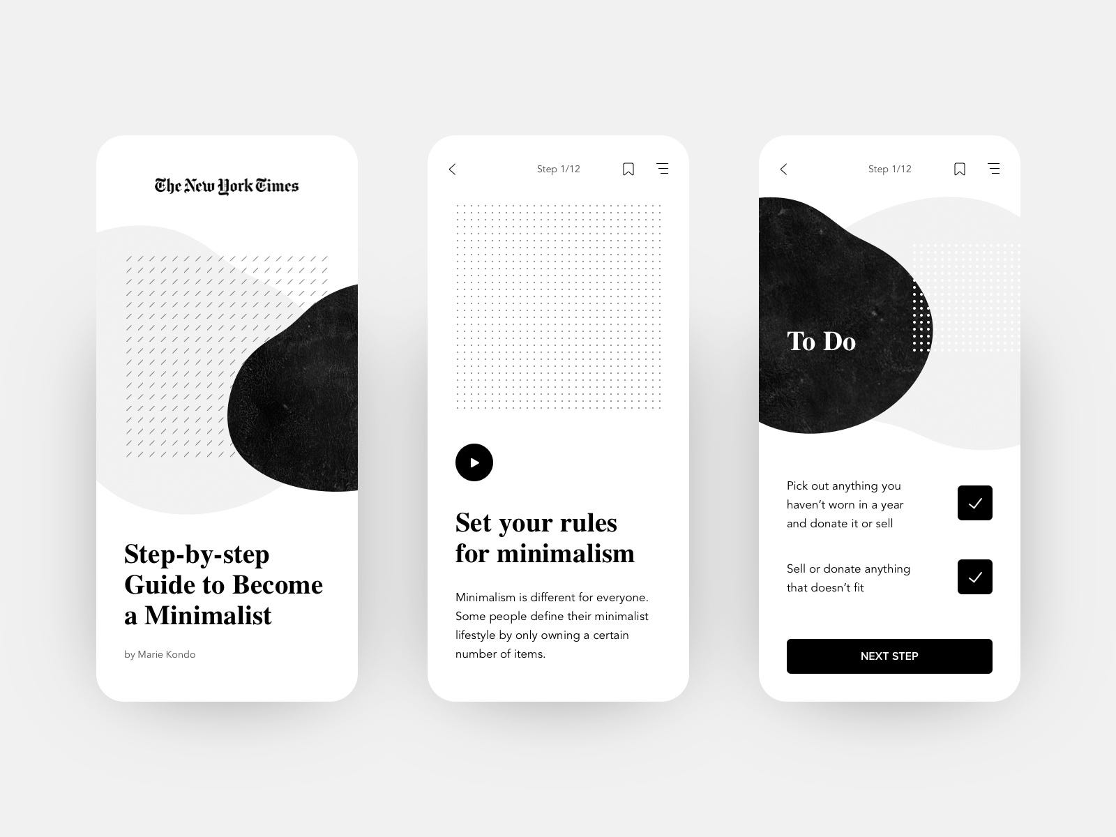
White Space
The blank page syndrome is a phenomenon that affects any artist — despite being widely associated with writing — when starting a new piece and being faced with the emptiness of the page.
Have you ever felt like you have to fill up every bit of white space on your work or else it feels off? The minimalist design concept invites you to embrace the emptiness and to use it as part of your art.
Using white space gives your design elements space to breathe and to live on their own. Sometimes, having a page with many elements can be too overwhelming for the users or make the usability more complicated for them to understand.


Colour
Your white space doesn’t necessarily have to be white. Don’t be afraid to experiment with different colours and to try new colour palettes and combinations.
Colour is not just an element that is part of others — such as images and text — but can also live and exist on its own. You can create beautiful mixtures and combinations, by using colour (or lack of it) as the main element or in certain appointments.

