Member-only story
Goodreads’s new book page design: a UX analysis
A look at the new book page experience.
The day we thought would never come is here — Goodreads is actually working on updating its design. I recently went onto the website after a few months of not using it, and I was surprised by this notification:
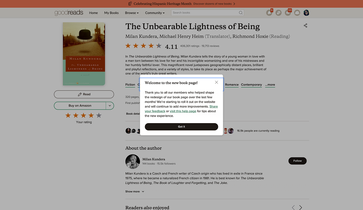
As the popup notification says, the design is still being rolled out and we may see more improvements being made.
What is Goodreads and why is it significant that they’re updating?
To those not familiar with Goodreads, it is a social website for readers, where you can track your reading, make lists, write reviews, connect with other readers and find recommendations. The website was launched in 2007 (founded in 2006), with a mobile app launching in 2010. It got acquired by Amazon in 2013, and apparently had 90 million registered users as of 2019.
The website in particular is notorious for its poor, outdated user experience which looks like they haven’t updated their layout since launching. The last redesign of the homepage was actually in 2016, from what I could find out on the website itself. Despite being plagued by usability issues, it still remains the dominant reading tracker website, even though arguably better products exist. Many articles have covered the numerous problems with Goodreads, such as this one by Daley Wilhelm.
I’ve been using Goodreads since 2013, and I have to admit there is a certain amount of nostalgia that I feel whenever I use it. That’s probably why I’ve learnt to live with the poor user experience, as others have as well. I’ve tried to use other products such as StoryGraph, which is easier to use and minimalist in design, but it didn’t strike the same chord, and felt a bit uninspired in terms of visual design.
So when I saw that Goodreads are working on implementing a new design, I thought, it’s about time.


