A perspective on tool tips
And product decisions in general.

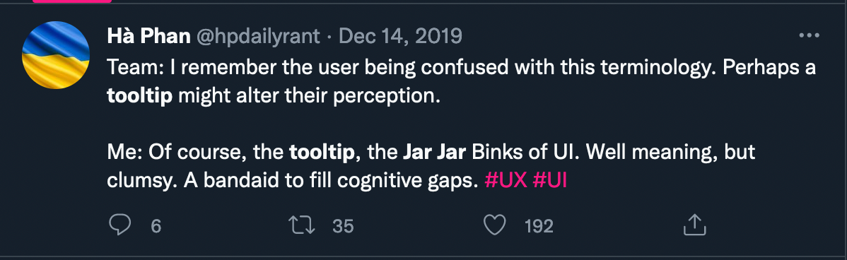
In one of my recent conversations with a product team, I was met with a strong hate towards the suggestion of tool-tip. And this wasn’t the first time. I have heard that often from founders as well. The general consensus is that they are quite awful. In the larger design community, they are even defined as Jar Jar Binks of UI.
Harsh, I know. Not my words.
And I understand the sentiment. Damage is already done if you are relying on the tool-tip for explaining the feature. I get it. But does that mean as a product owner, one should always meet the topic of using a tool-tip with extreme negation? I don’t think so.
Tool tips are generally used for on-boarding the user to the product/feature, providing product tours, or in the worst cases, upselling.
For me, personally, the decision comes down to how is it being used. There are a few areas where I think tool tips are brilliant.
Pointing a user to a new feature
Tool-tip can be a non-intrusive call out to a new capability within the product. It ensures that the user is aware of the feature addition and is not left wondering what this little random icon does. It also can make them slightly forgiving towards the newly added section.

Introducing users to new interactions
If you’re being innovative in your approach to digital design, there would definitely be scenarios where you would need to introduce a how-to. Tool tips can be quite effective in such scenarios.
A cornerstone for delight
When a tool-tip actually delivers in providing essential information — it’s an absolute delight and ecstatic experience. I love how Slack makes use of this tiny component.

Again, this post is not coming from a place of immense affection towards tool tips. I don’t want to die on that hill. And it’s not lost to me that the better-off use-cases of the component are quite rare.
My problem is with the air of absolute opinions which stirs in product meetings about what constitutes a good or bad UX.
These pre-made convictions often shut down ideas before there is even an opportunity to put them in the context of specific user needs and their product journey. Why? Because such and such is a hard no.
Just because something has the potential to be, doesn’t make it truly so.
Yes, you’re choosing to avoid a band-aid. But have you made sure that you’re not leaving behind an open wound?
This is just one of the examples of how a strongly held conviction can make you lose on opportunities which can lead to a better experience for the user. Don’t let stubbornness get the best of your product decisions.
If unsure, test and validate. Cheers :)
Still keen to design better tool tips? Do check out these handy resources: