A quick start guide to choosing accessible colours
Early last morning, I woke up to this tweet. Like everything else I find on the internet, it sent me on a wild goose chase searching for any and all the information I could find about colour accessibility. So I figured that I may as well condense this to help other people understand accessibility.
I found that there are two types of colour blindness that’s prevalent amongst people — protanopia and deuteranopia (both are red-green colour blindness).
How many people are affected by this, you ask?
In 2017, The World Health Organization estimated that roughly 217 million people live with some form of moderate to severe vision impairment.
That is the number of users that will bail on you for a competitor that is accessible. We don’t want all of that churn now do we?
If that isn’t enough to convince you of the importance of accessibility, then maybe the legal implications will. In 2017, 814 federal lawsuits were filed about inaccessible websites.
But more importantly, think about the kind of frustration you’re putting your users through.
For example, look at this map. The scale is easy enough to understand right? Red = Bad and Green = Good
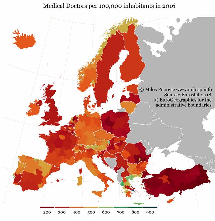
Here’s what it looks like for someone who’s colour blind:
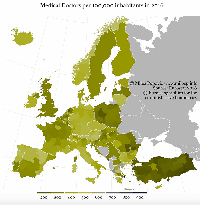
Take a look at that scale again — Dark Green = Too Few Doctors. And on the other end, Dark Green = Plenty of Doctors. How’re you supposed to make sense of that right?
And it’s not just graphs, its maps:


Packaging:
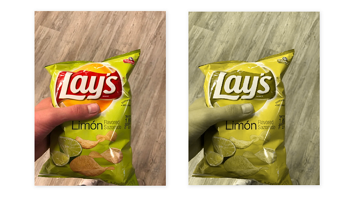
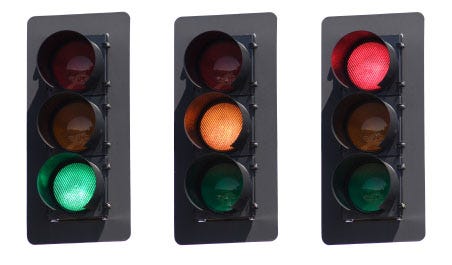
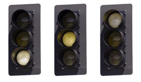
And even traffic signals:
So how do we, as designers account for this?
As Stephanie Walter said, contrast is a basic. So let’s start with that.
Contrast
W3Cs guidelines state that the minimum background to text contrast ratio must be 4.5:1. There are several tools to help you test this. But here’s what it’ll look like:
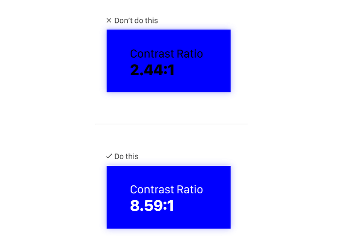
But it doesn’t end there:
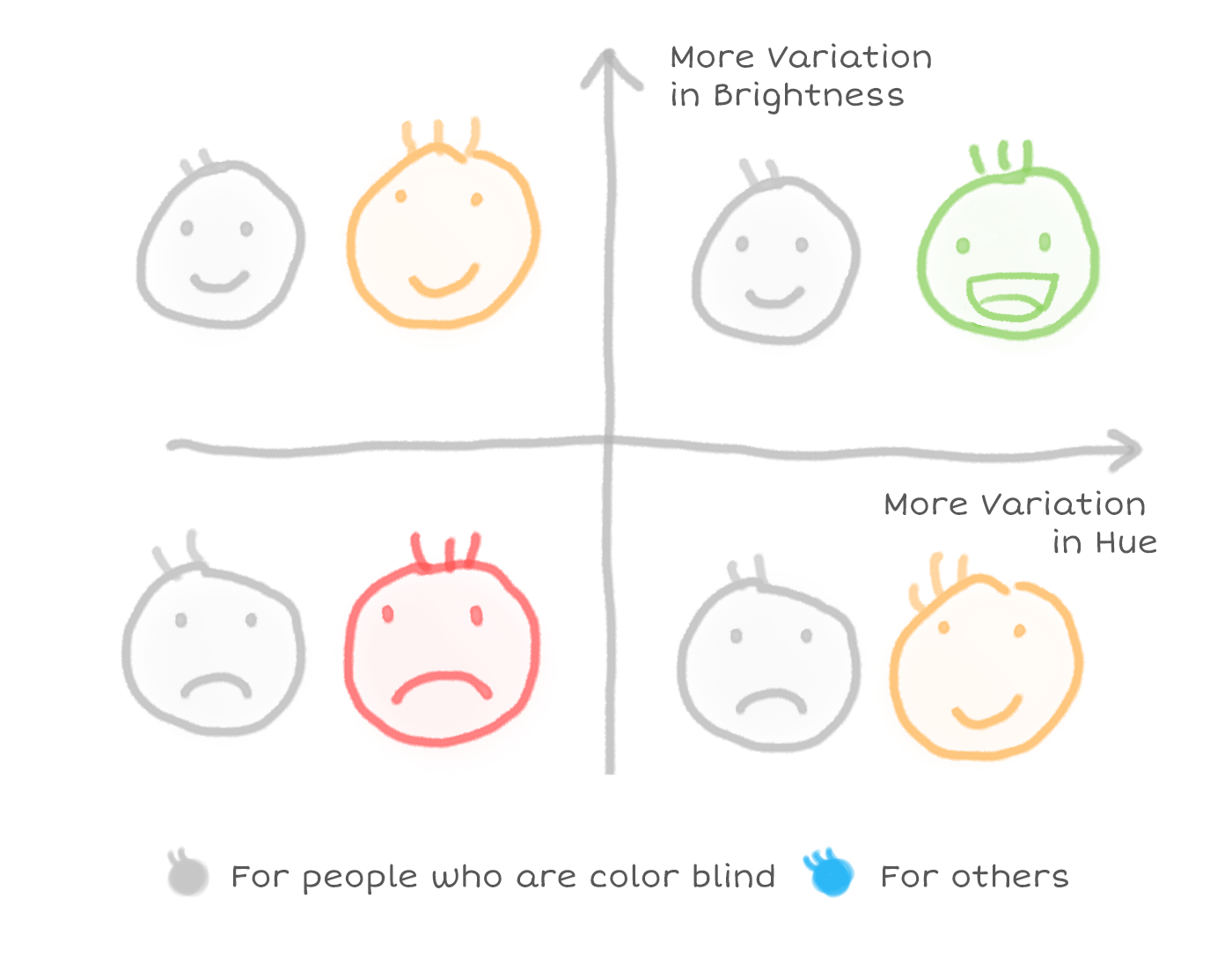
However, having a palette that varies only in brightness may not be enough. The more variance you can have in the color palette, the easier it is for users to map your data series to the visualization. If we can utilize the change in hue for people who are not color blind, it will delight them even more.
Alternatives to Colour
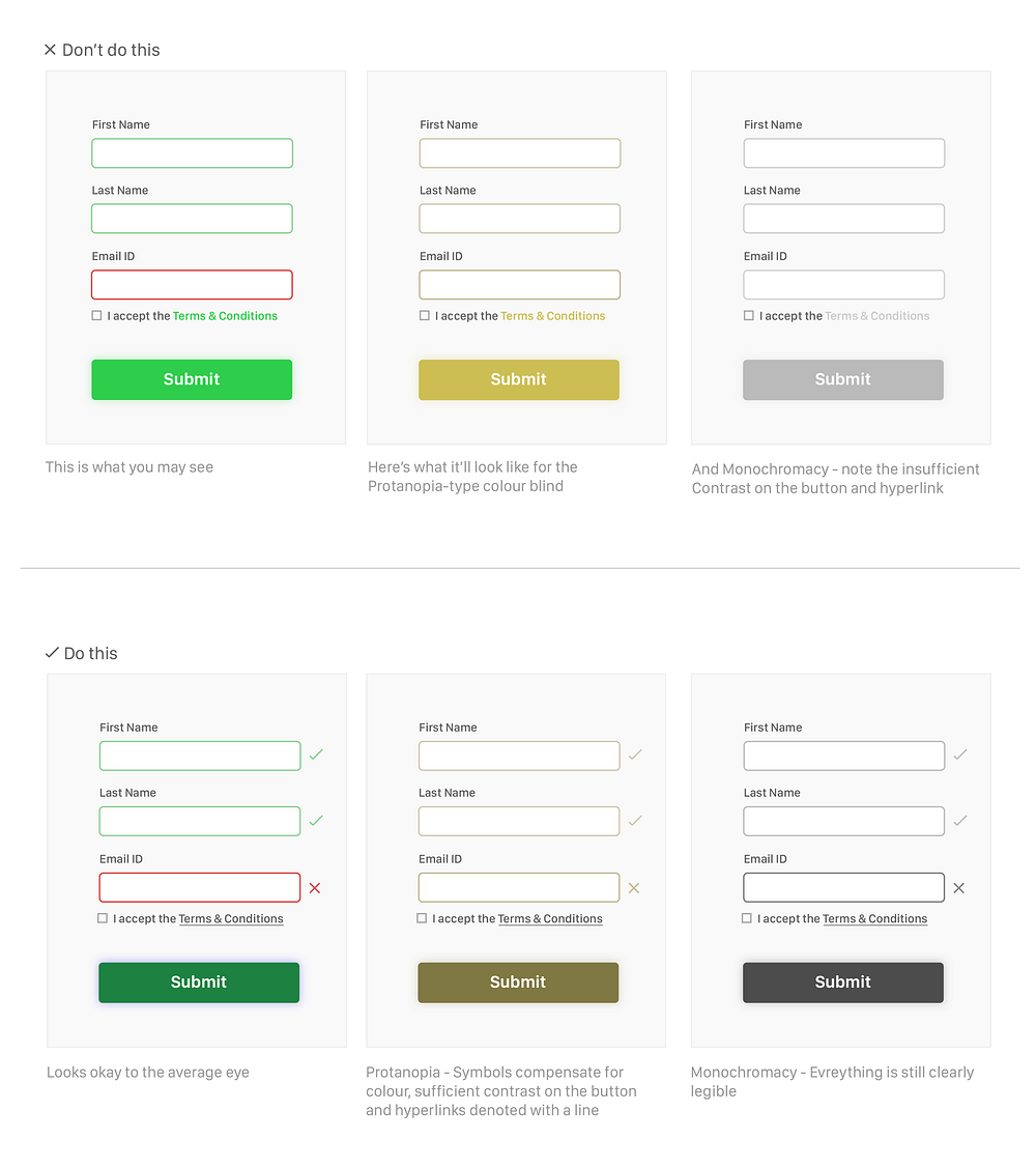
The next thing to keep in mind is that having colour be the only method of providing users with feedback is a bad idea. Whenever you can, use symbols. And make sure your hyperlinks aren’t highlighted only with the help of colour, underlining it is always a better option.
Here’s a quick example to show you what I mean:
💥 TIP
If you’re using Adobe Illustrator, go to View > Proof Setup and you’ll see options to toggle between Colour Blindness — Protanopia and Colour Blindness — Deuteranopia

The next thing you need to think about is labelling colours. Think about shopping sites, colours are often illustrated as a swatch of colour on the left with no description.
But adding text labels to colour swatches makes for an easy to navigate experience for colour blind users. Forever 21 does this super well:

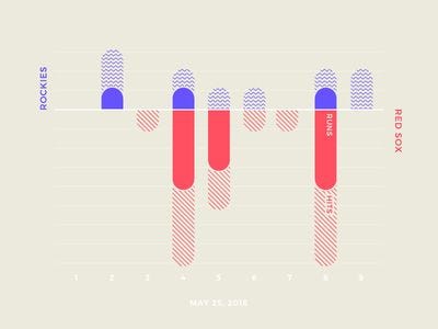
Another alternative to colours is patterns and textures. Here are a couple of examples of graphs that use patterns and textures instead of solely relying on colour:


💥 Tools
As an easter egg, here are a couple of fun tools to play around with to truly understand and experience colour accessibility:
- ColorBox by Lyft — A tool to produce accessible colour systems open-sourced by Lyft’s design team
- Color Blindness Test — A chrome plug-in that simulates web pages to show you what they’d look like to the colour blind
- Color Brewer 2.0 — Colour palettes with an option to view only colorblind safe palettes
If you like this article, you will enjoy this one too —Here’s Why we Need to Talk About Inclusive Design
